Criterion & Eclipse Cover Art & Packaging Babble-on Vol. 6
-
SpiderBaby

- Joined: Wed Dec 15, 2010 6:34 pm
Re: Criterion & Eclipse Cover Art & Packaging Babble-on Vol.
Gate of Hell, why not use something from the film itself? The film is more colorful than any cartoon you could slap on that cover. I agree with domino, don't like that Richard III cover.
-
Gregory

- Joined: Tue Nov 02, 2004 4:07 pm
Re: Criterion & Eclipse Cover Art & Packaging Babble-on Vol.
That's not Arial.domino harvey wrote:Why is everyone jizzing over the Richard III cover? Long-held loyalty to Arial font?
I don't see what the big problem with the cover is.
-
med

- Joined: Tue Mar 17, 2009 5:58 pm
Re: Criterion & Eclipse Cover Art & Packaging Babble-on Vol.
No Arial found anywhere on that cover. The Shakespeare and Olivier credits appear to be in Futura, however.
-
The Narrator Returns

- Joined: Tue Nov 15, 2011 6:35 pm
Re: Criterion & Eclipse Cover Art & Packaging Babble-on Vol.
I knew it! Wes Anderson is dominating Criterion even when they're not releasing his films!
-
Matt
- Joined: Tue Nov 02, 2004 12:58 pm
Re: Criterion & Eclipse Cover Art & Packaging Babble-on Vol.
Is the Gate of Hell cover by Robert Risko? That's one well I never thought Criterion would dip into.
Richard III is awful for all the reasons already mentioned plus purple.
Richard III is awful for all the reasons already mentioned plus purple.
-
Gregory
- Joined: Tue Nov 02, 2004 4:07 pm
Re: Criterion & Eclipse Cover Art & Packaging Babble-on Vol.
But no one has mentioned any reasons pro or con, unless "reasons" include "it's beautiful" or "it's ugly"Matt wrote:Richard III is awful for all the reasons already mentioned plus purple.
-
domino harvey

- Dot Com Dom
- Joined: Wed Jan 11, 2006 2:42 pm
Re: Criterion & Eclipse Cover Art & Packaging Babble-on Vol.
Yes, where are the usual well-reasoned arguments traditionally found in the Cover Art thread
-
Matt
- Joined: Tue Nov 02, 2004 12:58 pm
Re: Criterion & Eclipse Cover Art & Packaging Babble-on Vol.
White Futura text on a black background. Futura anywhere outside a Wes Anderson movie or the 1990s. Purple. Ugly woodcut that seems to have nothing to do with the style or content of the movie (except "dudes a king lol"). Unbalanced composition. Much better previous cover (even if it led people to believe it was a movie about the Klan).
-
dwk

- Joined: Sat Jun 12, 2010 6:10 pm
Re: Criterion & Eclipse Cover Art & Packaging Babble-on Vol.
According to Sam Smith, the Richard III cover is from an old poster
-
Gregory
- Joined: Tue Nov 02, 2004 4:07 pm
Re: Criterion & Eclipse Cover Art & Packaging Babble-on Vol.
People often give reasons. (I purposely didn't say "well-reasoned arguments," which is something different.) Just as often not, of course, but it's more interesting when there's some substance given to the usual comments of "that's ugly/beautiful".domino harvey wrote:Yes, where are the usual well-reasoned arguments traditionally found in the Cover Art thread
-
med
- Joined: Tue Mar 17, 2009 5:58 pm
Re: Criterion & Eclipse Cover Art & Packaging Babble-on Vol.
I might like the Richard III cover once I see it in person. Or I might just be even more distracted by the use of Futura. I like purple things, so there's that.
-
acroyear

- Joined: Sun Sep 23, 2012 10:22 pm
Re: Criterion & Eclipse Cover Art & Packaging Babble-on Vol.
I always come to this topic thread to see the new releases, where I can quickly scan all the new covers at once. In those first few milliseconds of taking in the cover for Gate of Hell I thought Criterion had broken the (unwritten) "no animated movies" rule.
I quite like Gate of Hell's illustration, but not having seen the film yet I wonder if its the "right" cover on the "wrong" movie.
I quite like Gate of Hell's illustration, but not having seen the film yet I wonder if its the "right" cover on the "wrong" movie.
-
Drucker

- Your Future our Drucker
- Joined: Wed May 18, 2011 9:37 am
Re: Criterion & Eclipse Cover Art & Packaging Babble-on Vol.
I dig Richard III because I feel like that could be a book cover.
-
rspaight

- Joined: Tue Jun 05, 2012 10:18 am
Re: Criterion & Eclipse Cover Art & Packaging Babble-on Vol.
The Richard III poster is on the Wikipedia article for the film:

-
Ashirg

- Joined: Wed Nov 03, 2004 9:10 am
- Location: Atlanta
Re: Criterion & Eclipse Cover Art & Packaging Babble-on Vol.
It's from Janus Films re-release.
-
HistoryProf

- Joined: Mon Mar 13, 2006 3:48 am
- Location: KCK
Re: Criterion & Eclipse Cover Art & Packaging Babble-on Vol.
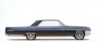
Repo Man is the most Swimming Horses cover they've ever done. it's horrid. Gate of Hell is just bizarrely WRONG in every way in addition to looking like shit. the original poster for Richard III is great...not sure how they managed to screw that up so badly. Etaix suggests it's a series of films starring an actual circus clown, which is creepy. the only one that doesn't suck is Naked Lunch, but only because they left it alone. The Eclipse is nice overall - especially the shots for THE THICK-WALLED ROOM and BLACK RIVER.
Very excited for Gate of Hell and the Kobayashi set. The rest not so much. Not a good month at all. blech.
Very excited for Gate of Hell and the Kobayashi set. The rest not so much. Not a good month at all. blech.
-
SpiderBaby
- Joined: Wed Dec 15, 2010 6:34 pm
Re: Criterion & Eclipse Cover Art & Packaging Babble-on Vol.
I know Criterion is big on trying to make a film cover there own with original artwork and all, but how many would take the poster in this case, or at least a screenshot of the film:

-
Shrew

- The Untamed One
- Joined: Tue Feb 27, 2007 2:22 am
Re: Criterion & Eclipse Cover Art & Packaging Babble-on Vol.
I've never really cared for those 50s era Japanese posters (see also, the old MoC Mizoguchi covers)--they're just so hella busy.
I think the trouble with Gate of Hell is that it's so close to being a good cover and one totally incongruous thing makes the whole hideous. The intent was obviously to mimic a ukiyo-e woodblock, which would suit the film, and some parts of the poster get it--that hand and the print on the kimono look great!
And then that face.
-
cdnchris

- Site Admin
- Joined: Tue Nov 02, 2004 2:45 pm
- Location: Washington
- Contact:
-
johnnysnatchclub7

- Joined: Thu Jan 03, 2013 3:49 pm
Re: Criterion & Eclipse Cover Art & Packaging Babble-on Vol.
Very odd having the tagline on the spine for Pina.
-
swo17

- Bloodthirsty Butcher
- Joined: Tue Apr 15, 2008 10:25 am
- Location: SLC, UT
Re: Criterion & Eclipse Cover Art & Packaging Babble-on Vol.
It's maybe a little more than just a tagline. That's presented as the full title of the film during the closing credits.
-
johnnysnatchclub7
- Joined: Thu Jan 03, 2013 3:49 pm
Re: Criterion & Eclipse Cover Art & Packaging Babble-on Vol.
Oh, okay. Good to know. I still haven't seen it. Still seems odd but makes sense now.swo17 wrote:It's maybe a little more than just a tagline. That's presented as the full title of the film during the closing credits.
-
cdnchris
- Site Admin
- Joined: Tue Nov 02, 2004 2:45 pm
- Location: Washington
- Contact:
-
mfunk9786

- Under Chris' Protection
- Joined: Fri May 16, 2008 4:43 pm
- Location: Philadelphia, PA
Re: Criterion & Eclipse Cover Art & Packaging Babble-on Vol.
The Narayama photos aren't showing up.
-
cdnchris
- Site Admin
- Joined: Tue Nov 02, 2004 2:45 pm
- Location: Washington
- Contact: