So do I. Reminds me of what happened with Viridiana a few years back, but this is not close to as great as the pink version of that was, and that cover was changed wholesale to something more all-around boring.HitchcockLang wrote:I may be in the minority, but I miss the blue cover.
Criterion & Eclipse Cover Art & Packaging Babble-on Vol. 7
-
mfunk9786

- Under Chris' Protection
- Joined: Fri May 16, 2008 4:43 pm
- Location: Philadelphia, PA
Re: Criterion & Eclipse Cover Art & Packaging Babble-on Vol.
-
Graphist

- Joined: Thu Jul 23, 2015 2:18 am
- Location: New York City
Re: Criterion & Eclipse Cover Art & Packaging Babble-on Vol.
Was the aqua color referring to the swimming pool? They could have toned it down, I think it was too saturated. But honestly, personally I don’t mind the grey monochromatic look.
-
cdnchris

- Site Admin
- Joined: Tue Nov 02, 2004 2:45 pm
- Location: Washington
- Contact:
-
DRW.mov

- Joined: Thu Sep 15, 2016 2:43 pm
- Location: Los Angeles, CA
Re: Criterion & Eclipse Cover Art & Packaging Babble-on Vol.
I can’t even tell you how cool it is to see an Outfest logo on the back of a Criterion package.
-
cdnchris
- Site Admin
- Joined: Tue Nov 02, 2004 2:45 pm
- Location: Washington
- Contact:
-
KJones77
- Joined: Wed Aug 23, 2017 11:35 pm
Re: Criterion & Eclipse Cover Art & Packaging Babble-on Vol.
Wow Jabberwocky looking pretty plain on the inside.
-
cdnchris
- Site Admin
- Joined: Tue Nov 02, 2004 2:45 pm
- Location: Washington
- Contact:
Re: Criterion & Eclipse Cover Art & Packaging Babble-on Vol.
Missed this initially, but they do use a metallic ink that I guess adds a little something to it.HitchcockLang wrote:I may be in the minority, but I miss the blue cover.
-
swo17
- Bloodthirsty Butcher
- Joined: Tue Apr 15, 2008 10:25 am
- Location: SLC, UT


-
zedz

- Joined: Sun Nov 07, 2004 7:24 pm
Re: Criterion & Eclipse Cover Art & Packaging Babble-on Vol.
I really like The Hero and An Actor's Revenge, but WTF Tom Jones?
-
perkizitore

- Joined: Thu Jul 10, 2008 3:29 pm
- Location: OOP is the only answer
Re: Criterion & Eclipse Cover Art & Packaging Babble-on Vol.
It is swimminghorses going analog!zedz wrote:I really like The Hero and An Actor's Revenge, but WTF Tom Jones?
-
KJones77
- Joined: Wed Aug 23, 2017 11:35 pm
Re: Criterion & Eclipse Cover Art & Packaging Babble-on Vol.
Wow The Silence of the Lambs has a seriously excellent cover.
-
Apperson
- Joined: Mon Dec 05, 2016 3:47 pm
- Location: Oxfordshire, UK
Re: Criterion & Eclipse Cover Art & Packaging Babble-on Vol.
Is there an incomplete painting in Tom Jones because that cover is inexplicable otherwise.
-
movielocke
- Joined: Fri Jan 18, 2008 12:44 am
Re: Criterion & Eclipse Cover Art & Packaging Babble-on Vol.
Silence of the Lambs is amazing.
The font of the title for Actor's Revenge kind of works but also kind of interferes with my eye's ability to parse between the title and the art. But a pretty striking idea/design, nonetheless.
The font of the title for Actor's Revenge kind of works but also kind of interferes with my eye's ability to parse between the title and the art. But a pretty striking idea/design, nonetheless.
-
zedz
- Joined: Sun Nov 07, 2004 7:24 pm
Re: Criterion & Eclipse Cover Art & Packaging Babble-on Vol.
It also cleverly evokes the film's spectacular CinemaScope framing.movielocke wrote:Silence of the Lambs is amazing.
The font of the title for Actor's Revenge kind of works but also kind of interferes with my eye's ability to parse between the title and the art. But a pretty striking idea/design, nonetheless.
-
thatobscurecharm

- Joined: Tue Aug 24, 2010 1:19 pm
- Location: Northern California
Re: Criterion & Eclipse Cover Art & Packaging Babble-on Vol.
Silence reminds me of artwork for the current revival of M. Butterfly 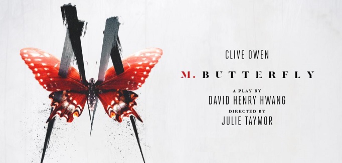
-
Cinephrenic
- Joined: Tue Nov 02, 2004 2:58 pm
- Location: Paris, Texas
Re: Criterion & Eclipse Cover Art & Packaging Babble-on Vol.
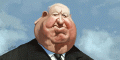
Tom Jones cover is somewhat boring. Elevator to the Gallows could have used a upgrade. Rest is nice.
-
aox

- Joined: Fri Jun 20, 2008 12:02 pm
- Location: nYc
Re: Criterion & Eclipse Cover Art & Packaging Babble-on Vol.
Agreed that Elevator could have used an artwork upgrade.
-
Ashirg

- Joined: Wed Nov 03, 2004 9:10 am
- Location: Atlanta
Re: Criterion & Eclipse Cover Art & Packaging Babble-on Vol.
It says The Hero cover is based on a poster designed by Satyajit Ray
-
criterionoop
- Joined: Mon Sep 20, 2010 7:46 am
Re: Criterion & Eclipse Cover Art & Packaging Babble-on Vol.
I'm assuming this is the poster it was based off:

-
Gerald Christie
- Joined: Wed Jun 08, 2016 12:06 pm
Re: Criterion & Eclipse Cover Art & Packaging Babble-on Vol.
Am I the only one that hates the new artwork for SOTL? This is one of those films where the only option is the original poster. Much like The Breakfast Club or The Exorcist it's so iconic and perfectly captures the movie.
-
Luke M

- Joined: Thu Jul 12, 2007 9:21 pm
Re: Criterion & Eclipse Cover Art & Packaging Babble-on Vol.
Silence of the Lambs is an all-time great cover. I know we already saw it, but Night of the Living Dead cover is nice. I think the other covers are pretty decent. No bad covers this month.
-
Ribs

- Joined: Fri Jun 13, 2014 1:14 pm
Re: Criterion & Eclipse Cover Art & Packaging Babble-on Vol.
Night of the Living Dead is surely a digipak, right?
-
Boosmahn

- Joined: Mon Sep 04, 2017 10:08 pm
Re: Criterion & Eclipse Cover Art & Packaging Babble-on Vol.
Both Night of the Living Dead and Silence of the Lambs will be.Ribs wrote:Night of the Living Dead is surely a digipak, right?
-
Feego

- Joined: Thu Aug 16, 2007 7:30 pm
- Location: Texas
Re: Criterion & Eclipse Cover Art & Packaging Babble-on Vol.
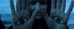
Sorry, but I'm not a fan of the new Silence of the Lambs or Night of the Living Dead covers. Dead is mostly ok, but the placement of the title on the left side behind the wacky C is triggering my OCD. Couldn't they have just shifted the zombie hands to the left side and placed the title on the right? And poor Judith O'Dea has been given the same unflattering face treatment that Candace Hilligoss received on the redux Carnival of Souls cover. The font and clean white background with little blood spatters on Silence make it look like a poster for the next season of American Horror Story. Nothing about it evokes the look or feel of the movie for me.
Edit: Although, come to think of it, the Silence cover does look mighty similar to my paperback copy of Red Dragon:
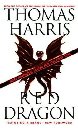
Edit: Although, come to think of it, the Silence cover does look mighty similar to my paperback copy of Red Dragon:
-
Bressonaire
- Joined: Mon Dec 02, 2013 4:49 pm
Re: Criterion & Eclipse Cover Art & Packaging Babble-on Vol.
You're too kind. I'd say it's seriously ghastly. Is he chewing his knuckles? Is he looking at the same cover we're looking at? (No wonder his eyes are wide and he looks nonplussed.) Is he having a Voltaire moment, pondering the meaning of life? It certainly conveys nothing of the rollicking energy of the film. A terrible cover.Tom Jones cover is somewhat boring.