Criterion & Eclipse Cover Art & Packaging Babble-on Vol. 7
-
Finch

- Joined: Mon Jul 07, 2008 5:09 pm
- Location: Edinburgh, UK
Re: Criterion & Eclipse Cover Art & Packaging Babble-on Vol. 7
I like the Criterion cover for Crash best.
-
Boosmahn

- Joined: Mon Sep 04, 2017 10:08 pm
Re: Criterion & Eclipse Cover Art & Packaging Babble-on Vol. 7
I actually like the cover for Amores perros. It reminds me of a dragon's mouth, not a dog's.
-
FrauBlucher

- Joined: Mon Jul 15, 2013 8:28 pm
- Location: Greenwich Village
Re: Criterion & Eclipse Cover Art & Packaging Babble-on Vol. 7
I like the Amores Perros cover but is this first cover where the director's name is larger than the film itself. I also like the Gary Tooze approved cover of Crash
-
cdnchris

- Site Admin
- Joined: Tue Nov 02, 2004 2:45 pm
- Location: Washington
- Contact:
-
Clarence

- Joined: Fri Jun 24, 2016 1:18 am
- Location: Orlando, FL
Re: Criterion & Eclipse Cover Art & Packaging Babble-on Vol. 7
Interesting that the Pierrot le fou inner cover has a picture of the Fuller scene with the green tint despite it not being present in this version.
-
cdnchris
- Site Admin
- Joined: Tue Nov 02, 2004 2:45 pm
- Location: Washington
- Contact:
-
mfunk9786

- Under Chris' Protection
- Joined: Fri May 16, 2008 4:43 pm
- Location: Philadelphia, PA


-
criterionsnob
- Joined: Wed Nov 03, 2004 1:23 am
- Location: Canada
Re: Criterion & Eclipse Cover Art & Packaging Babble-on Vol. 7
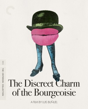
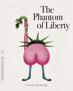
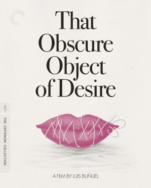
All quite lovely. I love, love, love the Buñuels, even if they're not very different than expected.
-
Blutarsky

- Joined: Thu Nov 30, 2017 10:09 pm
Re: Criterion & Eclipse Cover Art & Packaging Babble-on Vol. 7
The Buñuel set is not a knockout, yet I love it. I can’t wait to have it on my shelf. But the Rolling Thunder Revue art is just...dreadful.
-
Boosmahn
- Joined: Mon Sep 04, 2017 10:08 pm
Re: Criterion & Eclipse Cover Art & Packaging Babble-on Vol. 7
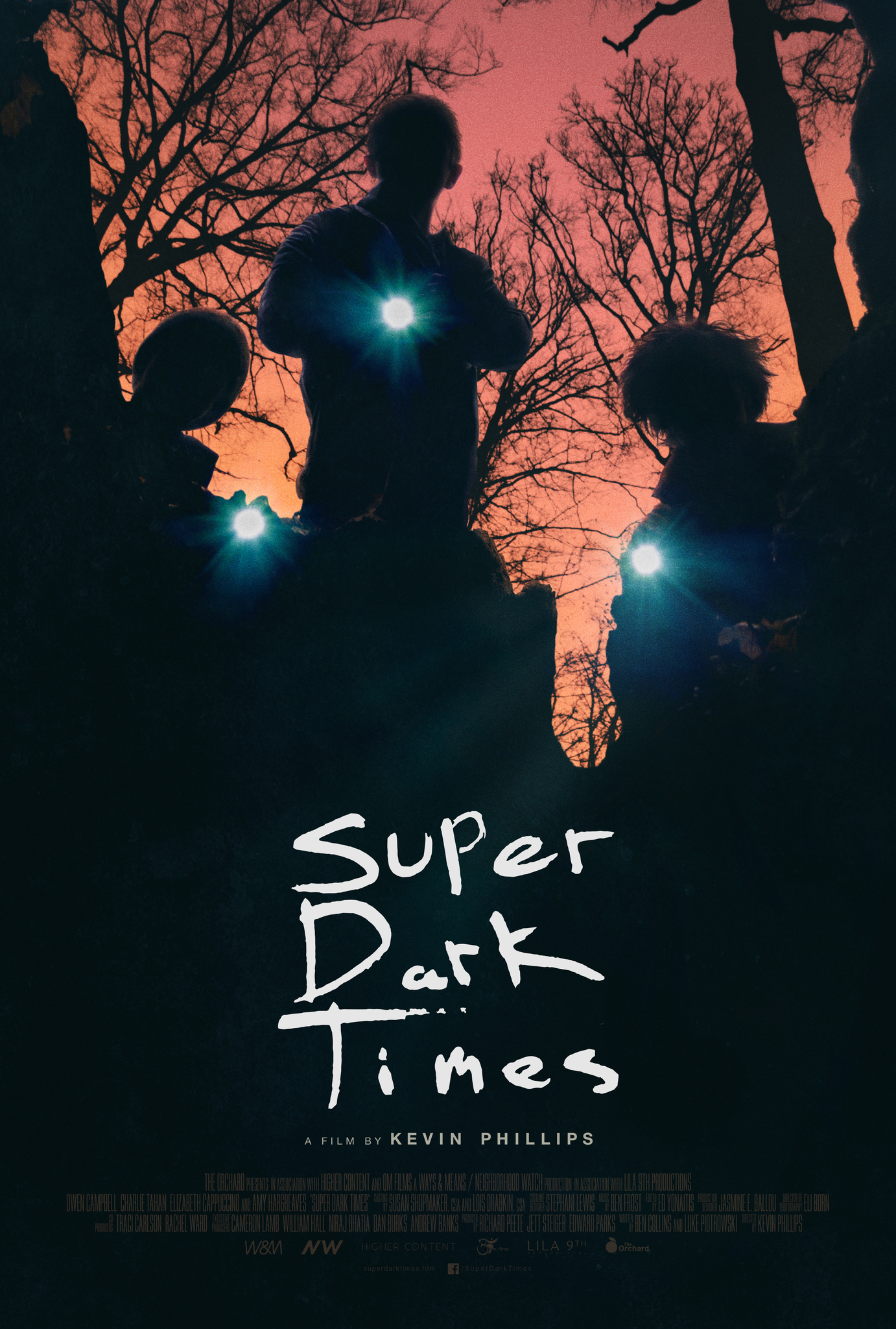
Minding the Gap looks great, but it reminds me of the poster for Super Dark Times.
-
therewillbeblus

- Joined: Tue Dec 22, 2015 3:40 pm
Re: Criterion & Eclipse Cover Art & Packaging Babble-on Vol. 7
Aside from the facial expression in The Ascent that looks a bit like The Passion of Joan of Arc in a dissociative state, the rest are fine. I'm glad they kept the Phantom of Liberty DVD art, which is one of my favorites.
-
J M Powell
- Joined: Wed Nov 03, 2004 9:20 am
- Location: Providence, RI
Re: Criterion & Eclipse Cover Art & Packaging Babble-on Vol. 7
The individual Buñuel covers are fantastic, but the wacky font nonsense on the set cover looks terrible to my eyes.
-
therewillbeblus
- Joined: Tue Dec 22, 2015 3:40 pm
Re: Criterion & Eclipse Cover Art & Packaging Babble-on Vol. 7
Wow, looking again I absolutely hate That Obscure Object of Desire's design due to a very personal nails-on-chalkboard physiological reaction to certain sensory stuff related to lips. Just looking at it is making me feel like crawling out of my skin.
-
FrauBlucher
- Joined: Mon Jul 15, 2013 8:28 pm
- Location: Greenwich Village
Re: Criterion & Eclipse Cover Art & Packaging Babble-on Vol. 7
The Rolling Thunder cover is Criterion's version of the Sgt Pepper art work
-
mteller
- Joined: Tue Nov 02, 2004 3:23 pm
Re: Criterion & Eclipse Cover Art & Packaging Babble-on Vol. 7
I was rather surprised to discover it's not designed by the same person who did W.R..
-
cdnchris
- Site Admin
- Joined: Tue Nov 02, 2004 2:45 pm
- Location: Washington
- Contact:
-
Pavel

- Joined: Fri Aug 07, 2020 2:41 pm
Re: Criterion & Eclipse Cover Art & Packaging Babble-on Vol. 7
Like all the other Netflix titles so far, Rolling Thunder Revue is going to be a digipak, which makes me wonder whether Atlantics and especially American Factory (a much less high-profile release than, say, The Irishman) are also going to be packaged that way.
-
lzx

- Joined: Sat Jul 19, 2014 7:27 pm
Re: Criterion & Eclipse Cover Art & Packaging Babble-on Vol. 7
All the titles Criterion have announced so far are Netflix-produced, whereas the other two are not; I wonder if that makes a difference?
-
cdnchris
- Site Admin
- Joined: Tue Nov 02, 2004 2:45 pm
- Location: Washington
- Contact:
-
domino harvey

- Dot Com Dom
- Joined: Wed Jan 11, 2006 2:42 pm
Re: Criterion & Eclipse Cover Art & Packaging Babble-on Vol. 7
That insert with Ghost Dog is an awesome touch
-
FrauBlucher
- Joined: Mon Jul 15, 2013 8:28 pm
- Location: Greenwich Village
Re: Criterion & Eclipse Cover Art & Packaging Babble-on Vol. 7
I love The Irishman packaging. It's a shame I'm not interested in buying it..... The Moonstruck insert is an interesting choice. A good one though. I'm glad they included the family portrait in the packaging
-
swo17

- Bloodthirsty Butcher
- Joined: Tue Apr 15, 2008 10:25 am
- Location: SLC, UT


-
flyonthewall2983

- Joined: Mon Jun 27, 2005 3:31 pm
- Location: Indiana
- Contact:
Re: Criterion & Eclipse Cover Art & Packaging Babble-on Vol. 7
Damn it, two minutes too late!
-
Luke M

- Joined: Thu Jul 12, 2007 9:21 pm
Re: Criterion & Eclipse Cover Art & Packaging Babble-on Vol. 7
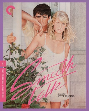
Man, that Smooth Talk art is so cool. I know, I know, we've seen it before, but that doesn't make it any less cool. Just wonderful illustrations and colors make it pop off the page err screen. The rest are good, not a bad one in the bunch.
-
CSM126

- Joined: Thu Nov 04, 2004 8:22 am
- Location: The Room
- Contact:
Re: Criterion & Eclipse Cover Art & Packaging Babble-on Vol. 7
Smooth Talk is a really good choice. It almost looks like one of those teen romance novels aimed at middle school girls back when I was a kid. Which actually works because the film starts off so breezy and innocent before turning right around when Williams creeps into the picture, much as he’s creeped up behind Dern in the art. Really good cover design.