Page 45 of 47
Re: Fake Criterion Covers
Posted: Fri Jul 02, 2010 1:02 am
by doowop82
Re: Fake Criterion Covers
Posted: Wed Jul 07, 2010 8:40 am
by primolandia
Re: Fake Criterion Covers
Posted: Wed Jul 07, 2010 3:11 pm
by Jeff
^ Love the licensing arrangement.
Re: Fake Criterion Covers
Posted: Thu Jul 15, 2010 6:45 pm
by Frances
alice_the_goon wrote:This is my first time making a fake cover, so I hope they aren't universally hated. On that note, here they are!
Love this!

Always wanted to try to create some covers and i have some ideas, but i'm really NOT a photoshop expert

Re: Fake Criterion Covers
Posted: Thu Jul 29, 2010 2:27 pm
by Matt
No idea whose work this is, but it beats the official version, hands down:

Re: Fake Criterion Covers
Posted: Thu Jul 29, 2010 2:42 pm
by Brian C
That's true, it does. Certainly it feels more like Kubrick than the actual cover.
Re: Fake Criterion Covers
Posted: Thu Jul 29, 2010 3:03 pm
by zitherstrings
More effort. Good image. Bad font, totally wrong. Further from the film itself than Criterion's. Did they even see this movie? Maybe just an impossible film to capture?
Re: Fake Criterion Covers
Posted: Thu Jul 29, 2010 3:27 pm
by Matt
If you take issue with this cover, you take issue with some of
the original art.
Re: Fake Criterion Covers
Posted: Thu Jul 29, 2010 5:38 pm
by Flike
Napier just inadvertently trolled me on FB. Saw his post with the cover and ran off to Criterion.com then came here to see it's a fake. Grr.
Re: Fake Criterion Covers
Posted: Thu Jul 29, 2010 5:53 pm
by Finch
That fake cover would actually be more in keeping with most of their cover choices of late in that it attempts to convey something about the film in an original/different (successfully or not) manner. The font is too cartoonish but the artwork itself is fab.
Re: Fake Criterion Covers
Posted: Thu Jul 29, 2010 5:57 pm
by Murdoch
Damn, for a second I thought I clicked on the real cover art thread.
Re: Fake Criterion Covers
Posted: Thu Jul 29, 2010 6:22 pm
by zitherstrings
Matt wrote:If you take issue with this cover, you take issue with some of
the original art.
Yes. That would be correct. Sometimes people making posters 50 years ago were unsuccessful as well.
Re: Fake Criterion Covers
Posted: Fri Jul 30, 2010 1:16 am
by HistoryProf
zitherstrings wrote:More effort. Good image. Bad font, totally wrong. Further from the film itself than Criterion's. Did they even see this movie? Maybe just an impossible film to capture?
haven't seen the original posters I take it?
That cover is MILES better than the boring photoshop by numbers job they chose. They should get in touch with the guy that posted it on FB and buy it from him today. It's PERFECT, while the real one is boring as shit.
Re: Fake Criterion Covers
Posted: Fri Jul 30, 2010 2:56 am
by Harmonov
HistoryProf wrote:zitherstrings wrote:More effort. Good image. Bad font, totally wrong. Further from the film itself than Criterion's. Did they even see this movie? Maybe just an impossible film to capture?
haven't seen the original posters I take it?
That cover is MILES better than the boring photoshop by numbers job they chose. They should get in touch with the guy that posted it on FB and buy it from him today. It's PERFECT, while the real one is boring as shit.
I don't know, sometimes shit can be really exciting...
Re: Fake Criterion Covers
Posted: Fri Jul 30, 2010 4:44 am
by Alphonse Doinel
Re: Fake Criterion Covers
Posted: Fri Jul 30, 2010 4:48 am
by Brian C
Those are not bad ... the first one, in fact, is pretty great.
I don't really mind the real cover but it's clear they could have done better.
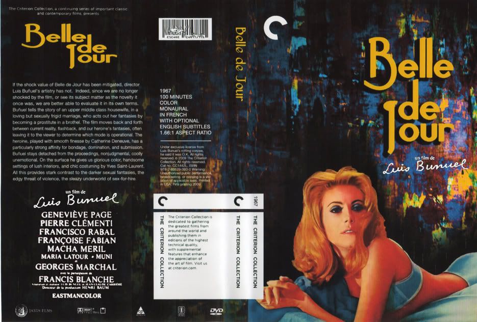
Re: Fake Criterion Covers
Posted: Fri Jul 30, 2010 4:49 am
by godardslave
The Belle De Jour cover posted above by "primolandia" is excellent.
And yes that paths of glory cover, while not perfect, is still much better than the official one.
A philosophical thought to ponder is why is choosing the right font in aesthetic terms for paths of glory is proving to be so hard? My thoughts cant help but stray to to the idea that is somehow related to the perfectionism of Kubrick...
Re: Fake Criterion Covers
Posted: Fri Jul 30, 2010 7:48 am
by kaujot
I think the still for the first PoG is absolutely brilliant. It's just the type that needs work.
Re: Fake Criterion Covers
Posted: Fri Jul 30, 2010 3:23 pm
by poultryinmotion
I don't see why everyone is so up in arms about the Paths of Glory cover. I think that that still more than adequately captures the anguish, filth, terror, exhaustion, and sheer futility of war. After all, isn't that what Kubrick was trying to communicate in the film?
The image Matt posted above looks like it's straight off the cover of some comic book extolling the glory and heroism of war.
Re: Fake Criterion Covers
Posted: Sat Jul 31, 2010 7:19 pm
by godardslave
poultryinmotion wrote:I don't see why everyone is so up in arms about the Paths of Glory cover. I think that that still more than adequately captures the anguish, filth, terror, exhaustion, and sheer futility of war. After all, isn't that what Kubrick was trying to communicate in the film?
The image Matt posted above looks like it's straight off the cover of some comic book extolling the glory and heroism of war.
I think your a secret spy planted by Criterion to say nice things about the cover.

Re: Fake Criterion Covers
Posted: Sat Jul 31, 2010 8:11 pm
by HistoryProf
Alphonse Doinel wrote:Wanted to show why they should have just used a still from the Kirk tracking shot in the trenches and somehow ended up with these. Sorry Kirk.

perfecto.
Re: Fake Criterion Covers
Posted: Sun Aug 01, 2010 4:27 am
by poultryinmotion
godardslave wrote:poultryinmotion wrote:I don't see why everyone is so up in arms about the Paths of Glory cover. I think that that still more than adequately captures the anguish, filth, terror, exhaustion, and sheer futility of war. After all, isn't that what Kubrick was trying to communicate in the film?
The image Matt posted above looks like it's straight off the cover of some comic book extolling the glory and heroism of war.
I think your a secret spy planted by Criterion to say nice things about the cover.
Ha, nah, just someone who's studied enough pictures from WWI to know that the cover image looks like it could very well have been taken in 1917 on the Chemin des Dames.
Re: Fake Criterion Covers
Posted: Sun Aug 01, 2010 6:53 am
by matrixschmatrix
poultryinmotion wrote:I don't see why everyone is so up in arms about the Paths of Glory cover. I think that that still more than adequately captures the anguish, filth, terror, exhaustion, and sheer futility of war. After all, isn't that what Kubrick was trying to communicate in the film?
The image Matt posted above looks like it's straight off the cover of some comic book extolling the glory and heroism of war.
I don't really think that's an apt description- I think the meat of the movie is more about the insane callousness of those in charge of war, and the meaninglessness of personal bravery and honor in the face of that inhumanity, and the inhumanity of war itself- resolved only by the shared humanity of the actual soldiers at the end. I'm not really sure there's a way to capture that in an image, but the official cover's image of dirty suffering feels more like something from a very different kind of movie, one about personal degradation and deprivation during combat.
The mock heroic cartoon is appropriate in a cruelly ironic way; it sets up a misleading idea of what the movie is about, but it's a misapprehension shared by the characters within the movie. The first cover Doinel posted gets across a sense the futility of combat and the human core of the soldiers. Someone posted a fake a while ago, showing the men at the shooting range- which sort of gives the game away, but obviously (if bluntly) expresses the movie. One I haven't seen and would sort of like would be a shot of the filthy Kirk, obviously a soldier and a frontline man, looking infuriated at his smug superiors, which I see as sort of the central conflict.
Of course, that lends itself to misinterpretation as the stupid Dirty Harry kind of hatred for men behind desks, but shit, I'm not an artist.
Re: Fake Criterion Covers
Posted: Sun Aug 01, 2010 6:10 pm
by poultryinmotion
I hear what you're saying about Paths of Glory being more about "lions being led by donkeys", I just think that the cover conceptualizes that theme. To each there own, but I certainly see betrayal (and many other emotions) written across Douglas's face.
Re: Fake Criterion Covers
Posted: Thu Aug 05, 2010 4:34 pm
by oldsheperd
So where is Swimminghorses with the fake Head cover?