Page 52 of 64
Re: MoC Cover Art & Packaging Babble-on
Posted: Mon Jul 08, 2013 10:13 pm
by knives
Name how any of those covers are Swimminghorse like in even one quality beyond the vague quality of 'bad'? The Pialat is uninspired and inaccurate, but not that sort of bad.
Re: MoC Cover Art & Packaging Babble-on
Posted: Mon Jul 08, 2013 10:22 pm
by domino harvey
Van Gogh? More like Van Nogh, amirite
Re: MoC Cover Art & Packaging Babble-on
Posted: Thu Aug 22, 2013 8:50 am
by eerik
Re: MoC Cover Art & Packaging Babble-on
Posted: Thu Aug 22, 2013 10:54 am
by Gregor Samsa
Glad to see they didn't change Nosferatu: that's a hard cover to top.
Re: MoC Cover Art & Packaging Babble-on
Posted: Thu Aug 22, 2013 11:11 am
by HJackson
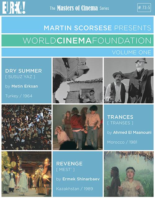
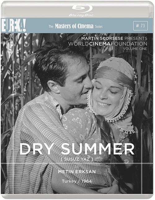
I don't think anybody can complain about the new sleeves for Mabuse or Red River. Not too keen on the WCF box, but I think they're starting to cope with the loss of peerpee.
Re: MoC Cover Art & Packaging Babble-on
Posted: Thu Aug 22, 2013 11:14 am
by RossyG
It seems there are two alternatives for MoC covers: original artwork with dynamic lettering or production still with... er... minimalist lettering. The latter can be jazzed up by adding random grey lines at right angles.
Re: MoC Cover Art & Packaging Babble-on
Posted: Fri Aug 23, 2013 10:11 pm
by scotty2
Then again, if you love sans serif fonts and clean modernist aesthetics, these look quite good, especially if you are trying to emphasize the still as the major design element. It isn't lazy--it is a conscious choice just as any other font would be. I also love the Mizoguchi fonts, which remind me of those Reid Miles used on some of the classic Blue Note album covers from the same era. They really work in this context.
Re: MoC Cover Art & Packaging Babble-on
Posted: Fri Aug 23, 2013 10:19 pm
by scotty2
I also don't get the criticism of the Van Gogh. The image emphasizes not a finished product but rather the process of creation, in particular Van Gogh's use of impasto techniques. Seems a perfectly legitimate choice. Sometimes it is well to set aside prior expectations and neat one-to-one correlations between design and what the film is "about," which is a pretty subjective place to begin anyway.
Of course, it could be that I simply love that font irrationally. It should be on everything, basically.
Re: MoC Cover Art & Packaging Babble-on
Posted: Fri Aug 23, 2013 11:09 pm
by Flanell
I'd say the cover for Van Gogh is both inspired and accurate, different strokes for different folks, i'd guess. Overall i like the new covers quite a bit. Also glad that they kept the cover for Nosferatu, of course. Really looking forward to these releases.
Re: MoC Cover Art & Packaging Babble-on
Posted: Tue Sep 10, 2013 12:19 pm
by Jeff
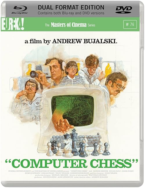
Stroke of genius -- and quite a coup, MoC, in getting Cliff Spohn to design the
Computer Chess poster art. It looks great.

I hope you can take the design even further with the fonts and everything for the Blu-ray release and really make the cover look like Atari 2600 box art.

Even though this is a theatrical poster, I'm putting this here instead of the
Computer Chess thread so as to avoid cluttering that thread with artwork discussion.
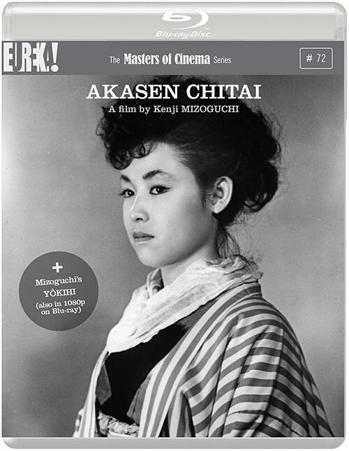
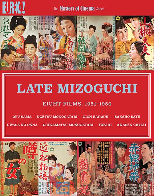
Re: 52-59 / BD 36-37, 71-72 Late Mizoguchi: Eight Films, 195
Posted: Sat Oct 26, 2013 10:37 am
by mistakaninja
Re: 52-59 / BD 36-37, 71-72 Late Mizoguchi: Eight Films, 195
Posted: Sat Oct 26, 2013 10:39 am
by mistakaninja
Re: 52-59 / BD 36-37, 71-72 Late Mizoguchi: Eight Films, 195
Posted: Sat Oct 26, 2013 3:08 pm
by swo17
Looks lovely, although so much for conserving shelf space. Don't those four cases only contain one disc each and no booklet?
Re: MoC Cover Art & Packaging Babble-on
Posted: Sat Oct 26, 2013 3:29 pm
by mistakaninja
Yeah, they've only got the single disc in each.
It's a quality package though. The book has a nice matte finish, and the box is properly finished, so it can't be untucked (like the BBS box).
Re: MoC Cover Art & Packaging Babble-on
Posted: Fri Nov 15, 2013 11:15 am
by Ozu Teapot
Trawling the internet I came across these on a Chinese blog where the owner was showing off their MoC collection :

I assume they're bootlegs rather than any kind of official release, although from what I could tell the blogger didn't mention this and seemed to be singing the praises of Eureka / MoC. Mind you I was relying on Google Translate to understand it (Judex translates as Jew Texaco!) Still nice slipcases...
Re: MoC Cover Art & Packaging Babble-on
Posted: Fri Nov 15, 2013 12:20 pm
by NilbogSavant
Those aren't slip covers. You get those pieces of cardboard in lieu of cases. Yes, they are bootlegs. MoC and Criterion are very popular in many of the DVD stores here in Beijing.
Re: MoC Cover Art & Packaging Babble-on
Posted: Fri Nov 15, 2013 12:39 pm
by Ozu Teapot
Oh yeah I knew they are sold like that because a friend once sent me a couple of films from Hong Kong (which also turned out to be bootlegs) that had the same kind of cardboard covers, but I found with a tiny bit of folding they would slip over a regular DVD case and also came with a paper cover you could slip into the amaray. Those MoCs in the photo looked like the same kind of thing.
Re: MoC Cover Art & Packaging Babble-on
Posted: Fri Nov 15, 2013 6:46 pm
by FerdinandGriffon
Ooo. I like the raised lettering on Alone Across the Pacific.
Re: MoC Cover Art & Packaging Babble-on
Posted: Fri Nov 15, 2013 7:00 pm
by The Elegant Dandy Fop
Oddly enough, on the MoC release of The World, Tony Rayns discusses all the Criterion and MoC titles you can find bootlegged with Chinese subtitles. In Los Angeles' Koreatown, I've even found a store that sold numerous Korean bootlegs of Criterion, MoC and other boutique labels from the UK.
Re: MoC Cover Art & Packaging Babble-on
Posted: Thu Nov 21, 2013 6:22 pm
by swo17
Re: MoC Cover Art & Packaging Babble-on
Posted: Thu Nov 21, 2013 9:34 pm
by domino harvey
Glad they didn't pull a Kino and are putting it out on Blu-ray
Re: MoC Cover Art & Packaging Babble-on
Posted: Thu Nov 21, 2013 9:45 pm
by med
I prefer the Kino artwork, though.
I'm probably never going to say that about anything ever again.
Re: MoC Cover Art & Packaging Babble-on
Posted: Fri Nov 22, 2013 2:10 pm
by Emak-Bakia
I think the MoC artwork is brilliant, though I have a lot of nostalgia attached to the Atari 2600-style artwork.
Any word on whether or not dual formats will be here to stay? I guess we'll have a better idea Monday!
Re: MoC Cover Art & Packaging Babble-on
Posted: Mon Nov 25, 2013 10:13 am
by rockysds
Re: MoC Cover Art & Packaging Babble-on
Posted: Mon Nov 25, 2013 11:10 am
by Finch
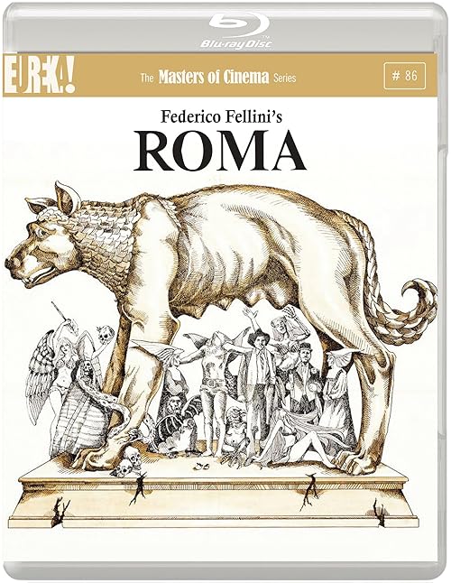
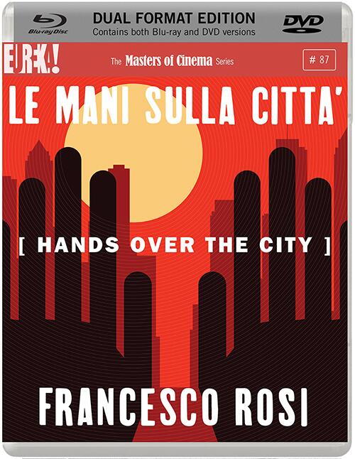
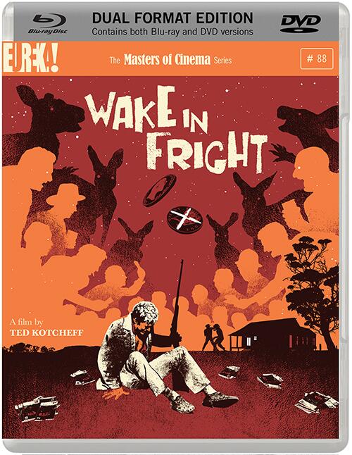
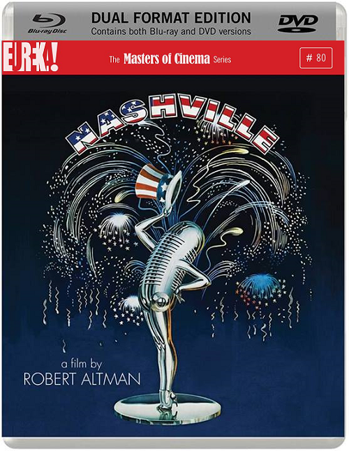
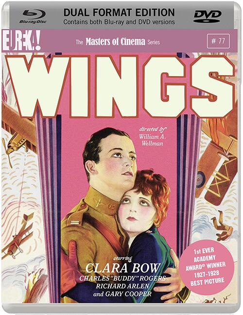
Nashville will be dual-format according to Eureka's press release, Roma BD only. Seeing that Eureka have struck a deal with Paramount, we can perhaps hope for Lady Eve and Miracle of Morgan's Creek in the collection (unless Arrow got there first). Very strong lineup for the first few months: the Rosi sounds intriguing and I'll probably replace my Paramount BD of Wings with the MoC for the booklet. Getting Wake in Fright as well.


 ]
]