Page 83 of 164
Re: Criterion & Eclipse Cover Art & Packaging Babble-on Vol. 7
Posted: Tue Aug 18, 2020 9:27 pm
by black&huge
barring Moonstruck obviously those covers hit it out of the park. This will also be a month where I buy every release. That never happens. Good job Criterion. I don't care if nothing comes out in December this is a fucking capper of a year.
Re: Criterion & Eclipse Cover Art & Packaging Babble-on Vol. 7
Posted: Tue Aug 18, 2020 9:29 pm
by Ribs
It's a core part of the idea of "The Irishman" as being the title that suits the movie - that he's the one who's not Italian allowed into the circle. I wouldn't say the movie makes a particularly strong effort at communicating this as one of its core ideas, as it's not really something I really read as being one of the major ideas of the movie until the third time I saw it.
Re: Criterion & Eclipse Cover Art & Packaging Babble-on Vol. 7
Posted: Tue Aug 18, 2020 9:47 pm
by Brian C
Cool, so I had forgotten about the ring specifically, but still after it being explained, I think this cover sort of overemphasizes it. It’s important to Frank, sure, but it wasn’t terribly important to the movie per se; its symbolism is really only meaningful to the character and not really representative of the themes or events in the movie. Mfunk pointed out the old hands, and I think that’s an element that does more to represent the actual film than the ring.
I guess it just seems trite, for basically the same reason a CITIZEN KANE cover of a kid’s hands holding a sled would seem trite. Even aside from that being a cliched image at this point, it would just be an overly simplistic representation of what is an enormously complex film. And so it is here.
Re: Criterion & Eclipse Cover Art & Packaging Babble-on Vol. 7
Posted: Tue Aug 18, 2020 10:08 pm
by therewillbeblus
Ribs wrote: Tue Aug 18, 2020 9:29 pm
It's a core part of the idea of "The Irishman" as being the title that suits the movie - that he's the one who's not Italian allowed into the circle. I wouldn't say the movie makes a particularly strong effort at communicating this as one of its core ideas, as it's not really something I really read as being one of the major ideas of the movie until the third time I saw it.
But that's not even the title Scorsese wanted, which he clearly emphasizes in the credits, so it was never intended to explicitly suit the movie- though I think the more universal themes of complacency, consciousness, and not being a participant in your own life trump specific belongingness to this organized crime world, which I don't see as a core idea. The point seemed to be very much that this group's world is unromantic and meaningless, and belongingness is in the places that are overlooked (by everyone but Hoffa). Anyways, I think it's a missed opportunity not to put
I Heard You Paint Houses on the cover, though you can't retitle the film completely and expect it to sell I suppose.
The
Moonstruck cover is my favorite, so far.
Re: Criterion & Eclipse Cover Art & Packaging Babble-on Vol. 7
Posted: Tue Aug 18, 2020 10:19 pm
by knives
therewillbeblus wrote: Tue Aug 18, 2020 10:08 pm Anyways, I think it's a missed opportunity not to put
I Heard You Paint Houses on the cover, though you can't retitle the film completely and expect it to sell I suppose.
The
Moonstruck cover is my favorite, so far.

Re: Criterion & Eclipse Cover Art & Packaging Babble-on Vol. 7
Posted: Tue Aug 18, 2020 10:20 pm
by swo17
They could have done something like "Martin Scorsese Presents the Irishman in I Heard You Paint Houses"
Re: Criterion & Eclipse Cover Art & Packaging Babble-on Vol. 7
Posted: Tue Aug 18, 2020 10:23 pm
by HinkyDinkyTruesmith
Honestly feels like the best opportunity to do a slipcase where it says "the Irishman" on the outside and "I Heard You Paint Houses" on the inside.
Re: Criterion & Eclipse Cover Art & Packaging Babble-on Vol. 7
Posted: Tue Aug 18, 2020 10:28 pm
by therewillbeblus
I can picture it now: faint, tiny font of "The Irishman" on the slip and then "I Heard You Paint Houses" taking up the entire face of the inside case. Would be a great replica of the joke in the movie's title sequence too
Re: Criterion & Eclipse Cover Art & Packaging Babble-on Vol. 7
Posted: Tue Aug 18, 2020 10:39 pm
by Ribs
The movie is called what it’s called - if Scorsese was really so dead set on his title it would have happened. I think people are a little melodramatic that he thought it’d be fun to do both titles.
Re: Criterion & Eclipse Cover Art & Packaging Babble-on Vol. 7
Posted: Tue Aug 18, 2020 10:55 pm
by therewillbeblus
I don't think that's true. If a company shells out insane money to give you the de-aging effects you need and contracts a nice, short, marketable title which will draw more people than a longer one, that sounds like a reasonable demand for a studio to make, and Scorsese wouldn't be in a very fair position to challenge that. But yeah that's the title of the movie, I just disagreed that it was alluding to a core idea of the film, which I'd be interested to hear more about (obviously not in this thread).
Re: Criterion & Eclipse Cover Art & Packaging Babble-on Vol. 7
Posted: Sat Aug 22, 2020 2:29 am
by FrauBlucher
I was hoping for the family portrait. Oh well

Re: Criterion & Eclipse Cover Art & Packaging Babble-on Vol. 7
Posted: Sat Aug 22, 2020 3:05 am
by therewillbeblus
Still the best cover of the lot
Re: Criterion & Eclipse Cover Art & Packaging Babble-on Vol. 7
Posted: Sat Aug 22, 2020 3:18 am
by black&huge
That is amazing. They made it look gothic for some odd reason it reminds me of Herzog's Nosferatu one sheet art.
Re: Criterion & Eclipse Cover Art & Packaging Babble-on Vol. 7
Posted: Sat Aug 22, 2020 4:38 am
by Brian C
The thumbnail version makes it look like her eyes are sunken back into her head instead of just being closed. So yeah, either zombies or vampires.
Re: Criterion & Eclipse Cover Art & Packaging Babble-on Vol. 7
Posted: Sat Aug 22, 2020 12:25 pm
by Altair
The underscore under the 'o' of Nicholas Cage is driving me mad though, especially as it's not replicated anywhere else.
Re: Criterion & Eclipse Cover Art & Packaging Babble-on Vol. 7
Posted: Sat Aug 22, 2020 1:52 pm
by FrauBlucher
That's probably why the delay. To underscore the 'o'
Re: Criterion & Eclipse Cover Art & Packaging Babble-on Vol. 7
Posted: Sun Aug 23, 2020 2:00 am
by TheKieslowskiHaze
FrauBlucher wrote:I was hoping for the family portrait. Oh well
Ironic that what seems to be the most basic cover of the month had its reveal delayed. It's fine, I guess.
FrauBlucher wrote: Tue Aug 18, 2020 9:07 pm
I actually don't mind
The Irishman cover
I like it quite a bit. It does a much better job than the original marketing of capturing the movie's tone and mood.
pavel wrote:Do we expect The Irishman to be a digipak like Roma and Marriage Story?
I hope so. I've grown to prefer the digipacks. They just look better.
Also, you stole my
Red Shoes avatar! But it's fine; I needed an excuse to change it to something that fit with my name anyway. So thanks.
Re: Criterion & Eclipse Cover Art & Packaging Babble-on Vol. 7
Posted: Sun Aug 23, 2020 7:53 am
by Pavel
TheKieslowskiHaze wrote:I hope so. I've grown to prefer the digipacks. They just look better.
I prefer digipaks, too, though for some odd reason they're more expensive in the UK (and as a European, buying from there is significantly more convenient for me). Are materials more expensive there or what?!
Also, you stole my Red Shoes avatar!
My original intent was to use
Elliot Gould chewing bubblegum in Bob & Carol & Ted & Alice, but I browsed through the default options, liked this one and thought it'd do for a while.
Re: Criterion & Eclipse Cover Art & Packaging Babble-on Vol. 7
Posted: Sun Aug 23, 2020 2:33 pm
by FrauBlucher
black&huge wrote: Sat Aug 22, 2020 3:18 am
That is amazing. They made it look gothic for some odd reason it reminds me of Herzog's Nosferatu one sheet art.
I think the look is more operatic (La bohème) which is a big part of the story
Re: Criterion & Eclipse Cover Art & Packaging Babble-on Vol. 7
Posted: Sun Aug 23, 2020 3:47 pm
by DarkImbecile
Re: Criterion & Eclipse Cover Art & Packaging Babble-on Vol. 7
Posted: Sun Aug 23, 2020 10:09 pm
by Pavel
Thanks much!
Re: Criterion & Eclipse Cover Art & Packaging Babble-on Vol. 7
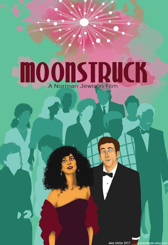
Posted: Tue Aug 25, 2020 12:21 am
by Matt
I regret to report that I hate the Moonstruck cover. Why purple? Why Art Nouveau? Or you know what — keep it but make it so she’s clutching the wacky c in one hand and her Oscar in the other.
Re: Criterion & Eclipse Cover Art & Packaging Babble-on Vol. 7
Posted: Tue Aug 25, 2020 4:55 am
by colinr0380
I quite like it and was thinking that the background makes it look a bit like it was influenced by the 1970s
Moët & Chandon advertising prints.
Re: Criterion & Eclipse Cover Art & Packaging Babble-on Vol. 7
Posted: Tue Aug 25, 2020 2:58 pm
by alacal2
I'm 100% with Matt on this for the very reason that Colinr0380 "quite likes it". Those Moet and Chandon adverts are 70s reproductions of the 20s.
Re: Criterion & Eclipse Cover Art & Packaging Babble-on Vol. 7
Posted: Tue Aug 25, 2020 4:20 pm
by Feego
To me, the
Moonstruck cover just seems like a needless reworking of the original (and famous) poster. I've never seen the film, but the impression I've always had is that it's very much a "New York" movie, so the appearance of the New York skyline behind Cher seemed fitting. Without it, this could just as easily be a
Witches of Eastwick character poster.
On the other hand, a brief Google image search reveals this could have been
far, far worse.