Page 11 of 47
Posted: Sun May 04, 2008 7:03 am
by hammock
Klaylock, that is amazing. Best disc art ever and the cover itself is way up the list too. I was not a big fan of the film but your fan art had med wanting to see it again - great job!
Posted: Mon May 05, 2008 5:04 am
by Rupert Pupkin

wow!

fantastic cover! If Criterion's thinking about re-releasing a remastered edition of Alphaville they have to look here!
I have the original Criterion and I'd like to "refresh" this edition... Could it be possible for you to post a 300dpi cover so I can print a pristine new artwork ? (I like both, the one with Anna Karina and Lemmy Caution cover and the Brazil-2001-red-eye (I think about Brazil because of the neon... But in many Godard's movies, I've seen that he tends often to use the neon (in Detective for instance...)
Posted: Mon May 05, 2008 8:18 am
by a.khan
Both versions are great, but I feel the one with the actors' faces is better. Once again, an excellent effort. Are you taking requests?
Posted: Mon May 05, 2008 11:41 pm
by Jean-Luc Garbo
I too love that cover. The first with the faces is great because it's a bit more ghostly. The second is great because it's more stark which is appropriate to that film. It'd be great to see it on a Criterion because this is the best fan cover I've seen in awhile. =D>
Posted: Wed May 07, 2008 3:51 am
by CSM126
The fruit of my boredom (and lacking photoshop skills)

(Admittedly derivative of that rejected Schizopolis cover on the ol'
Dungeon site)
Posted: Wed May 07, 2008 4:16 am
by domino harvey
I'm staying out of actually commenting on the fake covers, but I will say that I was just thinking a couple weeks ago about what a dream release a Brain Candy Criterion would be, considering that there's a whole forty percent of the movie missing and reshot that still exists in bootleg form. Add to that the now-friendly Kids' willingness to provide audio commentaries and potential for numerous hilarious extras. I mean, it IS a Paramount release, it's possible but.... I know it'll never ever happen. But man, if it did, I would spring for a free pizza party for the entire Criterion office staff. YOU HEAR THAT STAFFERS WHO LURK ON THIS BOARD? PIZZA PARTY!
Posted: Wed May 07, 2008 4:32 am
by miless
I'll supply the ice cream.
Posted: Wed May 07, 2008 4:58 am
by CSM126
domino harvey wrote:I know it'll never ever happen. But man, if it did...
Well, the old Paramount disc
did go out of print recently...
Posted: Wed May 07, 2008 12:58 pm
by souvenir
CSM126 wrote:domino harvey wrote:I know it'll never ever happen. But man, if it did...
Well, the old Paramount disc
did go out of print recently...
So did Anthony Mann's
The Tin Star, which isn't related to
Brain Candy, but is probably about as likely (or more) to get released by Criterion.
Posted: Thu May 08, 2008 8:00 am
by pianocrash
That red light on the fan-favorite Alphaville cover does look coincidentally like a dose of Gleemonex, dot dot dot.
Posted: Thu May 08, 2008 12:21 pm
by Lemmy Caution
For comparison:
Two Japanese covers of Alphaville:
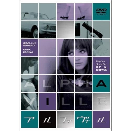
The purples and greens are a little brighter on the Dvd's I've seen, and look better than the image here.
And a Japanese VHS cover of Alphaville:
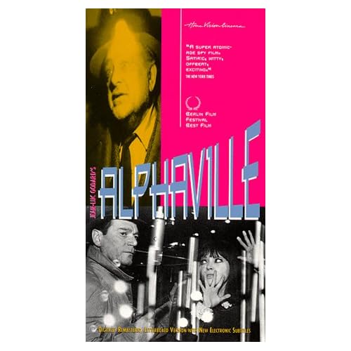
I like the curved title font, but otherwise a bit of a mess.
Posted: Fri May 16, 2008 2:35 am
by klee13
As far as requests go, sure I might take a few if I've seen the film. I usually get ideas for covers while I'm watching movies though.
A 300 dpi may be problematic since I didn't originally make it that big. Indeed, even the original screen caps don't look very good when magnified that much. However, it might be a good project for the future. Besides, I think it would be cool to make a full cover version sometime.
In the mean time, I made a cover for Week-End. It might not look as cool as Alphaville's, but I was trying to go for something different with this one. As for the fact that I did two Godard films in a row, it is a mere coincidence. Or perhaps not. There is that Film Forum festival going on after all.

Posted: Fri May 16, 2008 3:24 am
by PimpPanda
I made this in around five minutes so it's not that great:

I stole the logo and etc. from The Burmese Harp cover.
Posted: Fri May 16, 2008 3:42 am
by Feego
Posted: Fri May 23, 2008 2:20 am
by Oggilby
Posted: Sat May 24, 2008 10:17 am
by mrschroeder1982
Yes! It's about time we got another fake cover of a movie that will never be in the Collection! And it's a hell of a cover, too!
Posted: Sat May 24, 2008 11:12 pm
by broadwayrock
Posted: Sat May 24, 2008 11:51 pm
by miless
that's a really wide American flag
Posted: Mon May 26, 2008 1:22 am
by HerrSchreck
Thats pretty bad.
Posted: Mon May 26, 2008 2:26 am
by klee13
Posted: Mon May 26, 2008 2:33 am
by Jeff
New Rule: Only Klaylock is allowed to post in this thread.
Posted: Mon May 26, 2008 2:38 am
by Saturnome
Agreed!
It's just like the film. I'm just not sure about the the position of the text. The discs are fantastic too.
Posted: Mon May 26, 2008 2:51 am
by kaujot
Can't say that I like the choice of font, mainly because it's the same used by Kino and RusCiCo. (At least it is, fresh off my memory)
Posted: Mon May 26, 2008 3:47 am
by HerrSchreck
What gets me the most is the standard "charcoal art effect" on the stalkers head... very 1a Photo-shooop.
Posted: Tue May 27, 2008 3:54 am
by swo17
That Stalker art is making me drool...


