Page 144 of 164
Re: Criterion & Eclipse Cover Art & Packaging Babble-on Vol. 7
Posted: Fri Dec 13, 2024 11:23 pm
by yoloswegmaster
CSM126 wrote: Fri Dec 13, 2024 11:17 pm
yoloswegmaster wrote: Fri Dec 13, 2024 11:00 pm
Just noticed that the designer of the Godzilla cover put his signature on it. I don't think I've ever seen that on a release.
Lots of them do actually. Sometimes they’re more clever (Chilly Scenes of Winter’s artist put their name on the car license plate), but there are plenty where it’s just there. The standard Blu of Rules of the Game jumps to mind, and it goes back to the beginning - Grand Illusion is both signed and dated!
You and TechnicolorAcid clearly have better eyes than I do since I never noticed those before! The place of the signature for the Chilly Scenes of Winter cover is actually quite clever.
Re: Criterion & Eclipse Cover Art & Packaging Babble-on Vol. 7
Posted: Sat Dec 14, 2024 1:41 am
by Matt
I think the typography for Night Moves is appropriate for a mid-'70s crime film. I'm not a fan of the murky cover, but maybe it will look better in person than in a small thumbnail online. The cover for Choose Me is reminiscent of those old big-box VHS covers, and I kind of love it. Despite knowing nothing about the movie, it makes me want to watch it.
Re: Criterion & Eclipse Cover Art & Packaging Babble-on Vol. 7
Posted: Sat Dec 14, 2024 3:19 am
by Kracker
Not a bad month for covers, but as beautiful as Wages of Fear cover is I prefer the blu-ray cover featuring the trauma of the human faces. Also from far away it looked like the cover for a Godzilla. Every time they do something for Wages of Fear, im just wanting Sorcerer already.
Thief, still wishing they had gone with the striking poster.
Re: Criterion & Eclipse Cover Art & Packaging Babble-on Vol. 7
Posted: Sun Dec 15, 2024 12:58 pm
by olmo
Randall Maysin Again wrote: Fri Dec 13, 2024 5:02 pm
some of the other covers are pretty good (!) but
Night Moves is a muddled disappointment. The font really sucks, for one thing (why does Criterion keep using it?). Maybe a better choice for the cover image would be a direct lift or some sort of variation on
the iconic final image, an overhead shot of the boat with a semi-incapacitated Hackman on it going around and around in circles.
The font is a slight variation on the original promo's title and is emblematic of the era, much like Criterion's
Targets artwork.
I think it's a wonderful cover and lends intrigue, it's also a pretty iconic shot where it all becomes apparent to Harry what's been going on. Marvellous stuff!
Re: Criterion & Eclipse Cover Art & Packaging Babble-on Vol. 7
Posted: Sat Dec 21, 2024 9:59 pm
by dwk
Re: Criterion & Eclipse Cover Art & Packaging Babble-on Vol. 7
Posted: Wed Jan 08, 2025 2:23 am
by cdnchris
Re: Criterion & Eclipse Cover Art & Packaging Babble-on Vol. 7
Posted: Wed Jan 15, 2025 5:06 pm
by swo17
Re: Criterion & Eclipse Cover Art & Packaging Babble-on Vol. 7
Posted: Wed Jan 15, 2025 5:09 pm
by ryannichols7
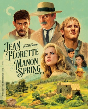
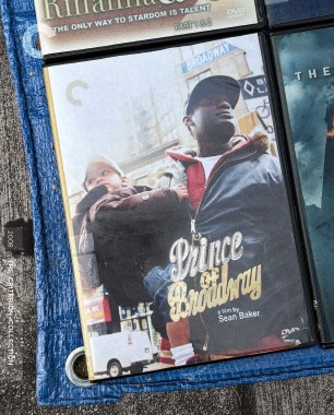
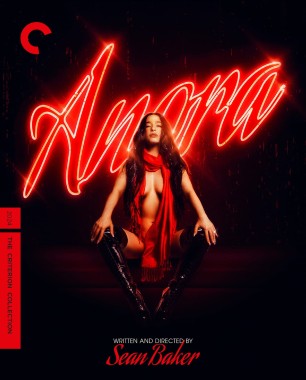
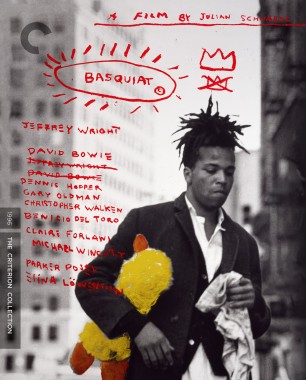
the Berri cover is awesome, Basquiat is fine, Prince of Broadway is genius, and I hate to be a prude/hater (my distaste for Baker has already been stated), but I really do not like the Anora cover
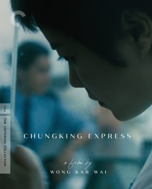
Ugetsu remains an all timer and Chungking Express remains really dumb. you know why the latter is so dumb? it makes it look like an ultra serious art film when in reality, it's a rough around the edges comedy
Re: Criterion & Eclipse Cover Art & Packaging Babble-on Vol. 7
Posted: Wed Jan 15, 2025 5:12 pm
by domino harvey
Berri cover is an all time great, wow!
Re: Criterion & Eclipse Cover Art & Packaging Babble-on Vol. 7
Posted: Wed Jan 15, 2025 5:13 pm
by TechnicolorAcid
Really love the gimmick of Prince of Broadway being presented as a bootleg DVD and that Claude Berri cover is wonderfully gorgeous. But gee whizz get a load of that Anora cover, almost sensual in it’s nature.
Re: Criterion & Eclipse Cover Art & Packaging Babble-on Vol. 7
Posted: Wed Jan 15, 2025 5:15 pm
by The Narrator Returns
Had a good laugh when I saw the corner of The Dark Knight in the Prince of Broadway cover, Sister Hyde never misses.
Re: Criterion & Eclipse Cover Art & Packaging Babble-on Vol. 7
Posted: Wed Jan 15, 2025 5:15 pm
by Fiery Angel
Anora the Demon
Re: Criterion & Eclipse Cover Art & Packaging Babble-on Vol. 7
Posted: Wed Jan 15, 2025 5:16 pm
by HinkyDinkyTruesmith
The Anora cover really expresses everything wrong with the movie.
Re: Criterion & Eclipse Cover Art & Packaging Babble-on Vol. 7
Posted: Wed Jan 15, 2025 5:19 pm
by jt938
I like all of the covers except for Some Like It Hot (never liked that cover) and Anora.
Re: Criterion & Eclipse Cover Art & Packaging Babble-on Vol. 7
Posted: Wed Jan 15, 2025 5:21 pm
by TechnicolorAcid
HinkyDinkyTruesmith wrote: Wed Jan 15, 2025 5:16 pm
The
Anora cover really expresses everything wrong with the movie.
If that’s what’s wrong with the movie then this is an immediate buy.
Re: Criterion & Eclipse Cover Art & Packaging Babble-on Vol. 7
Posted: Wed Jan 15, 2025 5:22 pm
by HinkyDinkyTruesmith
TechnicolorAcid wrote: Wed Jan 15, 2025 5:21 pm
HinkyDinkyTruesmith wrote: Wed Jan 15, 2025 5:16 pm
The
Anora cover really expresses everything wrong with the movie.
If that’s what’s wrong with the movie then this is an immediate buy.
Thanks for the nauseating comment.
Re: Criterion & Eclipse Cover Art & Packaging Babble-on Vol. 7
Posted: Wed Jan 15, 2025 5:24 pm
by TechnicolorAcid
No problem

Re: Criterion & Eclipse Cover Art & Packaging Babble-on Vol. 7
Posted: Wed Jan 15, 2025 5:30 pm
by Kracker
Haha Prince of Broadway is the winner in a month of good covers. The Criterion bootleg DVD aside The Dark Knight is just too much

I haven't seen this yet but if its a reflection of the humor in the film, its a blind buy for me. Excited for Basquiat as well, great month.
Safe to say Criterion is head over heels with Sean Baker, maybe a Tangerine/Florida Project/Red Rocket trilogy set is in the cards.
Re: Criterion & Eclipse Cover Art & Packaging Babble-on Vol. 7
Posted: Wed Jan 15, 2025 5:30 pm
by knives
That Prince of Broadway cover is honestly one of their best. Wow.
Re: Criterion & Eclipse Cover Art & Packaging Babble-on Vol. 7
Posted: Wed Jan 15, 2025 6:01 pm
by Aspect
The Anora cover design is only because Mikey Madison reminds Sean Baker of Soledad Miranda for some reason. They’re both brunette, I guess? Other than that, there’s little resemblance. And I haven’t seen Anora but I’m guessing it has little to do with Vampyros Lesbos.
Re: Criterion & Eclipse Cover Art & Packaging Babble-on Vol. 7
Posted: Wed Jan 15, 2025 6:29 pm
by dwk
Anora and Ugetsu will be digipaks.
Re: Criterion & Eclipse Cover Art & Packaging Babble-on Vol. 7
Posted: Wed Jan 15, 2025 6:39 pm
by nicolas
This should be the reference for Anora’s cover

Re: Criterion & Eclipse Cover Art & Packaging Babble-on Vol. 7
Posted: Wed Jan 15, 2025 7:10 pm
by rwiggum
Prince of Broadway is one of the best they've ever done, absolutely over the moon for that one.
My big problem with Anora is that I hate the negative space and don't think it works. More than the negative space, I really bump against pure black or white backgrounds. (I really hate the newest Sid & Nancy cover for this same reason.) I don't think the alluring sexuality of the cover is an issue, because
thematically it makes sense with the image she's keeping up until the final moments of the film.
Re: Criterion & Eclipse Cover Art & Packaging Babble-on Vol. 7
Posted: Wed Jan 15, 2025 8:16 pm
by Saturnome
Re: Criterion & Eclipse Cover Art & Packaging Babble-on Vol. 7
Posted: Wed Jan 15, 2025 10:09 pm
by Walter Kurtz
Prince of Broadway -- a wonderfully appropriate idea and execution
Chungking Express -- I disagree rather whole heartedly with ryannichols that the cover is inappropriate to the style/genre of the film. My take has always been that Wong's manic-happiness is a front she puts on for the world in an attempt to keep her true sad pensive longings buried. And one of those longings shares the cover with her... blurred, out-of-focus... just as our deepest longings are always in our mind's eye... buried on our third or fourth level of consciousness... barely there, but always there.
Florette/Manon -- The best-designed old-style romance novel cover in history. Again, what a wonderful idea... to replicate the romance novel passions... but instead of yearning love... yearning retribution.