Page 152 of 164
Re: Criterion & Eclipse Cover Art & Packaging Babble-on Vol. 7
Posted: Tue Jul 15, 2025 4:30 pm
by pzadvance
i like altered states and nightmare alley quite a bit, history of violence is very puzzling
Re: Criterion & Eclipse Cover Art & Packaging Babble-on Vol. 7
Posted: Tue Jul 15, 2025 4:34 pm
by Kracker
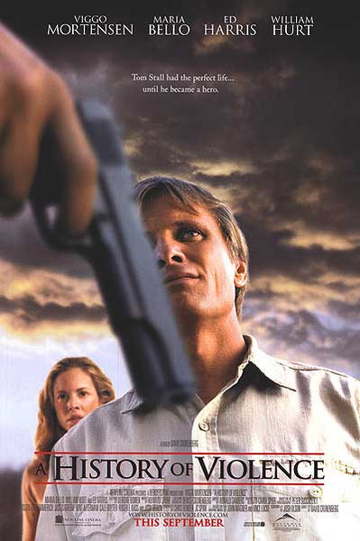
Figures, they had a wonderful original poster for
A History of Violence so naturally they went with an absolutely ugly abomination for the cover

Re: Criterion & Eclipse Cover Art & Packaging Babble-on Vol. 7
Posted: Tue Jul 15, 2025 4:43 pm
by flyonthewall2983
I like it as a meditation on the sort of Midwestern cliches in movies, that are often greatly exaggerated as they are spot on the nose about American life.
Re: Criterion & Eclipse Cover Art & Packaging Babble-on Vol. 7
Posted: Tue Jul 15, 2025 4:48 pm
by Never Cursed
Fantastic cover for Nightmare Alley - too bad about the film! Does that image even appear in the movie? (I only saw the theatrical color version).
The History of Violence cover would be good if they weren't obliged to put Mortensen on it and they just had the pastoral landscape
Re: Criterion & Eclipse Cover Art & Packaging Babble-on Vol. 7
Posted: Tue Jul 15, 2025 4:58 pm
by Big Ben
domino harvey wrote: Tue Jul 15, 2025 4:07 pm
What is that A History of Violence cover?!
I really, really, don't think it's any more complex than an attempt to communicate the juxtaposition of the idealized idyllic nuclear family stuff against the reality of genuine violence. Given what I remember of the film and the description on Criterion's site I cannot interpret the juxtaposition in any other way. Laughably ham-fisted for sure but I
think I that's all that's going on.
Re: Criterion & Eclipse Cover Art & Packaging Babble-on Vol. 7
Posted: Tue Jul 15, 2025 4:59 pm
by CSM126
History of violence almost looks like some 70s paperback cover, which is a style I usually like so I kinda dig it? Haven’t seen the movie so I can’t say how it does or doesn’t fit.
Re: Criterion & Eclipse Cover Art & Packaging Babble-on Vol. 7
Posted: Tue Jul 15, 2025 5:00 pm
by domino harvey
Big Ben wrote: Tue Jul 15, 2025 4:58 pm
domino harvey wrote: Tue Jul 15, 2025 4:07 pm
What is that A History of Violence cover?!
I really, really, don't think it's any more complex than an attempt to communicate the juxtaposition of the idealized idyllic nuclear family stuff against the reality of genuine violence. Given what I remember of the film and the description on Criterion's site I cannot interpret the juxtaposition in any other way. Laughably ham-fisted for sure but I
think I that's all that's going on.
Yes, that’s obv the intent but there’s no violence or even menace in Mortensen’s illustration. He’s just red and at worst looks like he’s stuck in line at the DMV
Re: Criterion & Eclipse Cover Art & Packaging Babble-on Vol. 7
Posted: Tue Jul 15, 2025 5:02 pm
by cdnchris
Surely not a surprise, but both Twin Peaks and Nightmare Alley are digipaks. The Blu-ray for Twin Peaks was also one.
Re: Criterion & Eclipse Cover Art & Packaging Babble-on Vol. 7
Posted: Tue Jul 15, 2025 5:13 pm
by Finch
I like the idea behind the History of Violence cover but I imagine it would have looked better as a photorealistic Greg Ruth cover like The Others.
Re: Criterion & Eclipse Cover Art & Packaging Babble-on Vol. 7
Posted: Tue Jul 15, 2025 5:14 pm
by mfunk9786
If you haven’t seen Nightmare Alley, it’s a masterwork. And now Del Toro can also say it’s got one of the best covers in the Criterion Collection!
Re: Criterion & Eclipse Cover Art & Packaging Babble-on Vol. 7
Posted: Tue Jul 15, 2025 5:30 pm
by Oedipax
I like the A History of Violence cover, although some of my reaction is a byproduct of being thrilled the film is in the collection now, and 4K to boot. Not really thrilled with the other non-poster originals.
1283 A History of Violence
Posted: Tue Jul 15, 2025 5:55 pm
by Monterey Jack
swo17 wrote: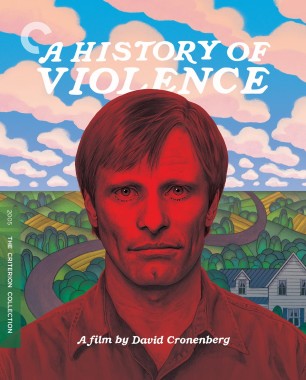
That cover's...a choice...
Re: Criterion & Eclipse Cover Art & Packaging Babble-on Vol. 7
Posted: Tue Jul 15, 2025 6:12 pm
by DRW.mov
The new Altered States art is hands down one of the best covers ever, and finally bestows that film with a piece art that properly fits its tone and aesthetic. (and finally makes good use of the augmented opening title version of the type design rather than the plain avant garde of the posters and previous home video releases)
Re: Criterion & Eclipse Cover Art & Packaging Babble-on Vol. 7
Posted: Tue Jul 15, 2025 6:27 pm
by DimitriL
I'm mixed on the Altered States cover. I like the type, I like the Bran Ferren of it all, and I think as a piece of art, it's kind of glorious. But I'm running against the same thing I did with the Shout version of Invasion of the Body Snatchers where it made pod people look like zombies on a haunted moor? I don't get where the skull or William Hurt's desiccated head comes from, and it's really throwing me off. He should be devolving into a primordial state, not disintegrating. (And looking at his artwork, it's got skulls EVERYWHERE so I think the artist just needs to jam that in as a motif.)
Re: Criterion & Eclipse Cover Art & Packaging Babble-on Vol. 7
Posted: Tue Jul 15, 2025 6:31 pm
by Zot!
domino harvey wrote: Tue Jul 15, 2025 5:00 pm
Big Ben wrote: Tue Jul 15, 2025 4:58 pm
domino harvey wrote: Tue Jul 15, 2025 4:07 pm
What is that A History of Violence cover?!
I really, really, don't think it's any more complex than an attempt to communicate the juxtaposition of the idealized idyllic nuclear family stuff against the reality of genuine violence. Given what I remember of the film and the description on Criterion's site I cannot interpret the juxtaposition in any other way. Laughably ham-fisted for sure but I
think I that's all that's going on.
Yes, that’s obv the intent but there’s no violence or even menace in Mortensen’s illustration. He’s just red and at worst looks like he’s stuck in line at the DMV
I assume it is an nod to Grant Wood's flatten depth of field Americana paintings (famously American Gothic) or something like that...but let's make sure we understand he's "red" with anger.

Re: Criterion & Eclipse Cover Art & Packaging Babble-on Vol. 7
Posted: Tue Jul 15, 2025 6:47 pm
by aox
mfunk9786 wrote: Tue Jul 15, 2025 5:14 pm
If you haven’t seen
Nightmare Alley, it’s a masterwork. And now Del Toro can also say it’s got one of the best covers in the Criterion Collection!
Seconded
I know it got Oscar nods (including Best Picture), but I somehow feel it is overlooked and underrated in the sense that I don't know anyone who talks about it. It really feels memory-holed to me. That cover is fantastic.
Re: Criterion & Eclipse Cover Art & Packaging Babble-on Vol. 7
Posted: Tue Jul 15, 2025 7:40 pm
by Finch
Having just gone back and checked what the BD artwork looked like, namely,
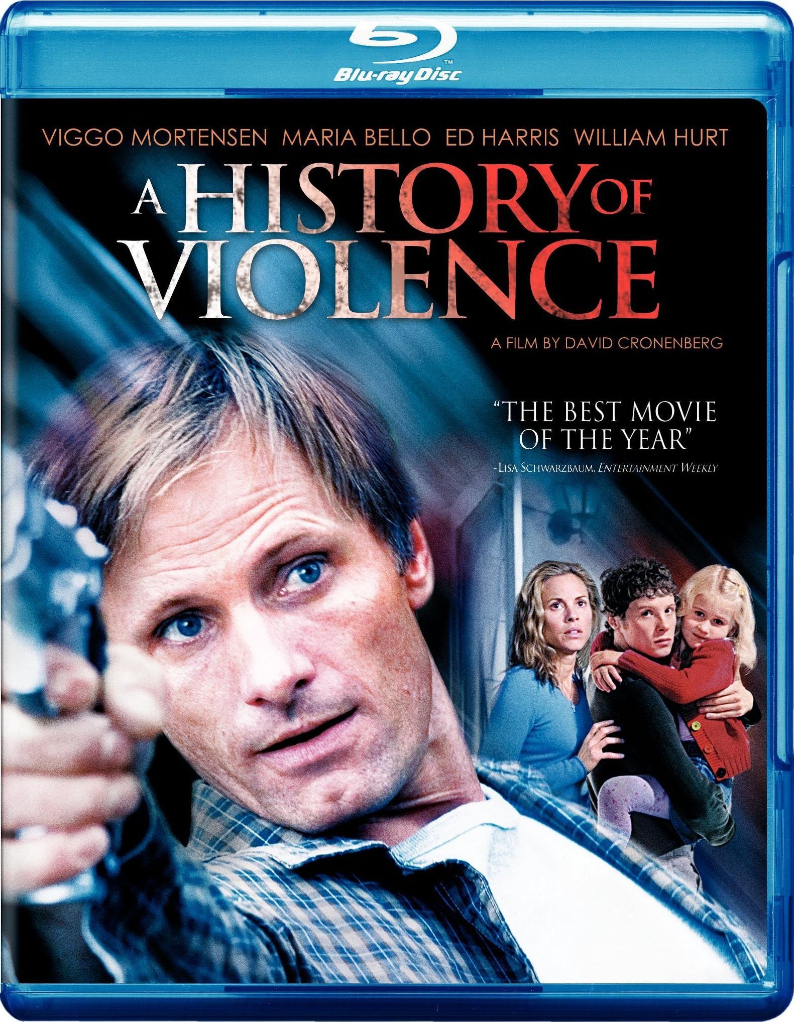
I'll appreciate it all the more that Criterion and their designer went for something different. I'm not sold on the execution but I do like the off-kilter vibe.
Re: Criterion & Eclipse Cover Art & Packaging Babble-on Vol. 7
Posted: Tue Jul 15, 2025 7:45 pm
by hearthesilence
In defense of
A History of Violence, I thought "wait a minute, this was based on a graphic novel...surely there must've been one printing of that publication with better cover art?" The answer is a resounding "NO."
(
This one does look like something Criterion would've done.)
Re: Criterion & Eclipse Cover Art & Packaging Babble-on Vol. 7
Posted: Tue Jul 15, 2025 7:50 pm
by Kracker
Yeah not talking about the BD cover, which was the standard trashy home release treatment, but the original poster which is thought was one of the most brilliant posters to come out around that time
Regardless of they were going for, it’s ugly. They could have executed the angle they were going in a way that it’s done well and effectively or fell back on the poster if the art director saw it wasn’t working out.
By contrast tho, that Altered States cover is top tier and one of their best.
Re: Criterion & Eclipse Cover Art & Packaging Babble-on Vol. 7
Posted: Tue Jul 15, 2025 7:51 pm
by Mark L.
aox wrote: Tue Jul 15, 2025 6:47 pm
mfunk9786 wrote: Tue Jul 15, 2025 5:14 pm
If you haven’t seen
Nightmare Alley, it’s a masterwork. And now Del Toro can also say it’s got one of the best covers in the Criterion Collection!
Seconded
I know it got Oscar nods (including Best Picture), but I somehow feel it is overlooked and underrated in the sense that I don't know anyone who talks about it. It really feels memory-holed to me. That cover is fantastic.
Thirded?
I was left a little cold by the original color version, but something clicked when I saw it in black and white. Really excited to be able to revisit it! I recommend people who weren't impressed when they first saw it to also give this version a go, I think the performances and tone shine through a lot better in this context.
Re: Criterion & Eclipse Cover Art & Packaging Babble-on Vol. 7
Posted: Tue Jul 15, 2025 7:54 pm
by black&huge
I'm actually confused why people don't like/perplexed by A History of Violence's cover.
Re: Criterion & Eclipse Cover Art & Packaging Babble-on Vol. 7
Posted: Tue Jul 15, 2025 7:59 pm
by Beloved Aunt
Or, how about a cover with Viggo Mortensen flipping backwards in an old calendar to a day that has the word "VIOLENCE" written on it? What a wonderfully shitty idea!
The current AHOV cover is really only a couple of tweaks removed from being a hackneyed way of rendering an acid trip. As is it sort of falls between two stools, into nowhere.
Re: Worst DVD Covers...ever! (Part 4K)
Posted: Tue Jul 15, 2025 8:11 pm
by dx23
This film never had a good poster or artwork to my knowledge, but this Criterion cover takes things from bad to worse

Re: Criterion & Eclipse Cover Art & Packaging Babble-on Vol. 7
Posted: Tue Jul 15, 2025 8:15 pm
by Matt
domino harvey wrote: Tue Jul 15, 2025 5:00 pm
Yes, that’s obv the intent but there’s no violence or even menace in Mortensen’s illustration. He’s just red and at worst looks like he’s stuck in line at the DMV
That could arguably be intentional. Mortensen's character actually just wants to be a guy stuck in line at the DMV but he gets sucked back into his old life of violence after he thought he'd escaped it.
I think it's a "neat" cover. I don't love it, I don't hate it, and maybe it doesn't suit the movie in the way the original out-of-focus gun partially obscuring his face key art does. I think once again Criterion had to work within contractual restrictions to have Mortensen's face take up a certain percentage of the cover. They went with a Grant Wood homage, which is "clever," but maybe not much more than that.
Re: Criterion & Eclipse Cover Art & Packaging Babble-on Vol. 7
Posted: Tue Jul 15, 2025 8:25 pm
by rwiggum
black&huge wrote: Tue Jul 15, 2025 7:54 pm
I'm actually confused why people don't like/perplexed by A History of Violence's cover.
Yeah I'm on the same page. I haven't seen the film but it really sells "hidden in the suburbs but his violent past can't be shaken loose."
Between that, Nightmare Alley and an all-timer for Altered States, this is one of the best months for covers in a hot minute, and they've been on a great streak lately