Page 3 of 47
Posted: Wed Nov 30, 2005 2:09 am
by thewind
That's pathetic.
Posted: Wed Nov 30, 2005 2:44 am
by pzman84
You have no sense of humor.

Posted: Wed Nov 30, 2005 3:08 am
by thewind
Oh, I think lots of things are funny. For instance, a bunch of DVD fanatics getting bent out of shape over the design of a DVD cover.
Posted: Wed Nov 30, 2005 2:56 pm
by toiletduck!
You, sir, are a silly little man.
-Toilet Dcuk
Posted: Wed Nov 30, 2005 3:06 pm
by Napoleon
Do you think he/she could be the designer?
Posted: Wed Nov 30, 2005 10:50 pm
by exte

This made me just laugh out loud. This forum's too much!
Posted: Thu Dec 01, 2005 3:10 am
by timothy.newsum
Still pretty bland (or at least, I wouldn't say that this necessarily makes it any better), but, basically, all I've done is removed the lavender, magenta and the diagonal titles (which seem to be the sources of great anguish) to see if it could actually pacify the outrage (and then added some ‘diffusion glow' - which I figured wouldn't be any cheesier than the textured rice-paper background from the actual cover art). Otherwise, the overall formal elements in the design are left relatively intact.

Posted: Thu Dec 01, 2005 4:59 am
by denti alligator
Not bad at all.
Posted: Thu Dec 01, 2005 10:54 am
by CSM126
That's great, actually. I'm still a fan of the real deal, but yours is very well done.
Posted: Thu Dec 01, 2005 9:08 pm
by thewind
I like that one, but it needs to be more pink.
Posted: Sat Dec 24, 2005 7:34 pm
by Mr Pixies
Posted: Thu Feb 09, 2006 12:06 am
by Noir of the Night
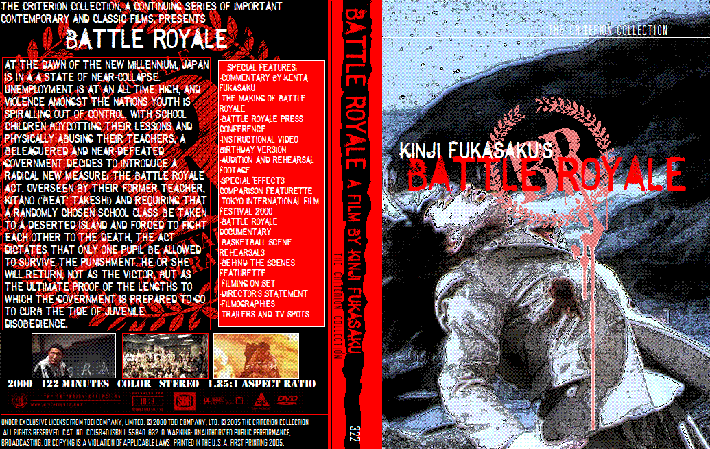
spine 322
Note: The reason this is spine 322 is because I created it last January, so yeah.
Posted: Thu Feb 09, 2006 12:26 am
by King of Kong

er, Charles Manson edition?
Posted: Tue Feb 14, 2006 9:22 pm
by Feast on me
Here is a cover I just did of Buñuel's Exterminating Angel (El Ã
Posted: Tue Feb 14, 2006 9:25 pm
by justeleblanc
I'm still holding out for a Pinal/Bunuel box when Viridiana is released. And you know, what would make that box perfect are three film covers that are just as weird and crappy as Viridiana -- that way maybe through unity I will finally see beauty.
Posted: Fri Mar 10, 2006 7:42 am
by Solaris
unclehulot wrote:The best Criterion fake cover ever though was on the old forum, the Au Haszard Balthazzar cover with a strong Shrek influence. I'd love to see that again as I don't think I saved a copy....might even print it for insertion into my case for the actual disc.........well, maybe not.
Does anybody have a copy of this?
Sounds hilarious.
Posted: Sat Mar 18, 2006 4:06 am
by Mr Pixies
Posted: Sat Apr 29, 2006 5:33 am
by Noir of the Night
Posted: Sat Apr 29, 2006 7:11 pm
by Faux Hulot
In the name of positive visualization:

Posted: Mon Aug 28, 2006 3:57 pm
by hammock
Posted: Mon Aug 28, 2006 4:11 pm
by Lino
I LOVE the one for Playtime! It's a shame Criterion didn't use it or any other, for that matter. I was a bit surprised to see they recycled the old one and simply added the new font and logo. La-zee!
Posted: Mon Aug 28, 2006 8:11 pm
by Matt
Lino wrote:I LOVE the one for Playtime!
Not me. Makes it look like some kind of dour Laurent Cantet film about cubicle drones.
Posted: Mon Aug 28, 2006 8:35 pm
by Michael
I love the Vivre Sa Vie cover. It made me want to watch the film again.
I haven't seen Scorpio Rising yet but its cover seems a bit too busy.. either one of the images (the jacket or the guy's face) should stand alone. Preferably the jacket one - red, black, metal all go together like a perfect harmony. The guy's face alone leaves an impression of something that's soft gay porn.
Posted: Tue Aug 29, 2006 12:04 am
by domino harvey
the My Life to Live cover is terrible, and the profile of the guy makes it seem like Bellmondo is in the pic
Posted: Tue Aug 29, 2006 3:51 am
by Jem
That Scorpio Rising cover is "the Shit!".


