Page 4 of 5
Re: 962 Death in Venice
Posted: Tue Feb 05, 2019 12:15 am
by movielocke
jsteffe wrote:movielocke wrote: Mon Feb 04, 2019 10:40 pm
If the scopes are showing an off kilter blue channel as you describe it, then it’s either a faulty scanner (bad blue channel in need of repair) or they’re correcting their black point with the blue channel and are pulling everything else off because of that approach. Bad way to approach grading because fucking up one of the channels in isolation to anchor one part of the image (the blacks) makes it damn hard to correctly grade the rest of the image.
Yes - the blue channel was consistently shifted down throughout the video of POMEGRANATES. I think the issue was that they applied a LUT to change the color profile so that it would reproduce correctly on film stock. So what the colorist was seeing may have been well balanced, but the output looks off when presented on DCP or home video. And Bologna only distributed that one grade, and not another one that was correctly timed for DCP. At least that is my understanding of what may have happened.
Maybe we are looking at something similar here.
If the green wash is to reverse a color profile of a film stock in order to print the correct image back to film that would make sense as to why it got applied,but crazy that a film out chain isn’t correctly segregated in the deliverables from DCP and home video chains.
Re: 962 Death in Venice
Posted: Tue Feb 05, 2019 3:02 am
by jsteffe
movielocke wrote: Tue Feb 05, 2019 12:15 am
If the green wash is to reverse a color profile of a film stock in order to print the correct image back to film that would make sense as to why it got applied,but crazy that a film out chain isn’t correctly segregated in the deliverables from DCP and home video chains.
Crazy indeed, because that element just gets put in cold storage, but what everyone actually gets to see doesn't look right. Not a great way to sell the value of film restoration. (That is, assuming the scenario is correct...)
Re: 962 Death in Venice
Posted: Tue Feb 05, 2019 4:33 am
by Rayon Vert
Would a Martin Scorsese be viewing this restoration and not seeing it as problematic? Just wondering.
Re: 962 Death in Venice
Posted: Tue Feb 05, 2019 6:38 am
by nitin
He may be seeing the film out!
Re: 962 Death in Venice
Posted: Tue Feb 05, 2019 9:37 am
by TMDaines
Rayon Vert wrote: Tue Feb 05, 2019 4:33 am
Would a Martin Scorsese be viewing this restoration and not seeing it as problematic? Just wondering.
My personal experience is that these issues affect you far less when you just watch a film on your setup, as opposed to comparing screengrabs on a monitor looking for fault.
I'm not saying people are wrong to scrutinise releases - in fact, I am glad people do so and hold labels and restorers to account - but issues with colour timing are far more noticeable when you have an immediate comparison, and your eyes aren't that great at judging colours in isolation. Obviously colours can be objectively defined and measured, but how your eyes perceive them is relative to those colours immediately next to them.
This release is obviously not ideal, but I don't think it is a disaster either.
Re: 962 Death in Venice
Posted: Tue Feb 05, 2019 10:09 am
by tenia
You're absolutely right : there is a bias playing currently thanks to the availability of direct A/B comparisons. It is easy to make a comparison and think that because it is greener or yellower, it is too green, or too yellow.
In the present case though, since you don't need a comparison to easily guess who did the grading, I believe there is an absolute (as opposed to a comparative) issue with the gradings applied by Ritrovata, which is the basis of my deep perplexity with them. And I'm not even from this field of work, I'm just an experienced viewer, but still, I can guess straight away Ritrovata graded that because of how much it shows.
To me, here, the grading is just another case of Ritrovata pisstavision, and I don't have much doubts it is not faithful to the original cinematography. Is it enough to make it a disaster ? I'm not sure, but it remains deeply problematic after so many years to still be facing such cases. Ritrovata shouldn't leave a recognizable color signature. By doing so, they're doing what no restorer should ever do, and I wouldn't be surprised if some find this enough to consider it a disaster.
Re: 962 Death in Venice
Posted: Tue Feb 05, 2019 2:12 pm
by jsteffe
TMDaines wrote: Tue Feb 05, 2019 9:37 am
My personal experience is that these issues affect you far less when you just watch a film on your setup, as opposed to comparing screengrabs on a monitor looking for fault.
You are correct - comparing screengrabs can even be visually misleading because of the way the eyes work. And the eyes do some white balancing on their own when you are looking at something. The bigger issue is a series of restorations going on for years now, mainly by two labs, that both the general public and production companies have complained about because of pronounced color biases. They (including me) have in fact been watching these restorations on ProRes, DCP and Blu-ray. These color biases are very much visible on their own, without directly comparing screenshots.
Anecdotally, one reviewer has observed the same color problems viewing the actual Blu-ray DEATH IN VENICE, and probably will mention it when their review comes out. But we will get a better picture of DEATH IN VENICE when it is more widely available.
Re: 962 Death in Venice
Posted: Tue Feb 05, 2019 3:17 pm
by tenia
jsteffe wrote: Tue Feb 05, 2019 2:12 pmThese color biases are very much visible on their own, without directly comparing screenshots.
Precisely.
Re: 962 Death in Venice
Posted: Fri Feb 15, 2019 7:07 pm
by Costa
Why do I remember reading a bluray.com review for this but I cannot find it right now?
Re: 962 Death in Venice
Posted: Fri Feb 15, 2019 8:18 pm
by tenia
I don't think I read one. However, Svet posted his Color of Pomegranates one only a week ago, maybe you're mixing it up with this one ?
Re: 962 Death in Venice
Posted: Fri Feb 15, 2019 8:31 pm
by Costa
tenia wrote: Fri Feb 15, 2019 8:18 pm
I don't think I read one. However, Svet posted his Color of Pomegranates one only a week ago, maybe you're mixing it up with this one ?
Ah, you're right! It was that one that I read.
I mixed the ritrovata restorations.
Re: 962 Death in Venice
Posted: Sun Mar 17, 2019 5:48 pm
by Fred Holywell
Re: 962 Death in Venice
Posted: Sun Mar 17, 2019 6:35 pm
by tenia
It's really fascinating to see how it's oh so close from the older Warner DVD (which doesn't seem very dated, color wise), yet has just what it takes for Ritrovata's signature to peer through.
Re: 962 Death in Venice
Posted: Thu Mar 28, 2019 11:08 am
by colinr0380
I'm afraid that I cannot add anything really to the colour timing debate above but I sat down with the Criterion edition of the film last night. It is still an overwhelming piece of work and it is interesting that the (arguably over literal) 'explanatory' flashbacks are where the most dialogue occurs whilst in the present the dialogue is all 'transactional' (with the staff of the hotel or the train station, or the gondolier, or the beach boys to set up a hut, and even then it is often distant with the camera literally pulled far back. With an implied message that you probably should not upset your gondolier even if they are taking you for a ride, or eat lukewarm strawberries!), or from an outsider's perspective looking on at other groups (though Tadzio and his family are talking in Polish and French, so distance is there too). Especially the present time is swathed with the musical score to express character, whilst in the past musical performance is fragmentary and the use of the piano in particular is an ironic underscore to a kind of critique of the central character. Other people are using music to criticise the composer and even when we think that we might hear his composition, the flashback is just one note at the very end of it followed by a chorus of boos instead!
Perhaps significantly there is one forward looking sequence in the idealised sequence of Aschenbach passing on the warning of the plague and the urgency of leaving to the family and finally being able to touch Tadzio's head, as if the threat of the plague exists to facilitate that connection. It is obviously too good to be true though and the warning and direct touch of Tadzio cannot lead anywhere, so the idealised hope of contact ends inconclusively but at its supreme moment as well.
In some ways the film seems to be about the dangers of abandonment to the senses. The composer is being criticised for wanting to control every aspect of his composition, perhaps over thinking his music into seeming dry and passionless as if afraid to acknowledge the feelings within himself (especially of grief of loss of his daughter, which perhaps is another way that Tadzio is substituting in the present. The younger generation are the material used for inspiration, as muses, without being consciously aware of the role they play in feeding that creative energy). That retreat into the safety of the known removes the sensual danger of art and the idea that an artist is exploring themselves rather than have already 'understood' their material and is presenting it in a pre-digested form to their audience. However abandoning yourself entirely to the senses always carries the dangerous sense, eventually bluntly literalised here, that following that muse leads to the greatest unplanned heights but also the possibility of reaching a dead end as well! Especially if you have allowed yourself to be carried by half-understood impulses and suddenly find yourself adrift as that impulse 'abandons' you, and it is difficult to know where you are any more as an artist.
A couple of the flashback sequences seem about the issue of the artist not wanting to have to explain their own art, and perhaps being the last person to really be able to (or want to) explain it. The right that artists have to not explain themselves, even to themselves, and that art is a medium that allows a creator to, not exactly hide from having to focus on issues directly, but to transform experiences and infuse them with even greater meaning. The 'secondhand' distance provided by the creation of a piece of art allows the creator to deal with parts of themselves (their past, their losses, their present mental state, the world around them, their desires, their notions of beauty and what aspects of the world stand out to them at that particular moment of their creative life) but also creates something new to add into the world through that process. The creator has left the world but in the work they have left they can communicate a moment (a place in time, a figure, a milieu) and perhaps more importantly an individual idea of what being alive in the world felt like to other people. In a sense the muse figure (whether the lost daughter or the distant Tadzio) is the key figure yet also the least important figure in the situation, and it is important that they remain barely conscious of their role in the creative process, or at least ambiguous about the part they play. The work is inspired by them and about what they represent, but not entirely for them to view, and as shown in the moment where Tadzio is swaddled in the toga-like towel on the beach, he is present but almost forgotten as Aschenbach is inspired to begin to furiously write his music again at his table - the muse present as a distant figure in the background but almost entirely absent as the thrill of artistic inspiration proves far more compelling. Even if the inspiration appears to be fleeting and Aschenbach has to return to following Tadzio and observing from afar, like a junkie gets strung out on needing the next fix to continue to function, even if it can only lead to much worse consequences.
Anyway, I really think that Criterion should have upgraded Summertime (aka Summer Madness) at the same time as releasing Death In Venice though, just for a slightly healthier take on a holiday fling in the city (with composing music replaced by photography), even if Katharine Hepburn does do that plunge into a murky canal that could not have done much for her heath either! It certainly would make for a nicely contrasting double bill!
Re: 962 Death in Venice
Posted: Fri Mar 29, 2019 9:47 am
by colinr0380
I also think that one of the less discussed aspects of the film is about the relationship that Tadzio has with his same age friend. Introduced on the beach and then walking off together we then see them together in the scene in the lift, which is probably what causes Tadzio to do that turn and look back as he leaves to say goodbye to his friend, but the friend is pretty much ignoring him whilst chatting with others in the lift so the moment goes unseen by everyone but Aschenbach. And then at the very end of the film his friend rough-houses Tadzio into the sand until he pulls away and walks off, seemingly in anger, into the waves in preparation for the transcendent final shot (remaining 'pure' and sexless in the viewer's gaze, even against those trying to drag him back to earth?)
Maybe Tadzio's introspection about some of the issues in his own more grounded relationship is already preparing him for a melancholy future, and I wonder if that is why Tadzio himself sometimes looks back at Aschenbach with curiosity (rather than lust) as someone who potentially might have been through such trials of life. Does he see Aschenbach as a warning of a lonely future ahead, or that present pain can potentially have a use a creative life at some future point (even if it may leave you blinkered to bigger issues around you!)
There is also that interesting through line of the name Esmeralda. It is the name of Aschenbach's deceased daughter (the last inspirational mother and child pairing for him?), the steam ship that brings him to Venice at the beginning of the film is named Esmeralda, and perhaps most significantly the prostitute playing Für Elise in the flashback sequence inspired by Tadzio tapping out a few notes of the tune on the piano is also named Esmeralda (On this re-watching I did wonder if this sequence inspired the extended brothel sequence in Mike Figgis's 1991 film
Liebestraum). That perhaps suggests that the composer has previously been directly trying to tap into his sensuality rather than his intellect unsuccessfully and maybe is a critique on the mores of his time, wanting sensuality and grand emotion rather than intellectual distance and observation (not understanding that sometimes the momentary glance holds more power than the greatest romantic embrace, as perhaps shown by many of the diegetic pieces of music seeming rather insipid and mocking of the composer in their direct appeal to an audience, and Aschenbach's make up at the end seems similar to the singer in that dance troupe in the garden of the hotel), and for this particular composer being forced to face the heights of ambiguity of desire head on assures that he is never going to be part of the mediocre mainstream, but also that there is no further point to go beyond his most supreme moment.
The tragedy is perhaps less the death but that the composer is never going to be able to have the chance to convey that feeling to others through his art (though of course Visconti does this for him), as he was still in the throes of dealing with his own feelings at the point of his death, leaving his composition inspired and begun, but presumably unfinished. But aren't the greatest symphonies sometimes unfinished?
Re: 962 Death in Venice
Posted: Tue Apr 09, 2019 7:01 pm
by Fortisquince
Ummm...well, I hate to bring this up, but does anyone know of a cut of this film, on Youtube, or some site like that, with the flashbacks cut out? I love Dirk Bogarde's performance in the "present" time period of the film. It's a wonder of behavior and body language. I would have never thought that photographing one person looking at another person could be so interesting. And Bogarde perfectly captures the reckless, heedless, beyond embarrassment quality of Von Aschenbach's pursuit of beauty/love/eros/truth/sex/death. But, yeah, the flashbacks kind of ruin the movie for me.
Re: 962 Death in Venice
Posted: Fri Apr 19, 2019 8:05 pm
by jsteffe
I finally had the opportunity to look at the Criterion Blu-ray of DEATH IN VENICE in person, and I don't think it suffers from the same kinds of pervasive and really obvious color balance problems or weird color palettes that we have seen elsewhere in THE COLOR OF POMEGRANATES, MURIEL, L'ARGENT, JE T'AIME JE T'AIME, RAN, etc. If you look at the color spectrum across the entire film, some scenes are a bit yellowish or greenish and some are brownish, but I personally think it falls within a range of plausible variability considering the different lighting conditions, interiors versus exteriors, etc.
In most shots where whites are clearly supposed to stand out - such as white shirts- they look reasonably white. It's different, from, say, THE COLOR OF POMEGRANATES, where the pronounced yellow-green push means that there are no true whites in the image even where they are obviously required.
Chris Galloway's review mentions the problem of black crush. I can see what he means and I'm not crazy about how the contrast looks overall. But there are also plenty of places where you have, say, a dark or black suit against the dark of night, and you can see the suit clearly and make out some details in it.
It's not the most luminous or inspiring looking restoration of a film that I've seen, but that could well come down in part to the film's original cinematography. Overall, I'd say it looks different from the 35mm print that I saw years ago, but that 35mm print wasn't all that great either. I'd be curious to see an early Technicolor print, if one survives, and compare it with that. In terms of Criterion releases, I wouldn't rank it at the top, but I wouldn't rank it at the bottom, either.
Re: 962 Death in Venice
Posted: Fri Apr 19, 2019 9:33 pm
by jsteffe
David, that's a very telling story about projecting DEATH IN VENICE. I do wonder whether the softness and overall graininess in the film may have do with the heavy reliance on a zoom lens as you suggest, perhaps combined with shooting in relatively low light conditions. For me, Visconti's most beautifully photographed color film is still by far THE LEOPARD, but that's something very special and it was shot in Technirama by Rotunno with robust and carefully designed lighting.
Re: 962 Death in Venice
Posted: Sat Apr 20, 2019 6:10 pm
by tenia
From what I've seen so far (I've yet to sit in front of the full movie), while I believe it is far from being the worst offender regarding Ritrovata's hands-on, the fact that we can still easily guess which lab did the grading remains quite telling.
Re: 962 Death in Venice
Posted: Sun Apr 21, 2019 5:43 pm
by jsteffe
I took a closer look at Criterion's
Death in Venice, alongside the HD streaming version which is still available on Amazon.
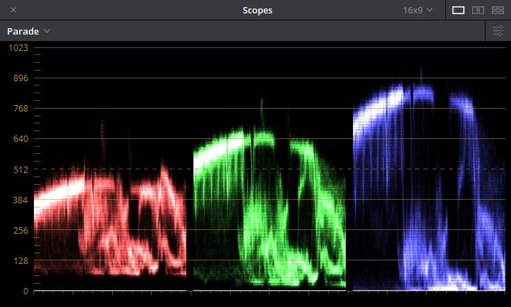
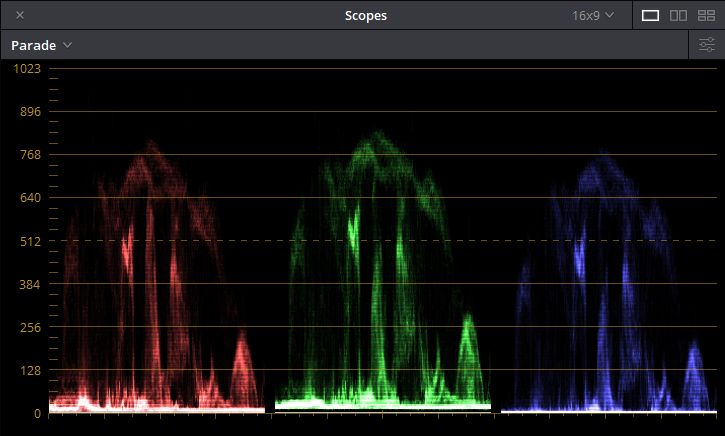
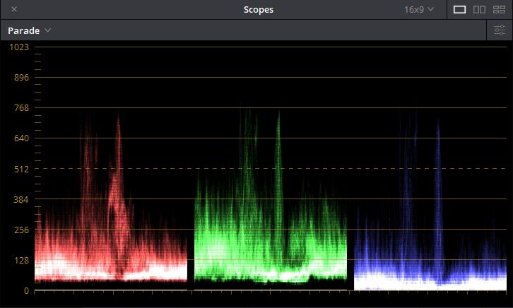
The black crush problem in the new restoration is worse than I originally thought, and I agree completely with Chris's criticisms of the image in his review on this site. Sampling the image with video scopes, it is similar to Ritrovata's
The Color of Pomegranates in that the gain in the green channel is pushed up for most of the film, contributing to a greenish cast to varying degrees depending on the specific content of the shot. The other point of similarity is that the floor of the blue channel is pushed down lower than the other two channels. If there are deep blacks in a particular shot, it results in black crush and information is getting lost. The problem was not as readily apparent with the
Pomegranates master because it doesn't have as many deep blacks. On this Blu-ray it is more obvious.
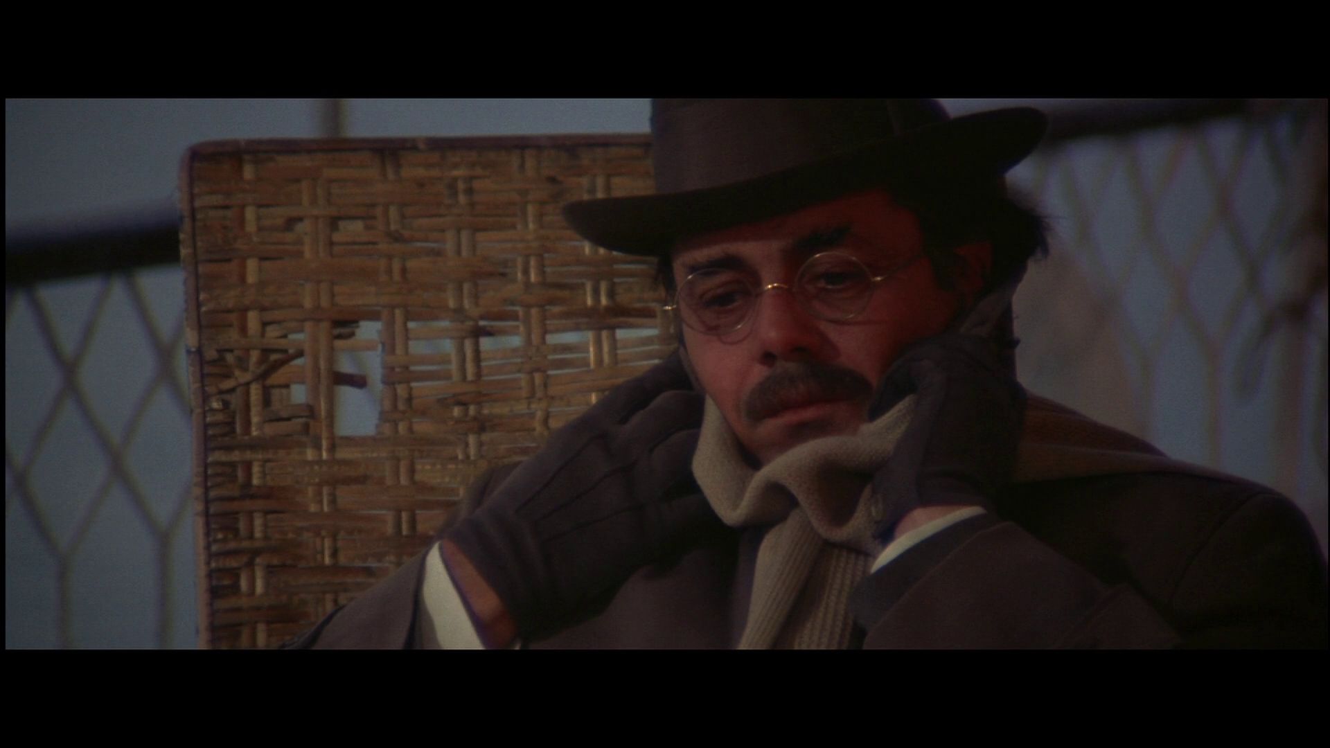
Here are some sample scopes to illustrate what I mean:
Shot beginning 05:56 (Lots of blue in this shot because of the blue sky in the background.)
Shot beginning 54:23
Shot beginning 1:05:43
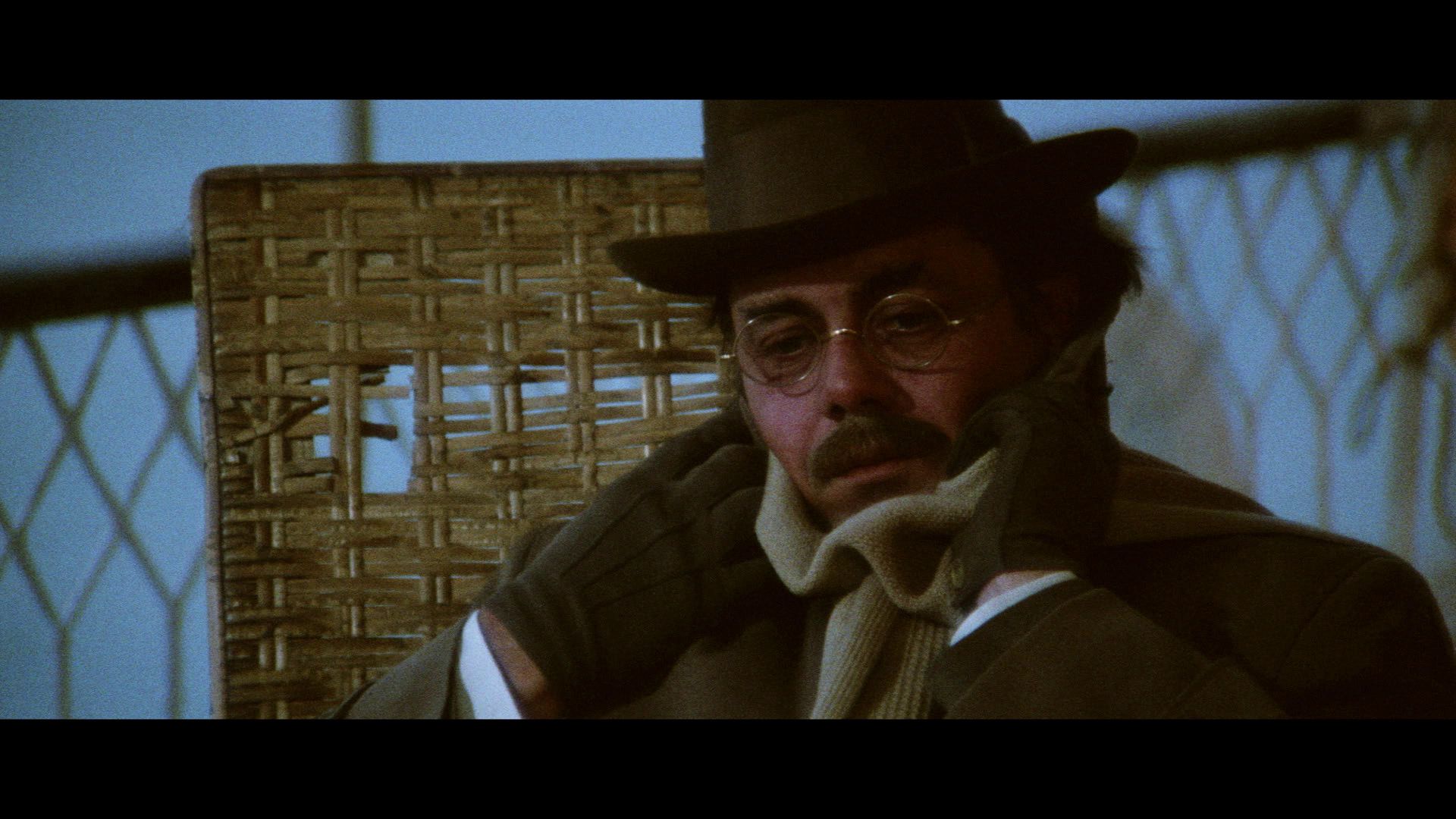
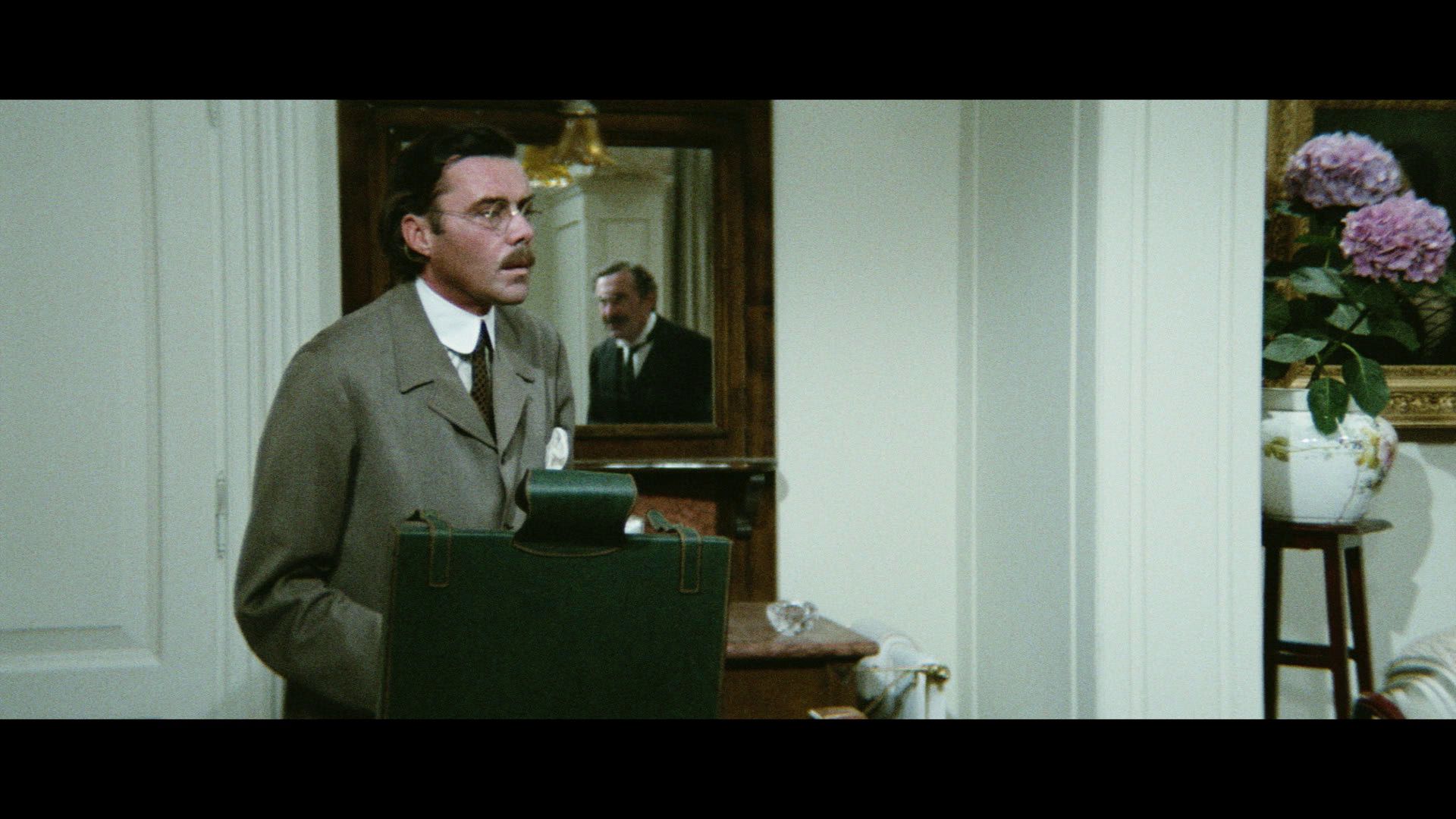
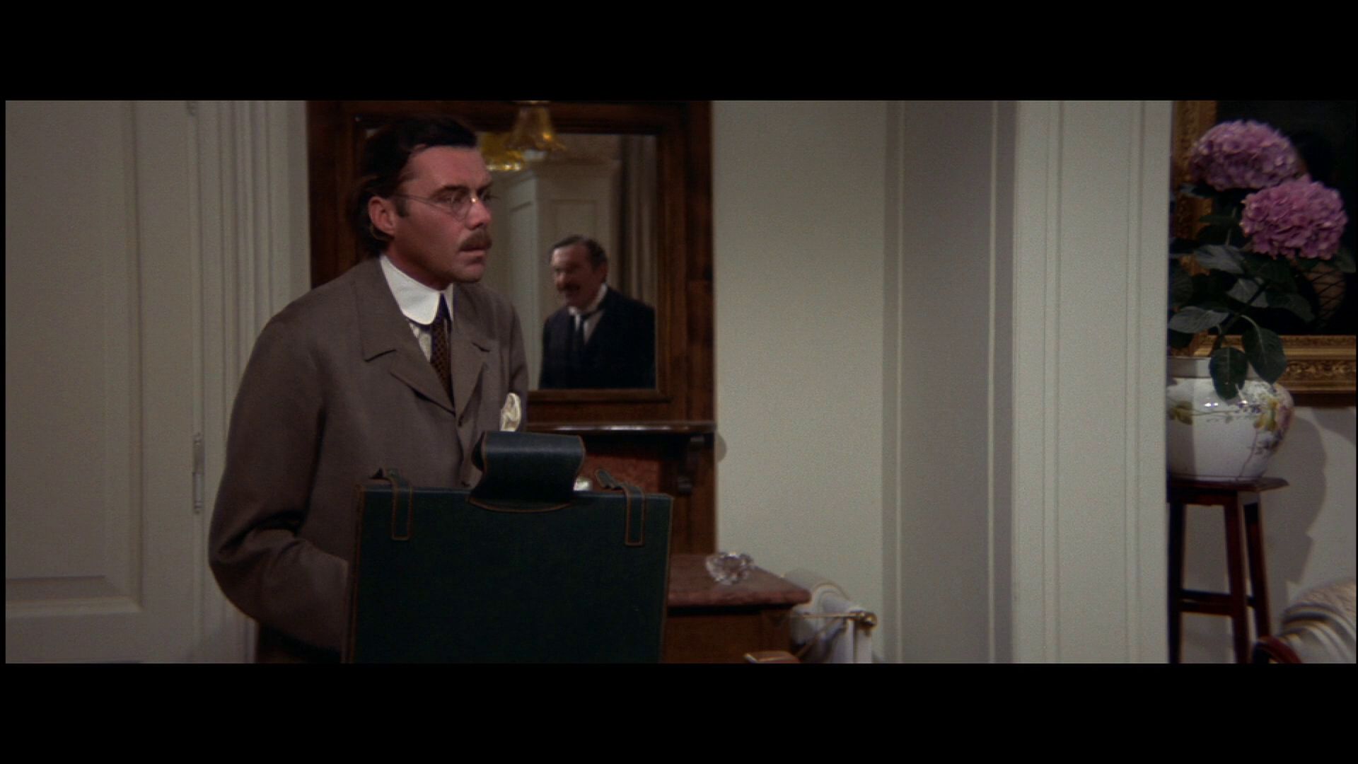
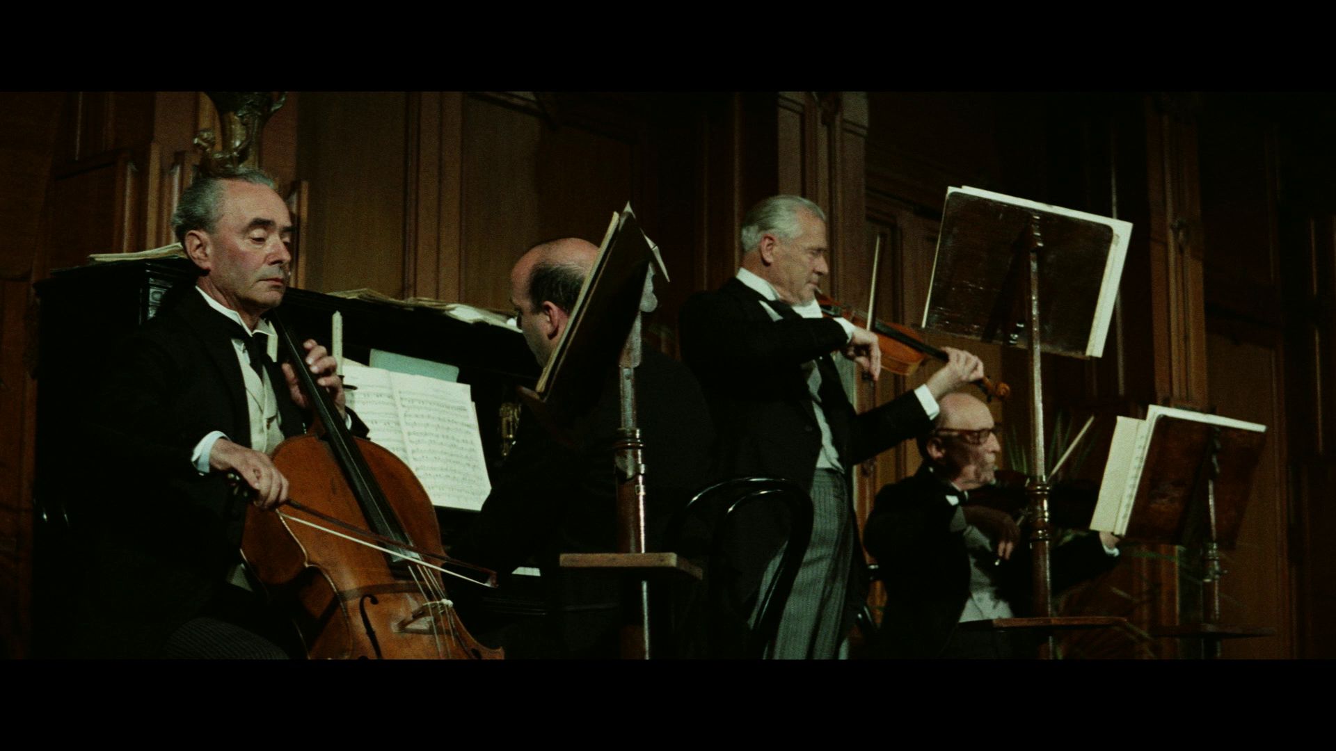
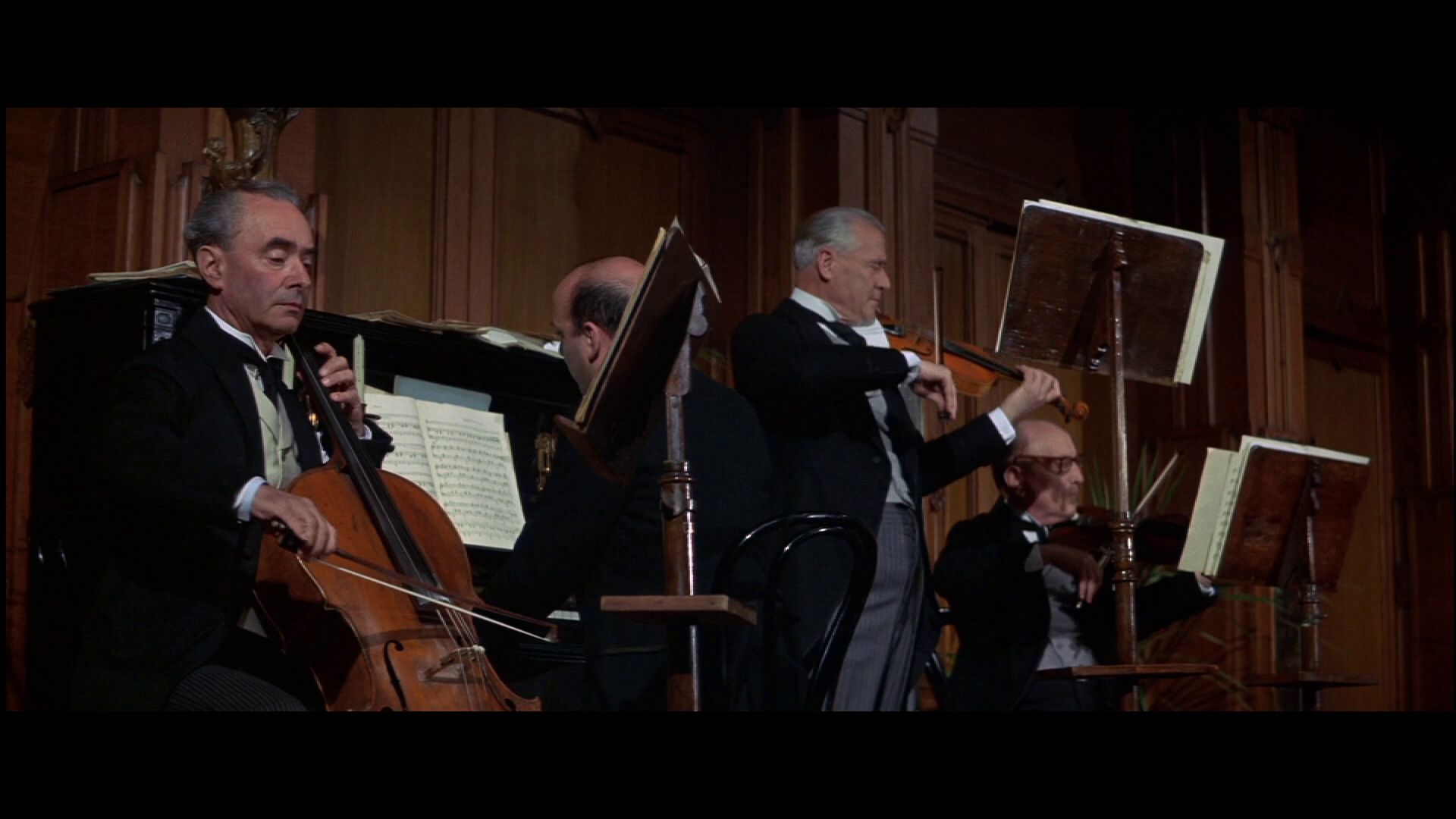
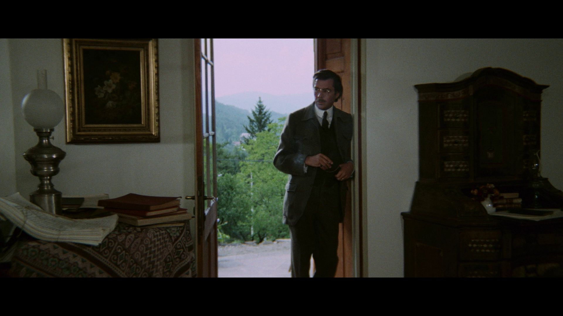
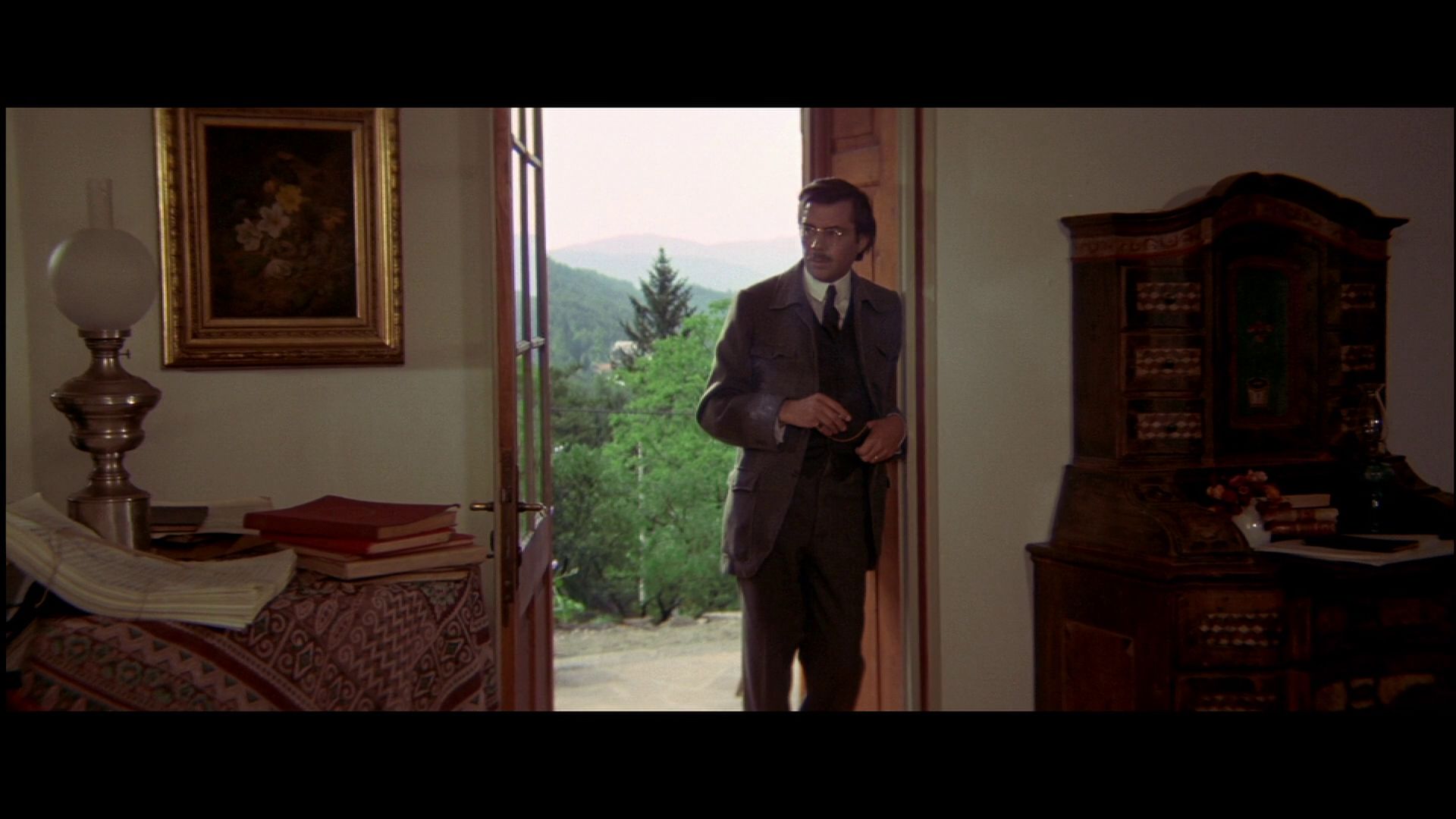
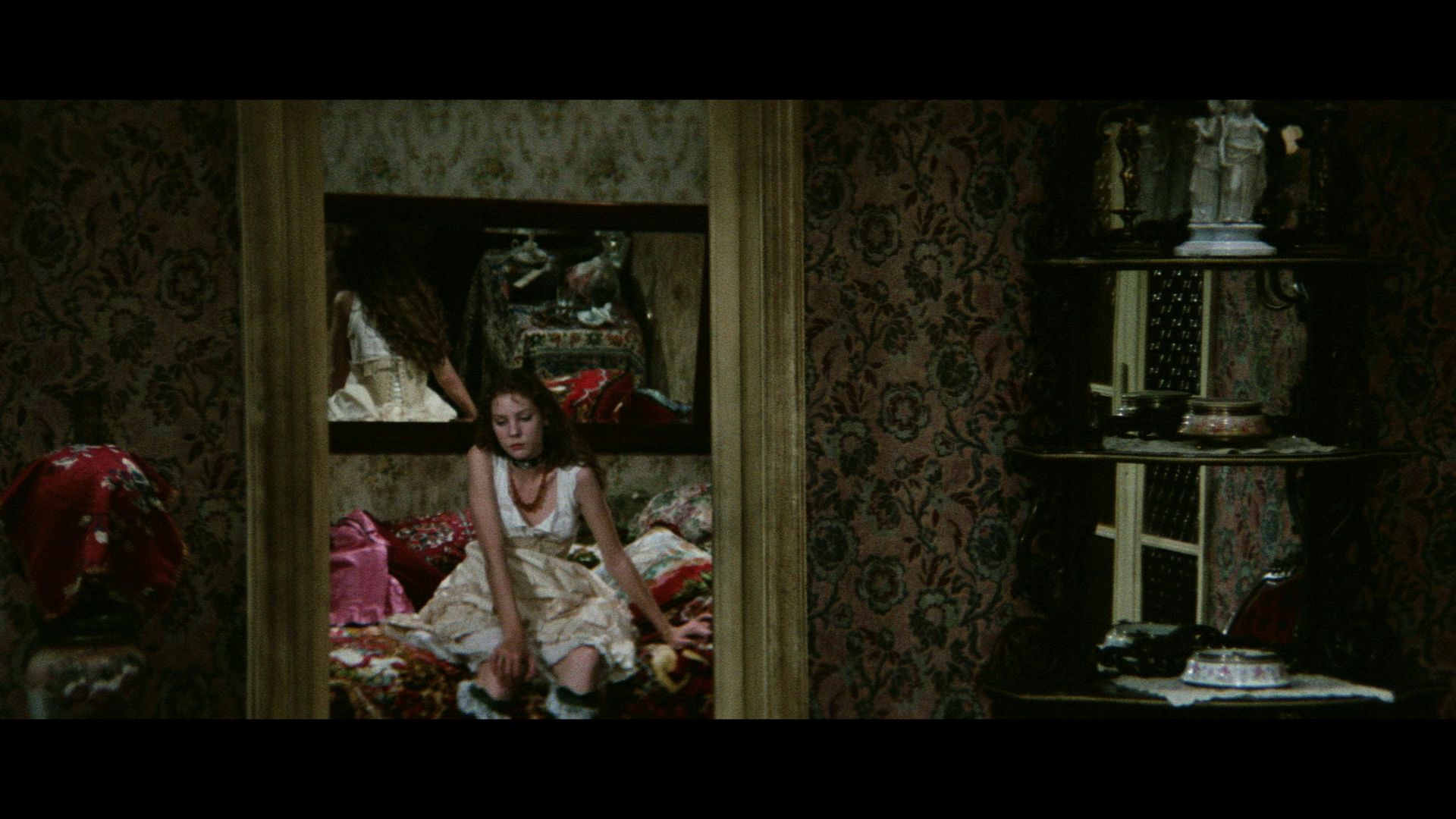
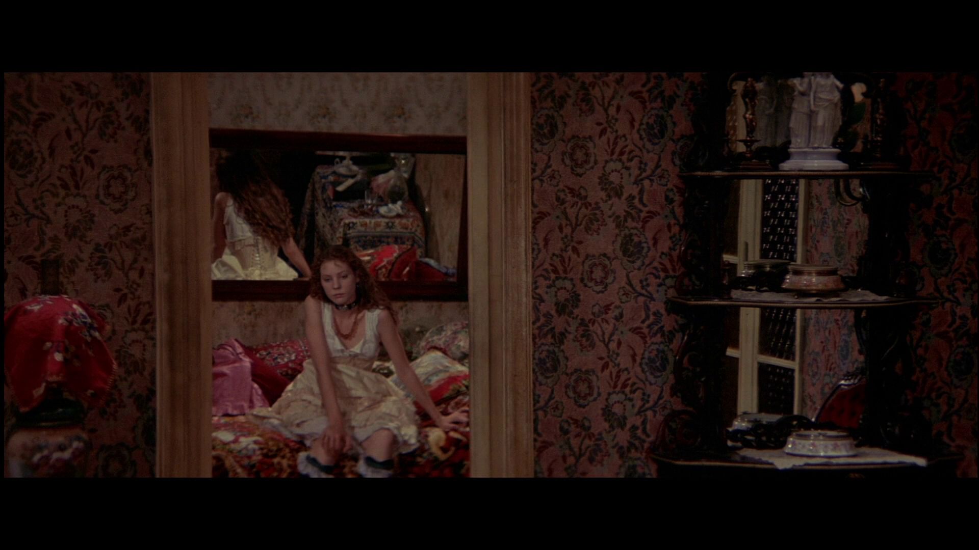
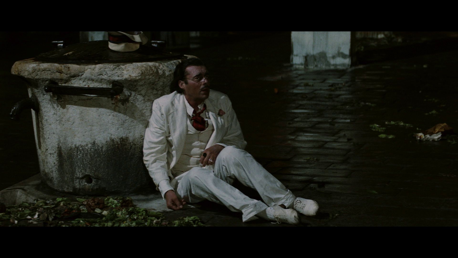
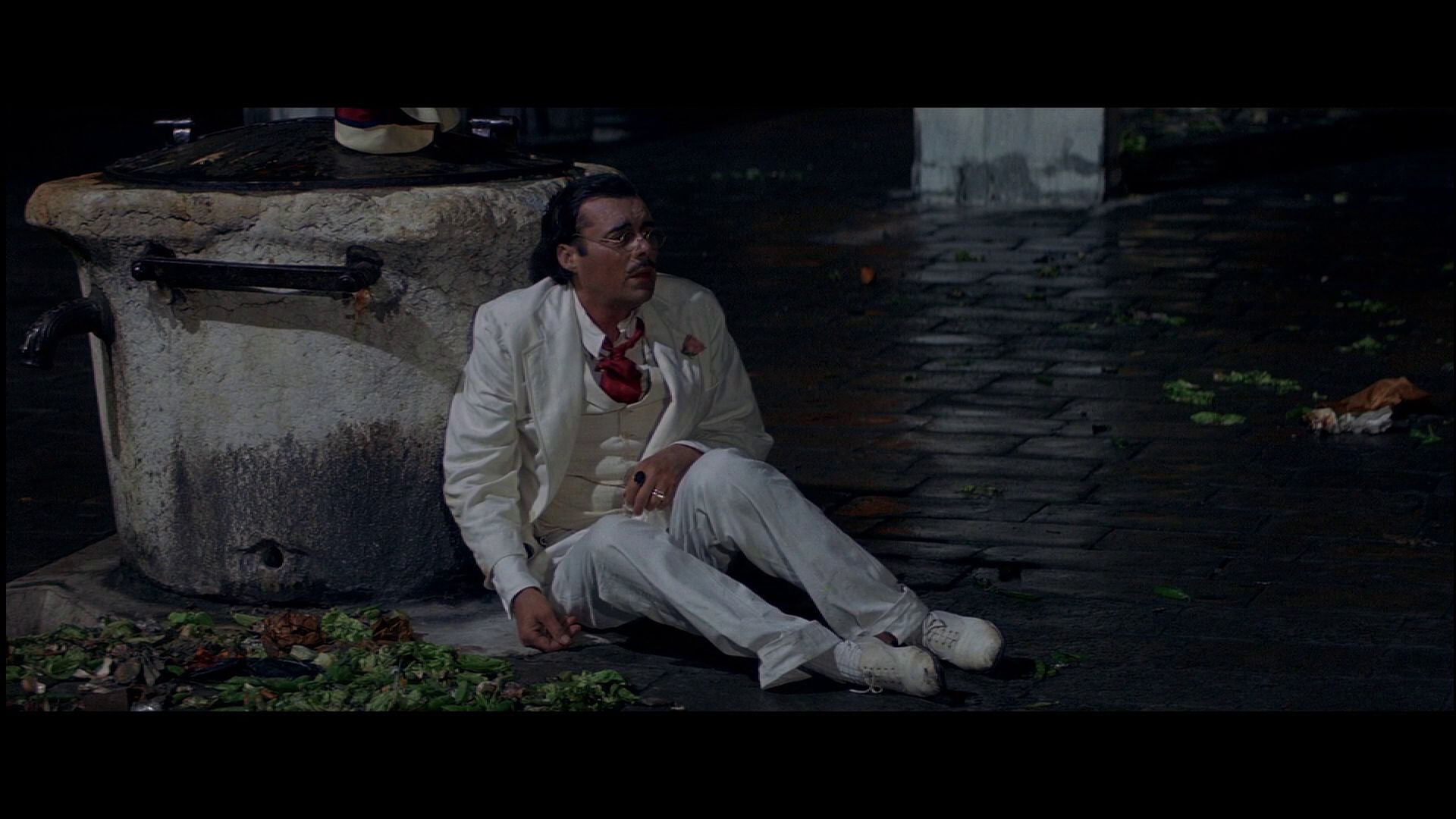
Here are several frame grabs to compare with the older HD master on Amazon. As you can see, sometimes the older master handles flesh tones better, but it is also quite dated and has a red push in many places.
Criterion 1
Streaming 1
Criterion 2
Streaming 2
Criterion 3
Streaming 3
Criterion 4
Streaming 4
Criterion 5
Streaming 5
Criterion 6
Streaming 6
I think consumers have a right to expect video transfers without obvious technical defects. Between this and the dark and teal
Mélo, its as if we are entering a new "dark ages" in digital film restoration.
Re: 962 Death in Venice
Posted: Sat May 11, 2019 6:35 pm
by M Sanderson
Wow, I expected it to look great with a little green or yellow pushing, which seems to be the trend of late.
But this is unwatchable. The film looks dark, harsh, underexposed. Definitely, black crush. Not the delicate film I recall from a cinema screening or from Warner’s old DVD. Where’s the greys and browns gone?
Looks weird as some other Italian films restored by this house Ritrovata. Such as several scenes in Arrow’s What Have you Done to Solange & Property is no Longer a Theft. But far worse.
Best Visconti Blu rays for me are still Arrow’s Ludwig & Cult Films’ L’Innocente. (I recall Eureka’s Conversation Piece & Rocco having various issues also).
(Yes I actually have the Blu ray & am not looking at screen grabs online.)
Re: 962 Death in Venice
Posted: Sat May 11, 2019 8:14 pm
by tenia
I don't think the older HD master is faithful either. It does look like a master graded following the habits of that time, especially regarding how pink-ish it can get (as James wrote).
It might be better overall compared to the intensity of the direction taken in the new restoration, but I'd be extremely wary in thinking this is more delicate.
I'm not sure about what issues the Eureka releases have. IIRC, Rocco has an incorrect gamma, but I don't think there was anything else, and I'd argue that's relatively negligible.
Re: 962 Death in Venice
Posted: Sun May 12, 2019 12:56 am
by Drucker
I actually just picked up the MOC Conversation Piece since it didn't adopt the obviously incorrect Gaumont color timing. And since the MOC generally is better at keeping audio hiss in tact, it figured to be the one to get.
Re: 962 Death in Venice
Posted: Sun May 12, 2019 2:11 am
by jsteffe
M Sanderson wrote: Sat May 11, 2019 6:35 pm
Best Visconti Blu rays for me are still Arrow’s Ludwig & Cult Films’ L’Innocente. (I recall Eureka’s Conversation Piece & Rocco having various issues also).
Both the older Criterion and the now out-of-print Australian Madman edition of
The Leopard are my favorite Blu-rays of Visconti color films, followed by Arrow's
Ludwig. The Australian Blu-ray of
The Leopard is based on the Film Foundation/Bologna restoration, which turned out extremely well even if some have debated the choice of standard 'scope aspect ratio. (I'm fine with it and prefer to watch that restoration, if given a choice.) That said, it seems almost unfair to compare
The Leopard to other Visconti Blu-rays because the film is clearly better photographed than any of the other films and benefits from being shot in Super Technirama 70.
Re: 962 Death in Venice
Posted: Sun May 12, 2019 7:29 am
by M Sanderson
tenia wrote: Sat May 11, 2019 8:14 pm
I don't think the older HD master is faithful either. It does look like a master graded following the habits of that time, especially regarding how pink-ish it can get (as James wrote).
It might be better overall compared to the intensity of the direction taken in the new restoration, but I'd be extremely wary in thinking this is more delicate.
I'm not sure about what issues the Eureka releases have. IIRC, Rocco has an incorrect gamma, but I don't think there was anything else, and I'd argue that's relatively negligible.
I was watching the old dvd on a 4:3 32” TV. It seemed fairly balanced, at the very least. At the time. Any other issues I wouldn’t have seen due to the smallness of the widescreen within the 4:3 screen.
The Criterion Blu ray is just objectionably strange. I was lucky to see a cinema screening and it wasn’t weirdly murky and dark like the current Blu ray. Lots of shadow & colour details are lost.