Page 35 of 49
Posted: Thu Jul 26, 2007 7:50 pm
by Floyd
The blurred man looks randomly dropped in and awful. They just need to remove it.
Posted: Thu Jul 26, 2007 9:23 pm
by Narshty
Jem wrote:That blurred figure is so fake, come on people!
Spatially it makes no sense either. Is he standing on a ladder?
Posted: Thu Jul 26, 2007 9:34 pm
by miless
Floyd wrote:The blurred man looks randomly dropped in and awful. They just need to remove it.
that ain't just no blurred man... that's Richard Gere!
Posted: Thu Jul 26, 2007 10:35 pm
by tavernier
miless wrote:Floyd wrote:The blurred man looks randomly dropped in and awful. They just need to remove it.
that ain't just no blurred man... that's Richard Gere!
Then he should definitely be removed.
Posted: Thu Jul 26, 2007 11:48 pm
by tryavna
tavernier wrote:miless wrote:Floyd wrote:The blurred man looks randomly dropped in and awful. They just need to remove it.
that ain't just no blurred man... that's Richard Gere!
Then he should definitely be removed.
Maybe that's why he's been blurred.
Posted: Fri Jul 27, 2007 7:49 am
by Cinesimilitude
something like this would be better. And I really love greathinker's title treatment.

Posted: Fri Jul 27, 2007 4:07 pm
by Steven H
Spatially it makes no sense either. Is he standing on a ladder?
I knew something about this seemed wrong, other than the hideous blurring effect, but yeah, it looks like he's floating. Get rid of the blurred figure, lower the entire image down about %15, and then we can get on with our lives. Or someone could photoshop
this picture of Richard Gere in blurred man's stead, for hilarity's sake.
Posted: Fri Jul 27, 2007 4:14 pm
by patrick
I love the Days of Heaven cover. It's simple and directly connected to the movie, but it's also elegant and intriguing.
Posted: Fri Jul 27, 2007 4:15 pm
by portnoy
I guess I'd be more okay with that cover if I felt like focus was a primary formal element to the film's look, but it's not. Those magic hour daytime exteriors are pretty consistently shot wide-open and with about as much deep focus as Almendros and Wexler could muster. Here's a comparable image in terms of distance between various points of interest and their focus:
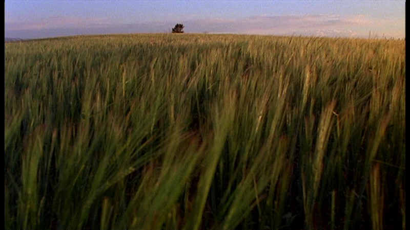
I mean, even on a crappy DVD like the Paramount one, there's a clear sense that the grass and the silhouette are both relatively in-focus.
Even with a shot like this:

There's a refinement and a crispness to the focus of the photography that simply doesn't suggest the cover we've got.
Posted: Fri Jul 27, 2007 4:39 pm
by teddyleevin
Steven H wrote:Or someone could photoshop
this picture of Richard Gere in blurred man's stead, for hilarity's sake.
Done and Done
Posted: Fri Jul 27, 2007 4:49 pm
by Greathinker
I think its spatial bizarreness refutes any claims about the way the film was shot.
As it turns out this is a fantastic cover. It's over-said but Malick's films have a purity that makes it wrong for some graphic designer to come in and supplant them with a daring image. Criterion's may not be an exception either; though the tension between gere and shepherd on the porch is a effective, it might be better with both of them missing. It's fine though either way, the film grain in the sky is great.
Posted: Fri Jul 27, 2007 5:07 pm
by tavernier
I don't like the Malick cover either, but luckily, once I have it, I'll only see the spine on the shelf 99.9% of the time....just like all my other discs.
Posted: Sat Aug 04, 2007 9:57 pm
by Doctor Sunshine
So. Booklet minutia. Paper is the new glossy.
They won't get finger prints anymore but will they yellow? Or is the paper acid free? They might be classy but what of the sleekness?
I don't believe we're not obsessive enough to discuss this.
Posted: Tue Aug 07, 2007 6:42 am
by Doctor Sunshine
What's this I'm feeling? Is it pride? Am I proud of everyone here for not taking the bait... Maybe it's shame? Am I ashamed of myself? No, wait. I am proud of myself.
Posted: Thu Aug 09, 2007 5:40 pm
by Sloper
You have to be more careful with these paper things. I like them at first - I feel classy. Then they fall off my desk and get a small dent in the corner. And I feel cheap.
Cheap and vulgar.
And I feel ashamed for not taking better care of my DVDs.
Whereas my plastic Leopard still looks gorgeous. Does yours?

Posted: Thu Aug 09, 2007 9:56 pm
by miless
Sloper wrote:Whereas my plastic Leopard still looks gorgeous. Does yours?
mine's as wrinkly as my grandpa after a long bath.
Posted: Thu Aug 09, 2007 10:06 pm
by keeproductions
I'll take a slightly-dented digipak over pickled plastic any day!
Posted: Fri Aug 10, 2007 12:40 pm
by ByMarkClark.com
Yeah, but you can buy a new keep case for, like, 50 cents. Try replacing your digipack sometime.
Posted: Fri Aug 10, 2007 7:19 pm
by miless
ByMarkClark.com wrote:Yeah, but you can buy a new keep case for, like, 50 cents. Try replacing your digipack sometime.
edit: where can you buy the 3-disc keep-cases for 50 cents?
I wrote digi's, but meant keep!
Posted: Fri Aug 10, 2007 7:21 pm
by CSM126
miless wrote:ByMarkClark.com wrote:Yeah, but you can buy a new keep case for, like, 50 cents. Try replacing your digipack sometime.
where can you buy the 3-disc digi's for 50 cents?
I believe he was implying that you can't. As in try to, and then realize your search is futile.
Posted: Sun Aug 12, 2007 8:07 pm
by carax09
I was checking out the Fuller set today at a local shop, and I noticed that one spine featured a still from Baron Of Arizona, while the other spine featured one from...Wooden Crosses?!
Posted: Sun Aug 12, 2007 8:18 pm
by justeleblanc
carax09 wrote:I was checking out the Fuller set today at a local shop, and I noticed that one spine featured a still from Baron Of Arizona, while the other spine featured one from...Wooden Crosses?!
Spine?
Posted: Sun Aug 12, 2007 8:46 pm
by Luke M
carax09 wrote:I was checking out the Fuller set today at a local shop, and I noticed that one spine featured a still from Baron Of Arizona, while the other spine featured one from...Wooden Crosses?!
I just checked mine and it's the same way. The still is the same and on the same side on both Raymond Bernard and the Fuller set.
Posted: Sun Aug 12, 2007 10:01 pm
by Cinesimilitude
Luke M wrote:carax09 wrote:I was checking out the Fuller set today at a local shop, and I noticed that one spine featured a still from Baron Of Arizona, while the other spine featured one from...Wooden Crosses?!
I just checked mine and it's the same way. The still is the same and on the same side on both Raymond Bernard and the Fuller set.
Holy ebay gold.
Posted: Sun Aug 12, 2007 11:43 pm
by domino harvey
justeleblanc wrote:carax09 wrote:I was checking out the Fuller set today at a local shop, and I noticed that one spine featured a still from Baron Of Arizona, while the other spine featured one from...Wooden Crosses?!
Spine?
the slipcase box