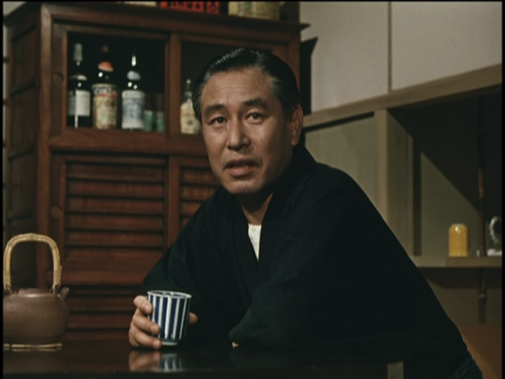
FilmFanSea wrote:However, I've yet to read a plausible hypothesis from the critics about why Criterion keeps choosing such "appalling" colors.
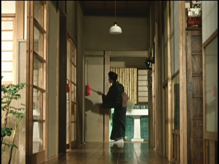
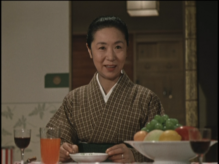
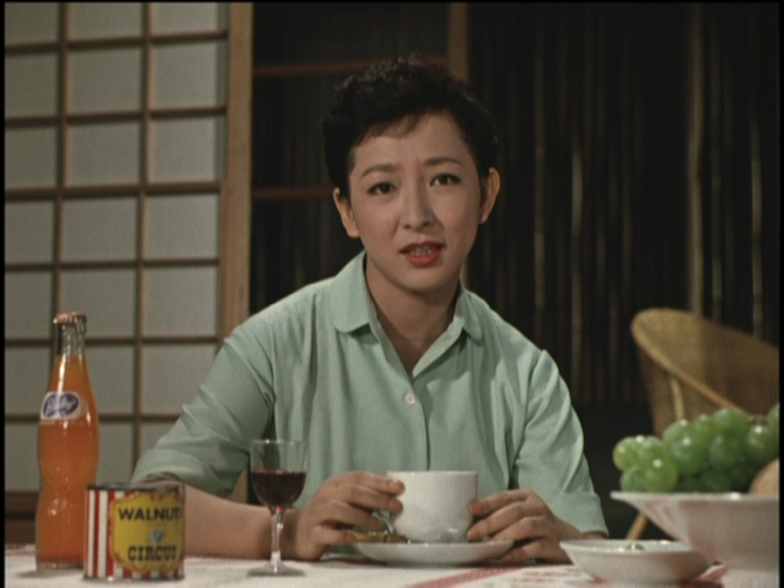
Well, I've never been one to give them *too* much credit for their supposedly exacting devotion to getting these things right. Pleasing their market is frequently good enough for them. I think their digital "restoration" schemes can err on the side of scrubbing the films *too* clean and obviously I think they've been getting Ozu's colors wrong from the start. I'm sure many people here will disagree with me (probably quite strongly on the first point). I think simple fallibility is enough of an explanation.
FilmFanSea wrote:2. Lee Kline is a dumbass who's never even heard of Agfacolor, has NEVER seen a color Japanese film from the 1950s and 1960s projected, and has no bloody clue that certain members of this forum have consistently blasted his Ozu color choices since at least 1997.
At the risk of being called posturing and condescending again, I think we're talking about Fujicolor, rather than Agfacolor. As for whether he knows or cares that people see this as a problem, your guess is as good as mine. (Indeed I asked if it had been brought to their attention in my original post on the subject.)
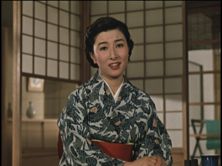
FilmFanSea wrote:4. Criterion has little problem reproducing the skewed color choices of Wong Kar Wai, Jean-Pierre Melville, and Krzysztof Kieslowski, but draws the line at Yasujiro Ozu (anti-Japanese sentiment?).
Simple case of greater familiarity with the films
on film in the case of Wong and Kieslowski, I would guess. Dumb luck with Melville?
Edit: But I also haven't looked at any of these discs, so can't comment on them.
FilmFanSea wrote:reasonable people can disagree about how these films looked when they were first projected, and can make divergent but reasonable choices about the way they should appear on DVD.
Sure, but some of them are wrong.


