Criterion & Eclipse Cover Art & Packaging Babble-on Vol. 7
-
CSM126

- Joined: Thu Nov 04, 2004 12:22 pm
- Location: The Room
- Contact:
Re: Criterion & Eclipse Cover Art & Packaging Babble-on Vol. 7
I like them all, kind of love Advertising.
-
afilmcionado
- Joined: Mon Sep 28, 2020 1:14 pm
Re: Criterion & Eclipse Cover Art & Packaging Babble-on Vol. 7
Unfortunately I think the Umbrellas one is hideous and overdesigned. The old one was just fine imo (even if it only had one of the leads on it).
-
DimitriL
- Joined: Thu Jul 24, 2014 10:07 pm
Re: Criterion & Eclipse Cover Art & Packaging Babble-on Vol. 7
That may be one of the most perfectly thematic designs they've ever done.
-
ryannichols7

- Joined: Mon Jul 16, 2012 6:26 pm
Re: Criterion & Eclipse Cover Art & Packaging Babble-on Vol. 7
the Cherbourg cover would be good except it sells a totally different movie than we actually get, and dramatically oversells its connection to Barbie. not a fan, though it'd work for a different movie!
The Wind Will Carry Us is great, which makes this all the more rough. and I also like Advertising a lot too. Killer of Sheep is very solid
The Wind Will Carry Us is great, which makes this all the more rough. and I also like Advertising a lot too. Killer of Sheep is very solid
-
Guido
- Joined: Sun Jun 01, 2008 3:31 am
Re: Criterion & Eclipse Cover Art & Packaging Babble-on Vol. 7
I find the Lester far, far more balanced than the typographic mess on the Demy cover — it crowds an already tight composition.domino harvey wrote: Fri Feb 14, 2025 4:53 pm Lester cover is too text heavy, Demy is good, rest are whatever
-
Matt

- Joined: Tue Nov 02, 2004 4:58 pm
Re: Criterion & Eclipse Cover Art & Packaging Babble-on Vol. 7
I really like the Musketeers cover. It's like a vintage magazine splash advertisement. It's whimsical without being too cute about it, and I think the type chosen for the names is not too obtrusive next to the title illustration. If you're contractually obligated to have a whopping 10 names on a cover, there are worse ways to do it than this.
-
swo17

- Bloodthirsty Butcher
- Joined: Tue Apr 15, 2008 2:25 pm
- Location: SLC, UT
Re: Criterion & Eclipse Cover Art & Packaging Babble-on Vol. 7
Curiously the StudioCanal releases omit one of the ten names: some guy named Christopher Lee
-
Kracker

- Joined: Sat Sep 28, 2013 6:06 pm
Re: Criterion & Eclipse Cover Art & Packaging Babble-on Vol. 7
I'm just really happy they greatly improved the Robinson releases because i've been waiting to get those on my shelf.
The rest are awful.
The rest are awful.
-
Matt
- Joined: Tue Nov 02, 2004 4:58 pm
Re: Criterion & Eclipse Cover Art & Packaging Babble-on Vol. 7
The more I look at the cover for The Wind Will Carry Us, the more it seems almost like a cliché. It's perfectly fine and tasteful, but it's so recognizably Eric Skillman's work, and so recognizably an Eric Skillman Criterion cover specifically, that it seems 10-15 years out of date already.
-
Walter Kurtz

- Joined: Sat Jul 25, 2020 7:03 pm
Re: Criterion & Eclipse Cover Art & Packaging Babble-on Vol. 7
Skillman's crush on typography ruined a great photo. With The Seven Musketeers there was an empty thought balloon over his head that eventually got filled with one word---- LETTERS!
-
cdnchris

- Site Admin
- Joined: Tue Nov 02, 2004 6:45 pm
- Location: Washington
- Contact:
Re: Criterion & Eclipse Cover Art & Packaging Babble-on Vol. 7
The Wages of Fear [4K] (Booklet)
Thief [4K]
A Woman of Paris
Godzilla vs. Biollante [4K]
Choose Me [4K]
Night Moves [4K]
Restoration info (bottom of the following pages):
The Wages of Fear
Thief
A Woman of Paris
Godzilla vs. Biollante (There is no mention in the specs or notes, but the 4K does feature HDR, though it's at SDR levels)
Choose Me
Night Moves
-
swo17
- Bloodthirsty Butcher
- Joined: Tue Apr 15, 2008 2:25 pm
- Location: SLC, UT


-
Beloved Aunt

- Joined: Tue Dec 14, 2021 7:28 pm
Re: Criterion & Eclipse Cover Art & Packaging Babble-on Vol. 7
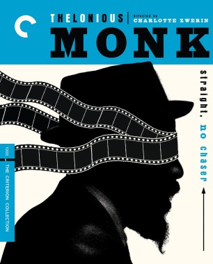
Thelonious Monk is terrific, is it a Criterion original Others are meh
-
ryannichols7
- Joined: Mon Jul 16, 2012 6:26 pm
Re: Criterion & Eclipse Cover Art & Packaging Babble-on Vol. 7
also only like Thelonious Monk. the rest are...not good...
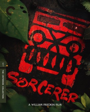
I'm not a fan of Sorcerer but surely there's better art out there for it?
I'm not a fan of Sorcerer but surely there's better art out there for it?
-
Furstemberg

- Joined: Thu Aug 12, 2021 5:31 pm
Re: Criterion & Eclipse Cover Art & Packaging Babble-on Vol. 7
Is there a rule at Criterion that black and white classics must receive black and white cartoon covers…
-
ryannichols7
- Joined: Mon Jul 16, 2012 6:26 pm
Re: Criterion & Eclipse Cover Art & Packaging Babble-on Vol. 7
can we go back to having covers like The Palm Beach StoryFurstemberg wrote: Fri Mar 14, 2025 3:39 pm Is there a rule at Criterion that black and white classics must receive black and white cartoon covers…
-
soundchaser

- Leave Her to Beaver
- Joined: Sun Aug 28, 2016 4:32 am
Re: Criterion & Eclipse Cover Art & Packaging Babble-on Vol. 7
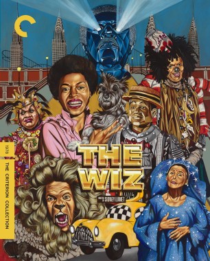
The contrast between Thelonious Monk and The Wiz could not be starker.
-
andyli

- Joined: Thu Sep 24, 2009 8:46 pm
Re: Criterion & Eclipse Cover Art & Packaging Babble-on Vol. 7
Or The Rules of the Game (the second last edition).ryannichols7 wrote: Fri Mar 14, 2025 3:42 pm can we go back to having covers like The Palm Beach Story
-
sabbath
- Joined: Fri Apr 25, 2014 10:29 am
Re: Criterion & Eclipse Cover Art & Packaging Babble-on Vol. 7
Sorcerer may look lame at first glance, but I quite like its texture in a larger image.
-
DeprongMori

- Joined: Fri Apr 04, 2014 5:59 am
- Location: San Francisco
Re: Criterion & Eclipse Cover Art & Packaging Babble-on Vol. 7
I actually love the Sorcerer cover and consider it one of their best alongside their re-issue of The Wages of Fear.
-
dwk

- Joined: Sat Jun 12, 2010 10:10 pm
Re: Criterion & Eclipse Cover Art & Packaging Babble-on Vol. 7
I mostly like the Sorcerer, but it doesn't need the flora. Just the logo and title in red on black would look better.
But it would have been fun if they had hired a different artist to redraw their new Wages of Fear cover.
But it would have been fun if they had hired a different artist to redraw their new Wages of Fear cover.
-
Lowry_Sam

- Joined: Mon Jul 05, 2010 7:35 pm
- Location: San Francisco, CA
Re: Criterion & Eclipse Cover Art & Packaging Babble-on Vol. 7
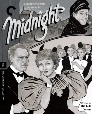
For me the biggest disappointment is Midnight, the original poster is perfect.
-
Kracker
- Joined: Sat Sep 28, 2013 6:06 pm
Re: Criterion & Eclipse Cover Art & Packaging Babble-on Vol. 7
Man, happy to finally to get Sorcerer but its kind of a disappointment especially after the beautiful new cover The Wages of the Fear just got.
Could be way worse though, feels like they went the safe route. (no pun intended on that)
Could be way worse though, feels like they went the safe route. (no pun intended on that)
-
Saturnome

- Joined: Sun Aug 12, 2007 9:22 pm
Re: Criterion & Eclipse Cover Art & Packaging Babble-on Vol. 7
I guess it's trying to evoke Blue Note covers, but Thelonious Monk Straight No Chaser is looking like a Criterion from 20 years ago.
-
ryannichols7
- Joined: Mon Jul 16, 2012 6:26 pm
Re: Criterion & Eclipse Cover Art & Packaging Babble-on Vol. 7
yes, this remains one of my all time favorite covers. more of that would be welcomed!andyli wrote: Fri Mar 14, 2025 3:48 pmOr The Rules of the Game (the second last edition).ryannichols7 wrote: Fri Mar 14, 2025 3:42 pm can we go back to having covers like The Palm Beach Story
or also ..just using original poster art every now and then would be lovely