Hmm, now let me see... Blazing Saddles, sounds like a western...Monument Valley, old-timey Western lettering, and a saddle on fire. Yup, that's it!
Must've gotten AI to do this one.
I love Amazon algorithms. Was looking for Pasolini's The Gospel According to Matthew and this was suggested as
something I might like.
Two middle-aged fellows with portly frames, matching lavaliers, button-down blue shirts, and beige pants set off on a journey
of discovery down ye olde Route 60.
"Is there anything more erotic than the relationship between Ambassador and Secretary? This Summer, witness their Biblical passions explode in the ultimate Middle East conflict!"
I was once recommended a Kylie Greatest Hits DVD because I'd bought a very serious classical music documentary by Christopher Nupen.
Since I had Nupen's email address, I forwarded it to him, and he replied saying that he liked to think that Kylie fans were similarly being pushed in his direction.
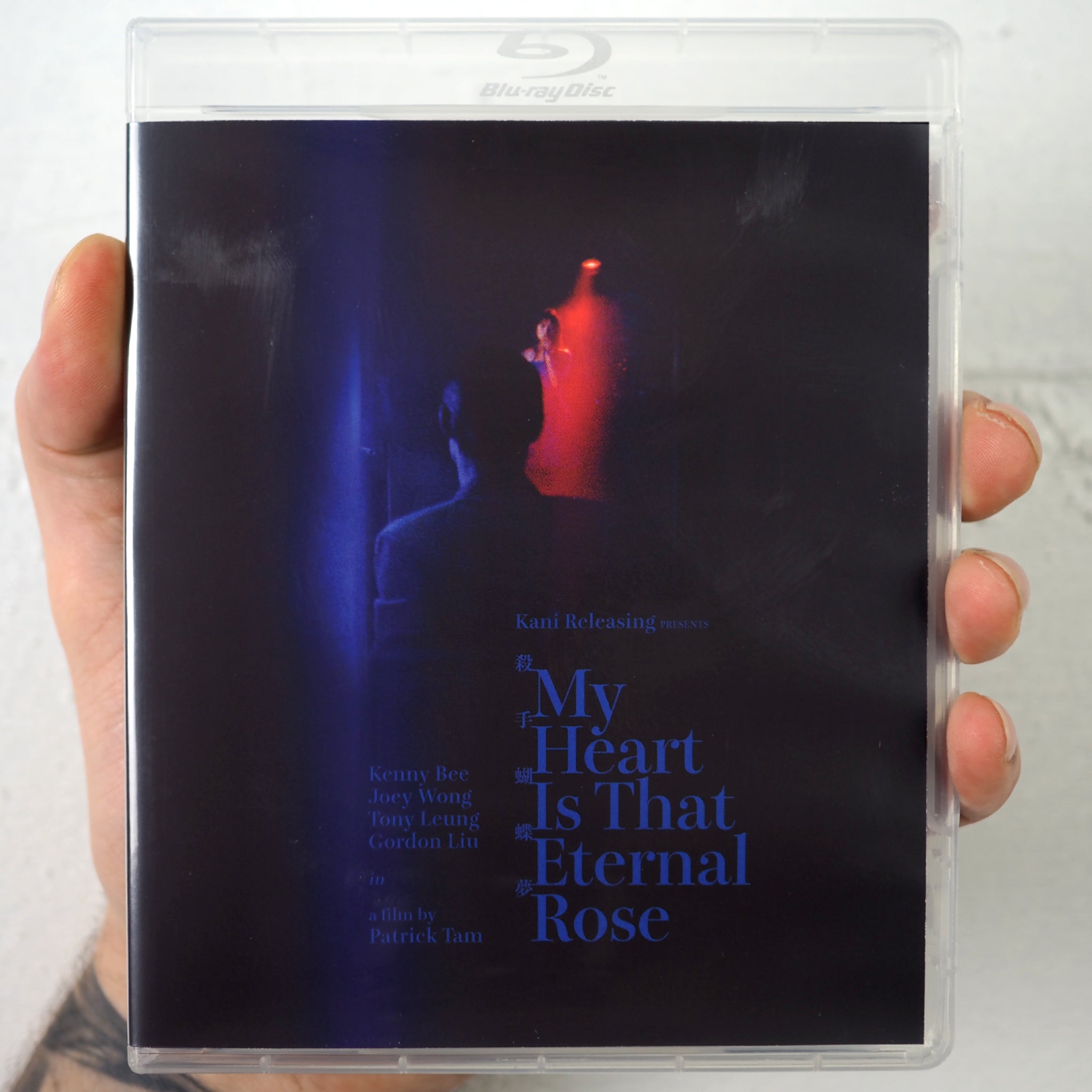
The choices Kani's cover designer for My Heart Is That Eternal Rose made are a bit confounding. I haven't watched the film (for the first time) yet but the slipcover colors are, uhm, loud and garish. Might be appropriate for the film but aesthetically it's not my thing. The actual cover feels moodier but the dark blue font colour against an already darkened image makes the title and cast names hard to read. I suppose they wanted the title etc to blend in but I had to hold the case up close to be able to read the smaller text. Either way, looking forward to watching the film tonight.
Finch wrote:The choices Kani's cover designer for My Heart Is That Eternal Rose made are a bit confounding. I haven't watched the film (for the first time) yet but the slipcover colors are, uhm, loud and garish. Might be appropriate for the film but aesthetically it's not my thing. The actual cover feels moodier but the dark blue font colour against an already darkened image makes the title and cast names hard to read. I suppose they wanted the title etc to blend in but I had to hold the case up close to be able to read the smaller text. Either way, looking forward to watching the film tonight.
Can you link to it? The movie is full of saturated primary colours, especially blues and reds, tho’ the atmosphere was more cool or passionate than garish.
Wow, that slipcover is nothing like the film. It’s like a bad expressionist painting. The actual cover is quite nice, tho’, and captures the film’s aesthetic.
I haven't seen the film, but I'm going to admit, there's something I kind of like about the slipcover (though if anything, it looks more like a drama about a limerent stalker than what the film actually seems to be about, so I can see why people dislike it). I do prefer the actual cover though, and I agree that the blue text on a dark background makes it hard to read.
Apperson wrote: Wed Oct 16, 2024 8:43 pm
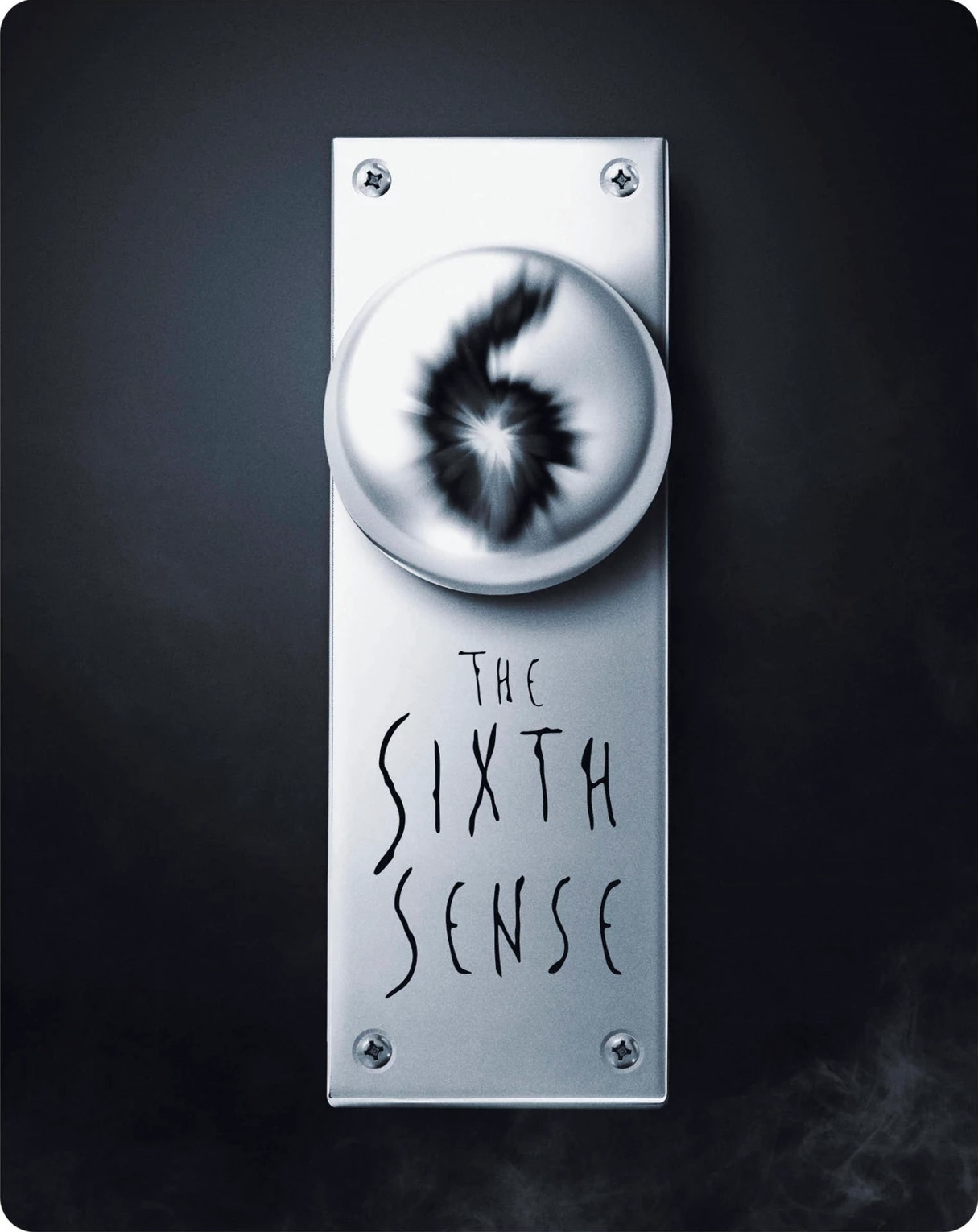
HMV Exclusive steelbooks, for collectors who care about flashing money more then having good taste. The Sixth Sense
It's telling that the Platinum Series DVD release did a better job at creating a minimalist cover, this one looks like a placeholder (and to think this UHD took a long time to get released).
Captain Paranoia wrote:It's telling that the Platinum Series DVD release did a better job at creating a minimalist cover, this one looks like a placeholder (and to think this UHD took a long time to get released).
The Platinum Series DVD was basically a copy of Criterion's LaserDisc cover.