MONTHLY COVER THOUGHTS: October 2023
- Don't Look Now: OLD COVER ALERT!!! The usage of blood to create the film's main symbol - one of the many recurring images that simultaneously confuse and clarify in tandem - makes for both a striking cover without firsthand knowledge of the film and a disquieting one when viewed in context. The only disappointing aspect is the placement of Julie Christie and Donald Sutherland's names - given the amount of free space, you would think there would be a less awkward placement that towards the end of the blood-coat. Even with that caveat, this is still a great cover, and I'm happy that they
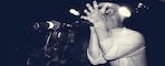
- Videodrome: OLD COVER ALERT!!! It's a classic; obviously, this benefits from the rest of the packaging (that Beta tape gag still works), but the artwork on the outer sleeve itself is still rather effective. The drawing gives it a strange, surrealist quality that enhances the nightmarish imagery, and it's a good taster for the type of body horror that awaits those watching the film for the first time. It is interesting (and a little disquieting) to think about how old the cover is though

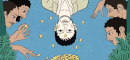
- Tod Browning's Sideshow Shockers: It's cute in concept - literalizng the sideshow settings in the films to the primary "attraction" - but much better in execution. Obviously, the centerpiece is Freaks, but it's nice to see The Unknown and The Mystic get decent spotlighting. The descriptors for the film, written in good ol' carny-speak, are a nice touch as well. The individual covers are somewhat weak, but it's safe to say that this will probably be a traditional boxed release rather than a grand boxset. Overall, a neat idea elevated by good execution
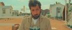
- The Others: GREGRUTHGREGRUTHGREGRUTH!!!!!! Fangirling aside, this is a genuinely beautiful cover; it's simple, but damn if it isn't beautiful. I genuinely thought that this was a lazy photo-based rushjob, but when I realized that it was a drawing (the hair gave it away), my thoughts did a complete 180. The fact that it's able to be effective despite its simplicity makes it all the more better. Easily the best of the batch, and a contender for best of the year
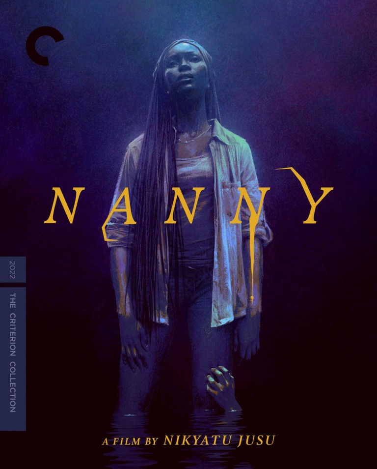
- Nanny: It's a pretty-looking cover, but it feels a bit basic. The implications of the horror elements feels like an afterthought (which is the vibe I'm getting from the trailer - I have not previously seen this film); the incorporation of water could have helped, though I guess that would be misleading? A cover that feels like its missing something