Criterion & Eclipse Cover Art & Packaging Babble-on Vol. 7
-
Kracker

- Joined: Sat Sep 28, 2013 6:06 pm
Re: Criterion & Eclipse Cover Art & Packaging Babble-on Vol. 7
Now they just need to actually press a DVD just for Hyde's rarest DVD edition.
-
Never Cursed

- Such is life on board the Redoutable
- Joined: Sun Aug 14, 2016 4:22 am
Re: Criterion & Eclipse Cover Art & Packaging Babble-on Vol. 7
Jeez, is the Anora cover the most hotly-discussed Criterion cover of all time outside of this forum? Some parts of twitter sound like this thread
-
DimitriL
- Joined: Thu Jul 24, 2014 10:07 pm
Re: Criterion & Eclipse Cover Art & Packaging Babble-on Vol. 7
I think the most discussed one since Querelle and the pseudo-AI controversy, certainly.
-
Computer Raheem
- Joined: Wed Jun 16, 2021 11:45 pm
Re: Criterion & Eclipse Cover Art & Packaging Babble-on Vol. 7
T h e l o n g - a w a i t e d r e t u r n . . .
MONTHLY COVER THOUGHTS: April 2025
MONTHLY COVER THOUGHTS: April 2025
- Ugetsu: OLD COVER ALERT! Pretty pretty! A nicely hazy-looking cover that's held up over the past 20(!) years; hopefully the next upgrade will keep the same art
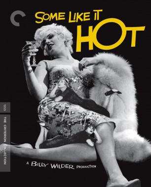
- Some Like It Hot: OLD COVER ALERT! I remember that my perusing around the forum began right around the time this abomination of a cover hit our collective eyes, and the... acceptance that was greeted to the revised one. It's ultimately mediocre, and I have no real opinion on its quality, but seeing it in the lineup made me oddly nostalgic. Strange thing to get nostalgic for, but

- Chungking Express: Horrendous artwork that encapsulates a lot of what I've found annoying about Wong Kar-wai's step back into the river, embracing a shallow aestheticization of the "Wong Kar-wai mood" - a mood that only really started with In the Mood for Love - that misses a lot of the energy that his early work has. The original artwork is so much better
- Jean de Florette / Manon of the Spring: It's pretty, but that's all there is to say; a bland niceness, which looks representative of the films themselves (in my opinion 8-[ )
- Anora: I don't hate this cover as much as some other people do, but I'm not particularly fond of it, either. I get the reference to both Soledad Miranda and Vampyros Lesbos, but it feels both disconnected from both the artwork's intended purpose as a advertisement of the film (why this reference, in particular, outside of Baker liking Jesús Franco's work?) and as a representation of what the film is trying to say. What does this artwork - and, frankly, a lot of the key art involving Mikey Madison - have to do with the film's themes? I get it as a bait-and-switch, but it feels shallow when the art doesn't feature any of the subversion featured in the film proper. It simply presents her as just a pretty face (which, let's be honest here...
 ) and it feels like bait for the film's most ardent detractors, and the reference only gives them fuel; hopefully we can bully them to change it (we have precedent in this release lineup lol)
- Basquiat: The last thing I should be using to describe anything Basquiat-related is "bland". Embraces the most annoying signifiers of Basquiat references and looks bad to boot; frankly looks like a good representation of the film itself (why would you present this in black-and-white?)
- Prince of Broadway: Even if it was just the cover itself, it'd be the best new cover here, but the concept and its execution make it genuinely brilliant. A genuinely funny concept that holds thematic resonance with the film itself? Who'd have thunk? Extra praise to sneaking in The Dark Knight in there as well (trying to figure out what the movie above it lol). Wonder what Criterion thinks of referencing one of their (surprisingly plentiful) bootlegs
-
Computer Raheem
- Joined: Wed Jun 16, 2021 11:45 pm
Re: Criterion & Eclipse Cover Art & Packaging Babble-on Vol. 7
Unfortunately...Never Cursed wrote: Thu Jan 16, 2025 2:59 am Jeez, is the Anora cover the most hotly-discussed Criterion cover of all time outside of this forum? Some parts of twitter sound like this thread
-
Kracker
- Joined: Sat Sep 28, 2013 6:06 pm
Re: Criterion & Eclipse Cover Art & Packaging Babble-on Vol. 7
Don't know why, the cover looks exactly how I expected it to and this is probably the most sexually charged big award contender in I don't know how long. It's also appropriate given how the expectations are subverted in the film. The nice red color scheme and usage of the Sean Baker font makes it a winner to me.
-
The Narrator Returns
- Joined: Tue Nov 15, 2011 10:35 pm
Re: Criterion & Eclipse Cover Art & Packaging Babble-on Vol. 7
It doesn't seem to be a movie above it, just a bootleg DVD about Rihanna tying this further to 2008. And the little sliver in the top right, which Sister Hyde revealed on Instagram when someone correctly guessed it, is what has to be the Criterion with the most bootlegs at the timeComputer Raheem wrote: Thu Jan 16, 2025 3:46 amExtra praise to sneaking in The Dark Knight in there as well (trying to figure out what the movie above it lol). Wonder what Criterion thinks of referencing one of their (surprisingly plentiful) bootlegs[/list]
Spoiler
Benjamin Button
-
HinkyDinkyTruesmith

- Joined: Tue Aug 08, 2017 2:21 am
Re: Criterion & Eclipse Cover Art & Packaging Babble-on Vol. 7
Probably because I'm the one who "instigated" the discourse by criticizing the cover and Neon's marketing line. Of course my tweets don't usually accrue so much attention and I was not expecting it to explode as it did, especially with so much deliberate misreading.Never Cursed wrote: Thu Jan 16, 2025 2:59 am Jeez, is the Anora cover the most hotly-discussed Criterion cover of all time outside of this forum? Some parts of twitter sound like this thread
-
ryannichols7

- Joined: Mon Jul 16, 2012 6:26 pm
Re: Criterion & Eclipse Cover Art & Packaging Babble-on Vol. 7
we agree on two out of three! while I don't like Baker at all, and was dreading this being part of the announcements and asking why his early films are being released standalone and not in a box....this cover justified that entirely. probably their most creative art since Festen easilyWalter Kurtz wrote: Wed Jan 15, 2025 10:09 pm Prince of Broadway -- a wonderfully appropriate idea and execution
Chungking Express -- I disagree rather whole heartedly with ryannichols that the cover is inappropriate to the style/genre of the film. My take has always been that Wong's manic-happiness is a front she puts on for the world in an attempt to keep her true sad pensive longings buried. And one of those longings shares the cover with her... blurred, out-of-focus... just as our deepest longings are always in our mind's eye... buried on our third or fourth level of consciousness... barely there, but always there.
Florette/Manon -- The best-designed old-style romance novel cover in history. Again, what a wonderful idea... to replicate the romance novel passions... but instead of yearning love... yearning retribution.
to further expand on Chungking without making it about Wong's color grading/technical revisionism: I rewatched the movie the other night for the first time in about three years, and it's still a favorite. but a big reason it's such a favorite (and all of Wong's 90s movies are, and I happen to like almost all of them better than In the Mood for Love) is because of the fact that it's so thrown together, which it genuinely actually was. as Zero Degree Buenos Aires and the Moving Pictures featurettes show, Wong was the king of just throwing shit together and coming up with a great movie in the 90s (Ashes of Time obviously aside). sure, his characters go through and show complex emotions. Faye Wong's stares in Chungking certainly carry a lot of weight to them, but I don't think they're reflective of the tone or mood of the entire movie in the slightest. the movie is a loud, fun pop romcom to me even in its most introspective moments, my favorite scene in the movie even being
Spoiler
where Takeshi Kaneshiro's character, after we've seen him be a loser and almost *too far* as a creep for 35 odd minutes, losing the audience, he has the incredible moment in the hotel room with sleeping Brigitte Lin. if he was truly an awful person, he could've done something awful to her. instead he just takes in her presence, eats, watches movies, and then removes her shoes before leaving. that really touched me big time on this watch and basically is the movie equivalent of Brian Eno's "I'll Come Running", a goofy little thing that ends up being very endearing
-
tenia

- Ask Me About My Bassoon
- Joined: Wed Apr 29, 2009 3:13 pm
Re: Criterion & Eclipse Cover Art & Packaging Babble-on Vol. 7
It also seems that several people dislike the movie, and it's allowing them to pile on it again : because they think Criterion shouldn't include it in their collection, and because of the cover.HinkyDinkyTruesmith wrote:Probably because I'm the one who "instigated" the discourse by criticizing the cover and Neon's marketing line. Of course my tweets don't usually accrue so much attention and I was not expecting it to explode as it did, especially with so much deliberate misreading.Never Cursed wrote: Thu Jan 16, 2025 2:59 am Jeez, is the Anora cover the most hotly-discussed Criterion cover of all time outside of this forum? Some parts of twitter sound like this thread
-
sabbath
- Joined: Fri Apr 25, 2014 10:29 am
Re: Criterion & Eclipse Cover Art & Packaging Babble-on Vol. 7
Not to disagree with anything, just to share Sean Baker's own explanation (from SlashFilm article "Director Sean Baker Explains How Anora Is Linked To A Lesbian Vampire Film [Exclusive Interview]") :Computer Raheem wrote: Thu Jan 16, 2025 3:46 am
- Anora: I don't hate this cover as much as some other people do, but I'm not particularly fond of it, either. I get the reference to both Soledad Miranda and Vampyros Lesbos, but it feels both disconnected from both the artwork's intended purpose as a advertisement of the film (why this reference, in particular, outside of Baker liking Jesús Franco's work?) and as a representation of what the film is trying to say. What does this artwork - and, frankly, a lot of the key art involving Mikey Madison - have to do with the film's themes? I get it as a bait-and-switch, but it feels shallow when the art doesn't feature any of the subversion featured in the film proper. It simply presents her as just a pretty face (which, let's be honest here...
One of the things in "Anora" that delighted me personally as a film nerd is seeing in the credits a special thanks to Jess Franco and Soledad Miranda.
Yeah, thank you. I love that. I love that.
What sparked that? I mean, was it just the vibe of their films together that inspired you while making this? Or was it something more specific?
Yes. And well, specifically, there is that red scarf that comes from "Vampyros Lesbos" in which Soledad Miranda wears it, and that prop becomes part of her character. Well, that's what we were doing with Ani. We were making that red scarf a very important prop — more than just a prop. It signifies, in many ways, her suppression, in a way. I mean, this thing is being used to silence her, and yet then she has to use it for her own comfort and warmth. So we're playing with that.
I could have thanked a million filmmakers. I mean, you probably see my influences. I'm wearing them on my sleeve in this film. But I think it was also probably that relationship, how he shot Soledad Miranda in those couple of films that he made with her. I started to recognize that's how I was shooting Mikey on the set. She was literally in every shot of the entire film, just about, and so was Soledad in those movies. So I felt it was appropriate. And I also wanted to kind of call attention to those movies to general audiences who may never have heard of Jess Franco.
-
tenia
- Ask Me About My Bassoon
- Joined: Wed Apr 29, 2009 3:13 pm
Re: Criterion & Eclipse Cover Art & Packaging Babble-on Vol. 7
On a different note, I find it quite funny that now, even Criterion's cover for Jean de Florette / Manon des Sources has the lab's color signature on it !
-
afilmcionado
- Joined: Mon Sep 28, 2020 1:14 pm
Re: Criterion & Eclipse Cover Art & Packaging Babble-on Vol. 7
I agree with this analysis. The original artwork for Chungking Express is one of the most culturally iconic in Wong Kar-wai’s catalogue. And it looks something like this:ryannichols7 wrote: Thu Jan 16, 2025 7:26 am
to further expand on Chungking without making it about Wong's color grading/technical revisionism: I rewatched the movie the other night for the first time in about three years, and it's still a favorite. but a big reason it's such a favorite (and all of Wong's 90s movies are, and I happen to like almost all of them better than In the Mood for Love) is because of the fact that it's so thrown together, which it genuinely actually was. as Zero Degree Buenos Aires and the Moving Pictures featurettes show, Wong was the king of just throwing shit together and coming up with a great movie in the 90s (Ashes of Time obviously aside). sure, his characters go through and show complex emotions. Faye Wong's stares in Chungking certainly carry a lot of weight to them, but I don't think they're reflective of the tone or mood of the entire movie in the slightest. the movie is a loud, fun pop romcom to me even in its most introspective moments, my favorite scene in the movie even being
so I think my big issue is this idea that Wong has about himself where all of his movies became these ultra serious art movies that all have the intense yearning and artistry that ITMFL has. they're all artistic! they all feature people yearning and being sad (especially Happy Together, but that's a long discussion for another time)! but that movie is so far removed from the rest of his catalog, and it's pretty reductive to slam that filter on the rest of his movies I think. especially the 4 90s movies that weren't Ashes of Time - all of them feel super ragtag and amateur in the best way possible, and in many cases exactly were that. while the old Chungking Express cover was better, I still think the original theatrical posters with the collage-style art were perfect in terms of nailing the tone of the film. and plus they represented both stories - I've been glad to see Criterion regularly feature Kaneshiro and his pineapples on their social media a lot, but it has always irked me a little that the Wang/Leung story has often dominated the key art and people's memory of the film - I like the Kaneshiro/Lin story better, and I know I'm not alone on that, and even if one doesn't agree, it should be represented in some way!Spoiler
where Takeshi Kaneshiro's character, after we've seen him be a loser and almost *too far* as a creep for 35 odd minutes, losing the audience, he has the incredible moment in the hotel room with sleeping Brigitte Lin. if he was truly an awful person, he could've done something awful to her. instead he just takes in her presence, eats, watches movies, and then removes her shoes before leaving. that really touched me big time on this watch and basically is the movie equivalent of Brian Eno's "I'll Come Running", a goofy little thing that ends up being very endearing
https://image.tmdb.org/t/p/original/ejk ... 3aRkr8.jpg
It really captures the manic, mad-dash, we-made-it-in-three-months nature of the film. It’s obviously valid for Criterion to go into another direction, but it’s equally valid to think it’s not as good.
-
dda1996a

- Joined: Tue Oct 27, 2015 10:14 am
Re: Criterion & Eclipse Cover Art & Packaging Babble-on Vol. 7
That is one of the most disgusting threads I've seen in a while, but why am I surprised with how X has turned under Musk (I mean the second one of course)Computer Raheem wrote: Thu Jan 16, 2025 3:46 am T h e l o n g - a w a i t e d r e t u r n . . .
- Anora: I don't hate this cover as much as some other people do, but I'm not particularly fond of it, either. I get the reference to both Soledad Miranda and Vampyros Lesbos, but it feels both disconnected from both the artwork's intended purpose as a advertisement of the film (why this reference, in particular, outside of Baker liking Jesús Franco's work?) and as a representation of what the film is trying to say. What does this artwork - and, frankly, a lot of the key art involving Mikey Madison - have to do with the film's themes? I get it as a bait-and-switch, but it feels shallow when the art doesn't feature any of the subversion featured in the film proper. It simply presents her as just a pretty face (which, let's be honest here...
-
spectre
- Joined: Thu Dec 29, 2011 8:52 am
Re: Criterion & Eclipse Cover Art & Packaging Babble-on Vol. 7
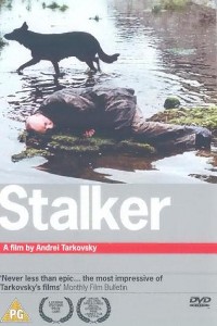
I may be misreading it, but I assume a big part of the backlash (perhaps in part on a subconscious level) is that being transparently horny is culturally perceived as embarrassing. For Baker along with Madison as entirely complicit subject, both no doubt vehemently opposed to that mentality, perhaps that's the point: to present an image that communicates "yeah I am, so what?". It's not exactly gratuitous, because it's in keeping with the ostensibly sex-positive (and specifically sex-work-positive) vibe of the film, and the distribution strategy seems to be leaning in pretty heavily to what might, in a past time, have been described as objectification (see: Neon tweeting "Bring her home"; yes, her!). So in that sense, it's a provocation, with everything that goes with that: maybe doesn't quite fit the brief in the sense that it sums up neither character nor film adequately, but it's an iconic image nonetheless, and great film posters and DVD covers do tend towards iconic rather than representative. Stalker isn't really about the dog, either, but I'll never forget that Artificial Eye cover that first drew me in to watch it.
None of that is to say I actually like this though. I couldn't quite put my finger on it at the time, but I did find something a bit cringeworthy in the film's whole artist/muse vibe (for example, the shot later in the film of Madison standing by the apartment window with snow falling outside seemed a bit like what a certain kind of guy might think is a perfect cinematic image, you know?), so I guess my own instinctive reaction was to see the cover as more of the same, dialled up to 11. But I can respect the intention: it's certainly better than something bland or, worse, apologetic for the film it's representing, and I expect fans of the film will eat it up. And why not? Even in the very temple of Criterion, fanservice has its sovereign shrine.
None of that is to say I actually like this though. I couldn't quite put my finger on it at the time, but I did find something a bit cringeworthy in the film's whole artist/muse vibe (for example, the shot later in the film of Madison standing by the apartment window with snow falling outside seemed a bit like what a certain kind of guy might think is a perfect cinematic image, you know?), so I guess my own instinctive reaction was to see the cover as more of the same, dialled up to 11. But I can respect the intention: it's certainly better than something bland or, worse, apologetic for the film it's representing, and I expect fans of the film will eat it up. And why not? Even in the very temple of Criterion, fanservice has its sovereign shrine.
-
Walter Kurtz

- Joined: Sat Jul 25, 2020 7:03 pm
Re: Criterion & Eclipse Cover Art & Packaging Babble-on Vol. 7
ryannichols and afilmcionado... I appreciate your CE viewpoints! It's a great when people are touched by completely different things in the same movie. All I take away from CE is Wong, California Dreaming and Tony Leung's blueish soft flannel cotton shirt. I want that shirt!
-
cdnchris

- Site Admin
- Joined: Tue Nov 02, 2004 6:45 pm
- Location: Washington
- Contact:
Re: Criterion & Eclipse Cover Art & Packaging Babble-on Vol. 7
Didn't receive Performance yet, but here's the rest of February:
Cronos [4K] (Booklet)
Punch-Drunk Love [4K]
King Lear
Crossing Delancey [4K]
Drugstore Cowboy [4K]
Cronos [4K] (Booklet)
Punch-Drunk Love [4K]
King Lear
Crossing Delancey [4K]
Drugstore Cowboy [4K]
-
cdnchris
- Site Admin
- Joined: Tue Nov 02, 2004 6:45 pm
- Location: Washington
- Contact:
-
olmo

- Joined: Wed Jul 16, 2014 5:10 pm
Re: Criterion & Eclipse Cover Art & Packaging Babble-on Vol. 7
I like the booklet as reverse image to the main artwork.
Nifty. Smart.
Nifty. Smart.
-
cdnchris
- Site Admin
- Joined: Tue Nov 02, 2004 6:45 pm
- Location: Washington
- Contact:
Re: Criterion & Eclipse Cover Art & Packaging Babble-on Vol. 7
I forgot to upload the pic (I'll try to remedy that when I can) but the Blu-ray art has everything in reverse, too; the wacky C, the title, etc.
-
Finch

- Joined: Mon Jul 07, 2008 9:09 pm
- Location: United States


-
domino harvey

- Dot Com Dom
- Joined: Wed Jan 11, 2006 6:42 pm
Re: Criterion & Eclipse Cover Art & Packaging Babble-on Vol. 7
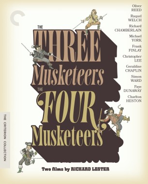
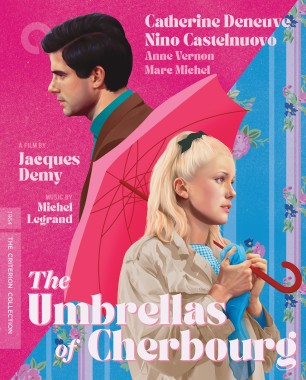
Lester cover is too text heavy, Demy is good, rest are whatever
-
dwk

- Joined: Sat Jun 12, 2010 10:10 pm
Re: Criterion & Eclipse Cover Art & Packaging Babble-on Vol. 7
I assume all those names on the Musketeers cover are contractually obligated to appear.
-
domino harvey
- Dot Com Dom
- Joined: Wed Jan 11, 2006 6:42 pm
Re: Criterion & Eclipse Cover Art & Packaging Babble-on Vol. 7
Based on the litigious history of the film, I don’t doubt it. But making even more text the central image of the cover art feels like a poor choicedwk wrote: Fri Feb 14, 2025 4:57 pm I assume all those names on the Musketeers cover are contractually obligated to appear.
-
denti alligator
- Joined: Thu Nov 04, 2004 1:36 am
- Location: "born in heaven, raised in hell"
Re: Criterion & Eclipse Cover Art & Packaging Babble-on Vol. 7
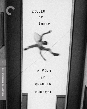
I like Killer of Sheep and the Kiarostami, and since those are the ones I'll likely buy, that's makes me happy.