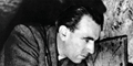
I was thinking a glossy vs matte texture to achieve the lettering (making it almost invisible from some angles). A Vietnam trilogy boxset. Thanks to dvdbeaver/gary for a couple of the stills.
Last edited by jon on Thu Apr 02, 2009 7:07 pm, edited 6 times in total.
I know there was Hou Hsiao hsien faux box set cover art posted here last year, but would anyone be interested in making cover art for Hou's Taiwan trilogy?
I like the Vertical Ray one, although I have a feeling Criterion would go with the "At the Height of Summer" title. The Cyclo one is just too hard to look at (not a big fan of the movie, either).
I would love to see Tran in the collection. Vertical Ray and Green Papaya are two of my absolute favorites.
I don't feel this cover is very indicative of the film, but Pierre Bonnard's The Road to Nantes always reminded me of the ending (and i always wanted to try using it). I would probably use the opening scene/shot if I were to make a real one.
jon wrote:I don't feel this cover is very indicative of the film, but Pierre Bonnard's The Road to Nantes always reminded me of the ending (and i always wanted to try using it). I would probably use the opening scene/shot if I were to make a real one.
I'm reminded of the literary fiction I read in high school.
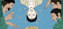
here is a new cover i made i didnt draw the picture i just found it on google and then made a few change, added in the title, and all the criterion stuff
Cosmic Bus wrote:I think this one is supposed to be part of an eventual Eclipse set
That's pretty damn good. Did you do that type treatment yourself? I think if you rotated the image of the 3 guys clockwise about 10-15% and made it a little bit bigger so that the left-most guy's arm fills that dead space below the title and above the Criterion slug, it would have much more punch. And maybe make the Wacky C and Criterion slug yellow with black text.
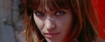
As per A Colt is My Passport (what a great title), I think something should be done about the top right. The rest of the top space is so dead, it feels weird to have this huge, imposing graphic there all by its lonesome.
Added a slightly revised Colt cover to my previous post. I (foolishly) hadn't saved the original PSD, so I had to recreate quite a bit of it this time around... \:D/ I tried shifting the men around, but due to limitations of the original photo, it doesn't really work any other way.
jbeall wrote:I hadn't been to this thread in awhile, and I'm surprised not to see more comments on this cover, which is stunning. Great job, Feego!
Thanks so much, jbeall!
To cosmic bus, that "Repulsion" cover is outstanding! It perfectly captures the essence of the film. Disturbing and creepy--I'd snatch it up in an instant. Well, I guess I'd snatch up the film regardless of the cover, but that is icing on the cake!
How about a theme for 'obscure first films'? Kubrick's "Fear and Desire," Weir's "The Cars That Ate Paris," Solondz's "Fear Anxiety and Depression," Haynes' "Poison," etc. Why not throw in Jarmusch's "Permanent Vacation" and Linklater's "It's Impossible to Learn to Plow by Reading Books" as well, even though they were included as extras on the editions of said directors' more famous sophomore efforts?