News on Criterion and Janus Films
godardslave
Joined: Tue Nov 02, 2004 8:44 pmLocation: Confusing and open ended = high art.
#26
Post
by godardslave Tue Aug 30, 2005 4:01 am
dx23 wrote: There are some South Park Criterion covers that I found both hillarious and great looking.
Here is the link
if you read more of the thread, and what is reasonably clever, is that he has put spine numbers on the fake south park covers which actually correspond to real spine numbers in the criterion collection that each cover is "inspired" by.
daniel p
Joined: Wed Nov 03, 2004 1:01 amLocation: Melbourne, Australia
#29
Post
by daniel p Wed Sep 14, 2005 4:42 am
sorry, but you can't just post that image with no mention of where/how you got it...
Gigi M.
Joined: Wed Jul 06, 2005 9:09 pmLocation: Santo Domingo, Dominican Rep
#30
Post
by Gigi M. Wed Sep 14, 2005 1:07 pm
Great. However that image looks fake.
Cinesimilitude
Joined: Tue Jul 09, 2013 4:43 am
#31
Post
by Cinesimilitude Wed Sep 14, 2005 2:23 pm
gigimonagas wrote: Great. However that image looks fake.
That was kind of the point. It took me about 5 minutes. I could have gone all out and made it look real, then posted it small in a ebay screenshot with text like "SPIRIT OF THE BEEHIVE CRITERION VERY RARE NOT YET RELEASED!!!!" beside it, and then tell you all that it was gone when i checked again.
I figured that was going a little too far.
cafeman
Joined: Sun Nov 07, 2004 2:19 pm
#32
Post
by cafeman Wed Sep 14, 2005 2:31 pm
I actually really dig the cover.
Sure beats Masculin-Feminin anyway.
Cinephrenic
Joined: Tue Nov 02, 2004 6:58 pmLocation: Paris, Texas
#33
Post
by Cinephrenic Wed Sep 14, 2005 3:14 pm
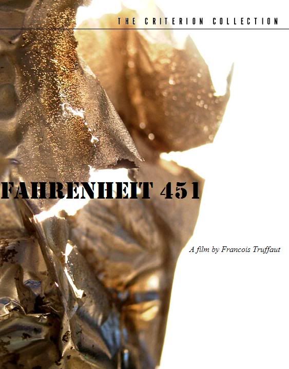
This is got to be authenic. Who is gonna make a cover like that and post it on eBay. My senses tell me that this is real. Maybe coming in December or January.
Cinesimilitude
Joined: Tue Jul 09, 2013 4:43 am
#34
Post
by Cinesimilitude Wed Sep 14, 2005 3:32 pm
ummm... I did. sorry cinephrenic. all photoshop.
see how I cropped one of the lower honeycombs to allow for more room for the title? It was a really quick job.
Michael
Joined: Wed Nov 03, 2004 4:09 pm
#35
Post
by Michael Wed Sep 14, 2005 3:37 pm
Not too crazy about the cover. Too dated in design. Same artwork as the British poster.
Jem
Joined: Mon May 02, 2005 3:03 amLocation: Potts Point
#37
Post
by Jem Wed Sep 14, 2005 11:40 pm
ummm... I did. sorry cinephrenic. all photoshop.
See all the trouble you have caused, very funny.
Cinesimilitude
Joined: Tue Jul 09, 2013 4:43 am
#38
Post
by Cinesimilitude Thu Sep 15, 2005 3:14 am
Michael wrote: Not too crazy about the cover. Too dated in design. Same artwork as the British poster.
just as long as you know that that is NOT the cover...
Gordon
Joined: Thu Nov 11, 2004 12:03 pm
#39
Post
by Gordon Thu Sep 15, 2005 7:22 am
I don't like that artwork that Criterion have used. It looks like it was created by some wanker at the Criterion Forums.
Michael
Joined: Wed Nov 03, 2004 4:09 pm
#40
Post
by Michael Thu Sep 15, 2005 1:18 pm
I don't think they get it.
Oh believe me I got it first time I laid my eyes on your "cover". I just wanted to throw in a criticism of your choice of the artwork..blah blah.
Cinesimilitude
Joined: Tue Jul 09, 2013 4:43 am
#41
Post
by Cinesimilitude Thu Sep 15, 2005 3:31 pm
thats all well and good, I think it sucks myself. like i said. 5 MINUTES.
daniel p
Joined: Wed Nov 03, 2004 1:01 amLocation: Melbourne, Australia
#43
Post
by daniel p Tue Nov 29, 2005 1:48 am
godardslave
Joined: Tue Nov 02, 2004 8:44 pmLocation: Confusing and open ended = high art.
#44
Post
by godardslave Tue Nov 29, 2005 1:53 am
come on, someone do one for viridiana.
zedz
Joined: Sun Nov 07, 2004 11:24 pm
#46
Post
by zedz Tue Nov 29, 2005 2:18 am
Does this prove that anything would be better than the current monstrosity?
godardslave
Joined: Tue Nov 02, 2004 8:44 pmLocation: Confusing and open ended = high art.
#49
Post
by godardslave Tue Nov 29, 2005 5:56 am
hehe, nice!!
rwaits
Joined: Tue Dec 21, 2004 4:24 pm
#50
Post
by rwaits Tue Nov 29, 2005 6:24 am
Thats hilarious.


