Oh, That Viridiana Cover!
-
blindside8zao

- Joined: Wed Apr 06, 2005 8:31 pm
- Location: Greensboro, NC
-
Jean-Luc Garbo

- Joined: Thu Dec 09, 2004 5:55 am
- Contact:
-
Panda
- Joined: Tue Nov 02, 2004 7:22 pm
- Location: New England
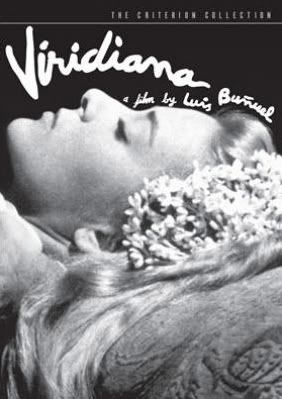
This new cover is a great improvement. The old pink monstrosity was bad gothic, which the film certainly is not. And as for the "doll" like appearance of Viridiana, the film does have sexual fetishism as one of its components.
There are other images from the film that I would have preferred, but this is good enough.
Panda
There are other images from the film that I would have preferred, but this is good enough.
Panda
-
jesus the mexican boi
- Joined: Fri Nov 05, 2004 9:09 am
- Location: South of the Capitol of Texas

-
domino harvey

- Dot Com Dom
- Joined: Wed Jan 11, 2006 6:42 pm
-
Jem

- Joined: Mon May 02, 2005 3:03 am
- Location: Potts Point
domino harvey wrote:
I prefer the pink one. they should print the original on the other side of the label. it's a shame that all the people bitching on this forum made Criterion second guess themselves.
Stubbornness does have its helpful features. You always know what you're going to be thinking tomorrow.I will dance a dance of joy if the original pink cover stays
-
Penny Dreadful

- Joined: Fri Jun 17, 2005 5:32 am
YES! Love the new cover. I've never seen the film and know very little about it, but now I am much more intrigued.
Thank you to the Criterion folks who listened to our complaints! If only Sony would follow suit and do something about that monstrously Photoshopped, melted-looking Midnight Cowboy CE cover...
Thank you to the Criterion folks who listened to our complaints! If only Sony would follow suit and do something about that monstrously Photoshopped, melted-looking Midnight Cowboy CE cover...
-
godardslave

- Joined: Tue Nov 02, 2004 8:44 pm
- Location: Confusing and open ended = high art.
still no sign of the old pink cover changing at criterions website.
it would be somewhat ironic that after all this, it might stay the same.
the horrible pink monstrosity, and just to be taunted cruelly by the beautiful black and white composition! the humanity!
Maybe the image cover is nothing more than some dude at Image photoshopping his own cover and saying, "here criterion this is what the cover SHOULD look like".
-
blindside8zao
- Joined: Wed Apr 06, 2005 8:31 pm
- Location: Greensboro, NC
-
godardslave
- Joined: Tue Nov 02, 2004 8:44 pm
- Location: Confusing and open ended = high art.
-
stroszeck
- Joined: Wed Jun 08, 2005 2:42 am
-
godardslave
- Joined: Tue Nov 02, 2004 8:44 pm
- Location: Confusing and open ended = high art.
-
Cinephrenic

- Joined: Tue Nov 02, 2004 6:58 pm
- Location: Paris, Texas


-
kekid
- Joined: Wed Nov 03, 2004 1:55 am
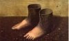
I noticed one minor quirk. On Criterion's website the cover art has the woman's head facing the opposite way from that shown above on this forum. The lateral transposition in their DVD of Jules and Jim has sensitized me to such arguably uniportant things.
I am glad they changed the cover. I do believe the new version is an improvement and, more importantly, the change suggests that Criterion take consumer feedback from this forum seriously.
I am glad they changed the cover. I do believe the new version is an improvement and, more importantly, the change suggests that Criterion take consumer feedback from this forum seriously.
-
godardslave
- Joined: Tue Nov 02, 2004 8:44 pm
- Location: Confusing and open ended = high art.
yes, how bizarre, the strange story of this cover is not yet over!kekid wrote:I noticed one minor quirk. On Criterion's website the cover art has the woman's head facing the opposite way from that shown above on this forum. The lateral transposition in their DVD of Jules and Jim has sensitized me to such arguably uniportant things.
I am glad they changed the cover. I do believe the new version is an improvement and, more importantly, the change suggests that Criterion take consumer feedback from this forum seriously.
in fact not only is the head facing opposite, her whole head is further down the cover, and the "a film by luis bunuel" layout is completely different. i prefer the lower image below with the words following the curves of her face, as compared to the official site cover (top image).

-
Toshiro De Niro

- Joined: Tue Mar 08, 2005 2:16 am
-
domino harvey
- Dot Com Dom
- Joined: Wed Jan 11, 2006 6:42 pm
-
justeleblanc

- Joined: Wed Nov 03, 2004 10:05 pm
- Location: Connecticut
-
pzman84

- Joined: Mon Dec 20, 2004 8:05 pm
As much as I hate the pink cover and as much as I like the black and white cover better, I can't help but feeling a sense of loss over the pink cover. It was just so easy to hate. All of my problems in life I could just take it out on the pink cover. I will miss it (or rather I will miss the fight over it). 
-
hammock

- Joined: Wed Nov 03, 2004 5:52 pm
- Location: www.criteriondungeon.com
- Contact:
If they paid more than $100 for the new artwork they are crazy! I did save the pink cover and besides the wallpaper in my, guess where, wallpaper section I have also added the pink beauty to my alternative section as well as the first run on the new doll b/w "I would never have noticed you if it wasn't for your pink little sister" cover. Not only do I miss the pink cover I think CC should have run a limited first edition of 3,000 copies with it and then changed it. I wish the forum colours would go pink for a complete day to mourn my loss. Was there ever a poll about this? Someone claimed this as a victory for this forum - but please do not speak for me and I have seen a few other posters in this forum who also enjoyed the pink bastard whom I assume would also like not to be accounted for.Namelessnumberheadman wrote:With all these cover art alterations, I'm surprised that the MSRP hasn't gone up on this disc. We are going to break Criterion with all our fickle bickering.