Criterion & Eclipse Cover Art & Packaging Babble-on Vol. 7
-
ianthemovie

- Joined: Sat Apr 18, 2009 2:51 pm
- Location: Boston, MA
- Contact:
Re: Criterion & Eclipse Cover Art & Packaging Babble-on Vol. 7
The only Criterion digipak that I really like is the Jacques Demy box. I'm very curious to see if they change the packaging for the Blu-ray-only edition that's supposed to be coming out September 6. I love the idea of it being smaller but I really hope they don't redesign it as a slotted book like the Varda box or something else similarly impractical.
-
Marwood
- Joined: Thu Sep 19, 2013 12:05 pm
Re: Criterion & Eclipse Cover Art & Packaging Babble-on Vol. 7
It'll be the same as the UK blu-ray-only box.ianthemovie wrote: Tue Aug 23, 2022 2:33 pm The only Criterion digipak that I really like is the Jacques Demy box. I'm very curious to see if they change the packaging for the Blu-ray-only edition that's supposed to be coming out September 6. I love the idea of it being smaller but I really hope they don't redesign it as a slotted book like the Varda box or something else similarly impractical.
-
ianthemovie
- Joined: Sat Apr 18, 2009 2:51 pm
- Location: Boston, MA
- Contact:
Re: Criterion & Eclipse Cover Art & Packaging Babble-on Vol. 7
Is the packaging for that edition any different from the original Region A box?
-
tenia

- Ask Me About My Bassoon
- Joined: Wed Apr 29, 2009 3:13 pm
Re: Criterion & Eclipse Cover Art & Packaging Babble-on Vol. 7
It's slimmer IIRC.
-
swo17

- Bloodthirsty Butcher
- Joined: Tue Apr 15, 2008 2:25 pm
- Location: SLC, UT
Re: Criterion & Eclipse Cover Art & Packaging Babble-on Vol. 7
I assume it will be sized the same as the Dietrich/von Sternberg set, which also contains six films
-
cdnchris

- Site Admin
- Joined: Tue Nov 02, 2004 6:45 pm
- Location: Washington
- Contact:
-
swo17
- Bloodthirsty Butcher
- Joined: Tue Apr 15, 2008 2:25 pm
- Location: SLC, UT

-
Ribs

- Joined: Fri Jun 13, 2014 5:14 pm
Re: Criterion & Eclipse Cover Art & Packaging Babble-on Vol. 7
Also, it appears to be another slipcover based on the image included in the newsletter.
-
DimitriL
- Joined: Thu Jul 24, 2014 10:07 pm
Re: Criterion & Eclipse Cover Art & Packaging Babble-on Vol. 7
It is. The artist, Jason Raish, confirmed it on Twitter.Ribs wrote: Thu Sep 08, 2022 4:08 pm Also, it appears to be another slipcover based on the image included in the newsletter.
-
ryannichols7

- Joined: Mon Jul 16, 2012 6:26 pm
Re: Criterion & Eclipse Cover Art & Packaging Babble-on Vol. 7
the more I look at this cover the more I like it. so many little easter eggs to be found here
I think it should be said that Criterion somehow pulled off leaving out "A Disney Pixar Film" or something along those lines. wonder if that sticks?
I think it should be said that Criterion somehow pulled off leaving out "A Disney Pixar Film" or something along those lines. wonder if that sticks?
-
Kracker

- Joined: Sat Sep 28, 2013 6:06 pm
Re: Criterion & Eclipse Cover Art & Packaging Babble-on Vol. 7
I was rather surprised the cover is devoid of any Disney or Pixar branding and gets to be treated like any other addition to the collection, but then again this is just the slipcover.
I also like how the cover doesn't even feature the film's two main characters but instead trashpiles that resemble them. Brava.
I also like how the cover doesn't even feature the film's two main characters but instead trashpiles that resemble them. Brava.
-
Amazing Goose

- Joined: Thu Jul 09, 2009 5:31 pm
- Location: tamu
Re: Criterion & Eclipse Cover Art & Packaging Babble-on Vol. 7
But why? I've never been one to post about cover art but this is driving me nuts: yes, it's not really Wall-e and EVE, it's garbage that looks like them--and how does that relate to the story? This makes it feel like a "velveteen rabbit" kind of story, like there was some poor boy who's only friends were the ones he made out of garbage until one day they came to life. The characters being made from garbage don't even fit a theme of the film; EVE is future technology and Wall-e's whole arc is that he is much more than a junky robot.I also like how the cover doesn't even feature the film's two main characters but instead trashpiles that resemble them.
I guess it's clever in that when you first glance at it you think it's just Wall-e and then see what's really going--cool--but it seems completely disconnected from the actual movie. And I know that book cover illustrators often go their artwork based on only a quick synopsis without reading the actual story, but everyone has two hours to watch Wall-e (if they haven't already seen it.)
-
Computer Raheem

- Joined: Wed Jun 16, 2021 11:45 pm
Re: Criterion & Eclipse Cover Art & Packaging Babble-on Vol. 7
IMPROMPTU MONTHLY COVER THOUGHTS: November 2022 (but it's for one movie)
- WALL•E: Retroactively the best cover of the month. The idea of making the main characters out of trash could have come off as cutesy, twee nonsense, but this cover wisely doesn't make this the point. It's simply a nice added detail, which I appreciate. I also appreciate that this cover primarily highlights both WALL•E and EVE's romance and the themes of consumerism and climate disaster; much of the key art simply markets the film as a cutesy talking robot movie for the whole family, and completely misses all the nuances that make WALL•E such an eccentric, sly piece of social commentary. A nice cover all-around. Props too for not slathering Disney•Pixar branding on the cover (no idea how much convincing that took the Mouse)
Last edited by Computer Raheem on Thu Sep 15, 2022 11:57 pm, edited 1 time in total.
-
swo17
- Bloodthirsty Butcher
- Joined: Tue Apr 15, 2008 2:25 pm
- Location: SLC, UT


-
Finch

- Joined: Mon Jul 07, 2008 9:09 pm
- Location: United States
Re: Criterion & Eclipse Cover Art & Packaging Babble-on Vol. 7
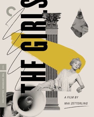
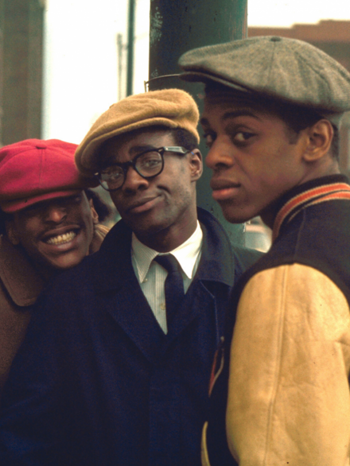
Dreadful month for covers again. I like Cooley High and nothing else. Why are the fonts on the Velvet Underground cover backwards? The Metterling covers look like something swimminghorses might have put together on a better day and the Haneke covers are very bland.
-
ryannichols7
- Joined: Mon Jul 16, 2012 6:26 pm
Re: Criterion & Eclipse Cover Art & Packaging Babble-on Vol. 7
I knew The Velvet Underground would be controversial, but I love it. the cover is meant to reflect screen printing!
I actually like the Zetterling ones and Haneke I'm sure is supposed to emulate the coldness of his movies or whatever
I actually like the Zetterling ones and Haneke I'm sure is supposed to emulate the coldness of his movies or whatever
-
swo17
- Bloodthirsty Butcher
- Joined: Tue Apr 15, 2008 2:25 pm
- Location: SLC, UT
Re: Criterion & Eclipse Cover Art & Packaging Babble-on Vol. 7
I think these all basically work though it feels like if the guy wearing the "Cooley High" jacket turned to the side his torso would vanish
-
domino harvey

- Dot Com Dom
- Joined: Wed Jan 11, 2006 6:42 pm
Re: Criterion & Eclipse Cover Art & Packaging Babble-on Vol. 7
This is what happens when an artist has to improvise!swo17 wrote: Thu Sep 15, 2022 5:14 pm I think these all basically work though it feels like if the guy wearing the "Cooley High" jacket turned to the side his torso would vanish
-
agnamaracs

- Joined: Thu Dec 21, 2006 7:13 am
Re: Criterion & Eclipse Cover Art & Packaging Babble-on Vol. 7
I like the Velvet Underground one, but shouldn't the C be backwards and in the upper-right corner?
-
CSM126

- Joined: Thu Nov 04, 2004 12:22 pm
- Location: The Room
- Contact:
Re: Criterion & Eclipse Cover Art & Packaging Babble-on Vol. 7
I don’t like Haneke but I love negative space so those covers appeal to me. Kinda like the Zetterlings too. I know nothing about her work, though so for all I know they might be wildly inappropriate.
-
Swift
- Joined: Sun Oct 28, 2012 7:52 pm
- Location: Calgary, Alberta
Re: Criterion & Eclipse Cover Art & Packaging Babble-on Vol. 7
The Zetterlings remind me somewhat of Pasolini's Trilogy of Life. Same artist?
-
RIP Film
- Joined: Tue Oct 10, 2017 7:53 pm
Re: Criterion & Eclipse Cover Art & Packaging Babble-on Vol. 7
The Cooley High one looks more odd the longer you look at it.
-
ryannichols7
- Joined: Mon Jul 16, 2012 6:26 pm
Re: Criterion & Eclipse Cover Art & Packaging Babble-on Vol. 7
I love the idea and would be fully on board, but after Le Corbeau didn't feature anything fun with the spine, I'm not too surprised. I would've loved to have seen the bitching that would've caused!agnamaracs wrote: Thu Sep 15, 2022 5:40 pm I like the Velvet Underground one, but shouldn't the C be backwards and in the upper-right corner?
Haneke and Zetterling were interestingly both designed by Eric Skillman, Criterion's head of design.
-
Saturnome

- Joined: Sun Aug 12, 2007 9:22 pm
Re: Criterion & Eclipse Cover Art & Packaging Babble-on Vol. 7
I probably have bad memory but is the original DVD of Le Corbeau the only time they ever played a bit with the branding on the cover?
-
dekadetia

- was Born Innocent
- Joined: Wed Nov 03, 2004 3:57 am
- Location: Pennsylvania, USA
Re: Criterion & Eclipse Cover Art & Packaging Babble-on Vol. 7
Robocop chrome-plated the old-school logo, while Eric Chase Anderson hand-drew the branding on Rushmore and The Royal Tenenbaums (very tidily).Saturnome wrote: Thu Sep 15, 2022 7:43 pm I probably have bad memory but is the original DVD of Le Corbeau the only time they ever played a bit with the branding on the cover?