
Criterion & Eclipse Cover Art & Packaging Babble-on Vol. 7
-
Ribs

- Joined: Fri Jun 13, 2014 5:14 pm
-
diamonds

- Joined: Sun Apr 24, 2016 6:35 pm
Re: Criterion & Eclipse Cover Art & Packaging Babble-on Vol. 7
The struggle with cover art is how to depict the face and the back of the letterman jacket at the same time.
-
goblinfootballs

- Joined: Thu Oct 09, 2014 1:37 am
- Location: Portland, OR
Re: Criterion & Eclipse Cover Art & Packaging Babble-on Vol. 7
Curious that there is separate artwork for each film in the Haneke and Zetterling sets if they are a single spine number Scanovo case.
-
CSM126

- Joined: Thu Nov 04, 2004 12:22 pm
- Location: The Room
- Contact:
Re: Criterion & Eclipse Cover Art & Packaging Babble-on Vol. 7
The C is melting on Sweet Movie. I think that’s the only other example.dekadetia wrote: Thu Sep 15, 2022 8:06 pmRobocop chrome-plated the old-school logo, while Eric Chase Anderson hand-drew the branding on Rushmore and The Royal Tenenbaums (very tidily).Saturnome wrote: Thu Sep 15, 2022 7:43 pmI probably have bad memory but is the original DVD of Le Corbeau the only time they ever played a bit with the branding on the cover?
-
black&huge
- Joined: Tue Dec 26, 2017 9:35 am
Re: Criterion & Eclipse Cover Art & Packaging Babble-on Vol. 7
That Cooley High cover would have looked better as an MSpaint job like the Zazie dans le Metro cover.
-
swo17

- Bloodthirsty Butcher
- Joined: Tue Apr 15, 2008 2:25 pm
- Location: SLC, UT
Re: Criterion & Eclipse Cover Art & Packaging Babble-on Vol. 7
Ha!diamonds wrote: Thu Sep 15, 2022 8:33 pm The struggle with cover art is how to depict the face and the back of the letterman jacket at the same time.
Actual Cooley High letterman jacket:

-
Matt

- Joined: Tue Nov 02, 2004 4:58 pm
Criterion & Eclipse Cover Art & Packaging Babble-on Vol. 7
I’m pretty certain the Cooley High cover references the work of a particular Black artist, but I can’t quite place it.
EDIT: The artist I was thinking of is Manassah Johnson and he actually made this cover.
EDIT: The artist I was thinking of is Manassah Johnson and he actually made this cover.
-
swo17
- Bloodthirsty Butcher
- Joined: Tue Apr 15, 2008 2:25 pm
- Location: SLC, UT
Re: Criterion & Eclipse Cover Art & Packaging Babble-on Vol. 7
Looks like distorted perspectives are part of his thing. Fair enough.
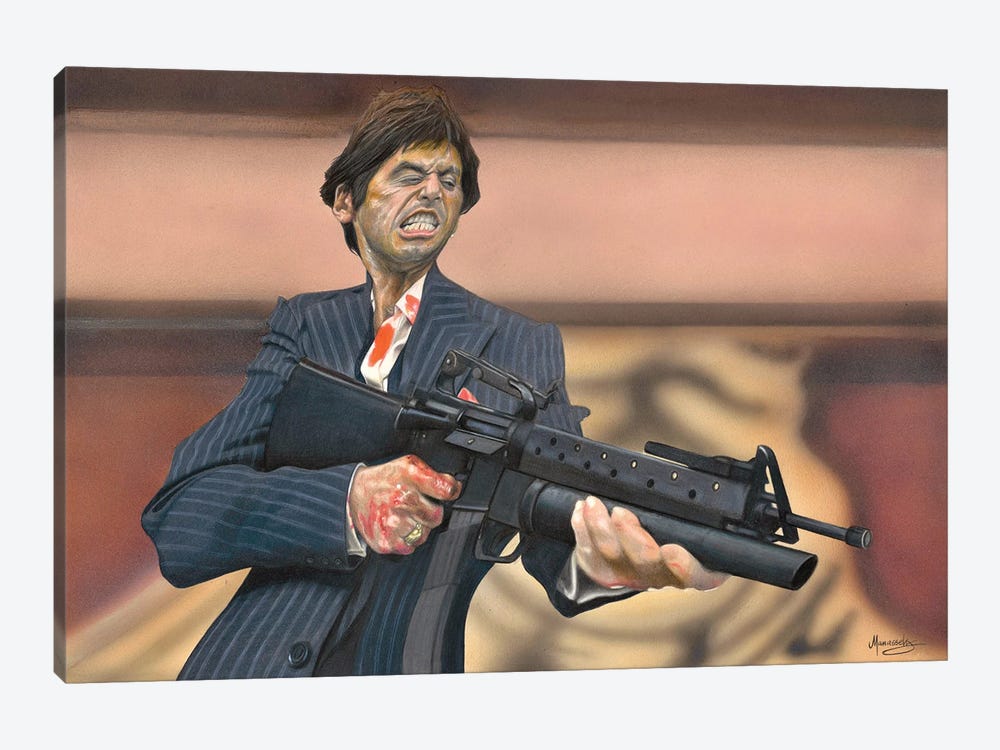
 I see he also did the cover for I Wanna Hold Your Hand
Spoiler
-
dwk

- Joined: Sat Jun 12, 2010 10:10 pm
Re: Criterion & Eclipse Cover Art & Packaging Babble-on Vol. 7
They often do that for titles in boxsets that don't come in individual cases (Bergman, Varda, Fellini, Bruce Lee, etc)goblinfootballs wrote: Thu Sep 15, 2022 8:40 pm Curious that there is separate artwork for each film in the Haneke and Zetterling sets if they are a single spine number Scanovo case.
-
Computer Raheem

- Joined: Wed Jun 16, 2021 11:45 pm
Re: Criterion & Eclipse Cover Art & Packaging Babble-on Vol. 7
MONTHLY COVER THOUGHTS: December 2022
- Cooley High: Probably the best cover of the bunch; it has a nice naturalism to it that appears fitting for a low-key coming-of-age movie. I do think the placement of the director's name is a bit wonky, though (it would have looked better had it been drawn into the cover rather than being inserted digitally). Still, it's a minor complaint for what is ultimately a quality cover
- The Velvet Underground: I get the idea - it's supposed to resemble traditional screen-printing techniques. I understand the point. It still looks bad (in my opinion). This is an idea that's much better suited for inside the release instead of the front cover. This is an instance where using the original poster art would have probably been a better option, even if it is ultimately a safe one. Even if they wanted to keep with this screen-printed idea, there's already a poster with correctly-oriented text (though it does somewhat defeat the idea's effectiveness)
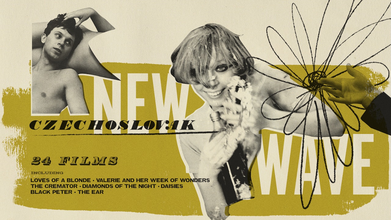
- Three Films By Mai Zetterling: I seem to be in the minority, but I think these covers look nice. I'm generally very picky when it comes to collage-type covers, but these ones work for me. They remind me of the artwork the Criterion Channel used for it's Czechoslovak New Wave series. It works for me
- Michael Haneke: Trilogy: I hate this. All of the covers look like an 80s science textbook. Minimalism gone wrong
-
Ribs
- Joined: Fri Jun 13, 2014 5:14 pm
Re: Criterion & Eclipse Cover Art & Packaging Babble-on Vol. 7
I think you’ll find that this is based on the original teaser poster for the Velvet Underground - which for whatever reason was flipped in the image above, but was always presented as backwards. The later theatrical poster is similar but is not “the original” as you claim.
-
HinkyDinkyTruesmith

- Joined: Tue Aug 08, 2017 2:21 am
Re: Criterion & Eclipse Cover Art & Packaging Babble-on Vol. 7
What would make the VU cover cool is if it was double sided with the 'print' on the other side.
-
swo17
- Bloodthirsty Butcher
- Joined: Tue Apr 15, 2008 2:25 pm
- Location: SLC, UT
Re: Criterion & Eclipse Cover Art & Packaging Babble-on Vol. 7
I bet it actually is, with a transparent plastic insert like The Celebration
-
cdnchris

- Site Admin
- Joined: Tue Nov 02, 2004 6:45 pm
- Location: Washington
- Contact:
Re: Criterion & Eclipse Cover Art & Packaging Babble-on Vol. 7
Stillman's Barcelona has the hand drawn look, too.dekadetia wrote:Robocop chrome-plated the old-school logo, while Eric Chase Anderson hand-drew the branding on Rushmore and The Royal Tenenbaums (very tidily).Saturnome wrote: Thu Sep 15, 2022 7:43 pm I probably have bad memory but is the original DVD of Le Corbeau the only time they ever played a bit with the branding on the cover?
-
Kracker

- Joined: Sat Sep 28, 2013 6:06 pm
Re: Criterion & Eclipse Cover Art & Packaging Babble-on Vol. 7
Ho man, I’d buy it just for that.swo17 wrote: Fri Sep 16, 2022 1:51 am I bet it actually is, with a transparent plastic insert like The Celebration
-
Computer Raheem
- Joined: Wed Jun 16, 2021 11:45 pm
Re: Criterion & Eclipse Cover Art & Packaging Babble-on Vol. 7
Got it. I'm still not too fond of it as a finished product, but I guess that knowing it was part of the original marketing makes it a little bit less egregious.Ribs wrote: Fri Sep 16, 2022 1:25 am I think you’ll find that this is based on the original teaser poster for the Velvet Underground - which for whatever reason was flipped in the image above, but was always presented as backwards. The later theatrical poster is similar but is not “the original” as you claim.
That would make the most sense (and would actually be quite neat). Fingers crossed that this is the intention. [-o<HinkyDinkyTruesmith wrote: Fri Sep 16, 2022 1:48 am What would make the VU cover cool is if it was double sided with the 'print' on the other side.
-
Zot!
- Joined: Wed Jan 20, 2010 4:09 am
Re: Criterion & Eclipse Cover Art & Packaging Babble-on Vol. 7
This breaks every rule of perspective, anatomy, and good taste. It's like he's an owl.RIP Film wrote: Thu Sep 15, 2022 7:04 pm The Cooley High one looks more odd the longer you look at it.
-
Quote Perf Unquote

- Joined: Tue Jul 19, 2022 6:57 pm
Re: Criterion & Eclipse Cover Art & Packaging Babble-on Vol. 7
You guys sound like a bunch of ignorant racists re the "Cooley High" cover art. Whatever effects are present (distortion, flatness, caricature) are obviously intentional, though thankfully to a markedly lesser degree than the artist's other work (as image quoted by Swole 17 above).
I don't like his style in general, it looks like the gross exaggeration of late-90s illustrators from Rolling Stone Magazine: Philp Burke, Matt Mahurin, Anita Kunz, or modern guys like Steve Brodner, that kind of stuff, but with more deceptive use of computer alterations (in the preparatory work, at least, clearly the finished product is analog). His subject matter for the most part (celeb assholes) is tedious, shallow and passé, but he is skilled and knows what he's doing.
Poster and book cover art has a long history flattening all or part of the image, both for ease of reproduction and to accommodate text (which he has done here) as well as violating perspective and proportion to fit within the frame.
-
RIP Film
- Joined: Tue Oct 10, 2017 7:53 pm
Re: Criterion & Eclipse Cover Art & Packaging Babble-on Vol. 7
Seriously? The painting is basically a direct lift from the image Domino posted, with the exception of one shoulder. You can’t claim stylistic liberties if the style only applies to one small part.
-
Quote Perf Unquote
- Joined: Tue Jul 19, 2022 6:57 pm
Re: Criterion & Eclipse Cover Art & Packaging Babble-on Vol. 7
That one part is where the text is, first of all, as I specifically pointed out, and secondly, that's the part everyone here is bellyaching about. It's not about percentage of picture affected, it's about the intentions of the stylistic choices, however miniscule. Why know-nothing non-artists here, just like the other forum, get hung on on shit like this, I'll never understand. At least I applied historical knowledge and concrete aesthetic reasoning to my reaction.RIP Film wrote: Fri Sep 16, 2022 4:09 pm Seriously? The painting is basically a direct lift from the image Domino posted, with the exception of one shoulder. You can’t claim stylistic liberties if the style only applies to one small part.
-
CSM126
- Joined: Thu Nov 04, 2004 12:22 pm
- Location: The Room
- Contact:
Re: Criterion & Eclipse Cover Art & Packaging Babble-on Vol. 7
Someone needs to go touch grass
-
ryannichols7

- Joined: Mon Jul 16, 2012 6:26 pm
Re: Criterion & Eclipse Cover Art & Packaging Babble-on Vol. 7
this would rival Festen for my "best packaging" vote in the year end poll - by all means! they did dip into slipcovers a little with Pink Flamingos so that is a possibility tooHinkyDinkyTruesmith wrote: Fri Sep 16, 2022 1:48 am What would make the VU cover cool is if it was double sided with the 'print' on the other side.
as for the above posts...fun to see a classic forum meltdown happen in real time
-
zedz

- Joined: Sun Nov 07, 2004 11:24 pm
Re: Criterion & Eclipse Cover Art & Packaging Babble-on Vol. 7
Spoiler Alert!Zot! wrote:This breaks every rule of perspective, anatomy, and good taste. It's like he's an owl.RIP Film wrote: Thu Sep 15, 2022 7:04 pm The Cooley High one looks more odd the longer you look at it.
-
Zot!
- Joined: Wed Jan 20, 2010 4:09 am
Re: Criterion & Eclipse Cover Art & Packaging Babble-on Vol. 7
Absolutely right, the problem with the Cooley High cover is when applying my studies in phrenology, it ranks low on the ol’ craniometer.Quote Perf Unquote wrote: Fri Sep 16, 2022 3:57 pm You guys sound like a bunch of ignorant racists re the "Cooley High" cover art.
-
Quote Perf Unquote
- Joined: Tue Jul 19, 2022 6:57 pm
Re: Criterion & Eclipse Cover Art & Packaging Babble-on Vol. 7
No idea what that means