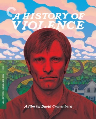
That cover doesn’t depict “suburbs,” though. More like a country farmhouse.rwiggum wrote:Yeah I'm on the same page. I haven't seen the film but it really sells "hidden in the suburbs but his violent past can't be shaken loose."
Criterion & Eclipse Cover Art & Packaging Babble-on Vol. 7
-
Brian C

- I hate to be That Pedantic Guy but...
- Joined: Wed Sep 16, 2009 3:58 pm
- Location: Northwest US
Re: Criterion & Eclipse Cover Art & Packaging Babble-on Vol. 7
-
Boosmahn

- Joined: Tue Sep 05, 2017 2:08 am
Re: Criterion & Eclipse Cover Art & Packaging Babble-on Vol. 7
Hm... I've warmed up to it a bit, and I appreciate the thought behind the choices. But I think what's still throwing me off is the color scheme. TWBB's Blue's Clues pull is accurate.
Also, love Nightmare Alley's cover.
Also, love Nightmare Alley's cover.
-
mfunk9786

- Under Chris' Protection
- Joined: Fri May 16, 2008 8:43 pm
- Location: Miami, FL
Re: Criterion & Eclipse Cover Art & Packaging Babble-on Vol. 7
Thanks for sharing. I, for one, think it’s a pretty great cover, but can understand the grousing. The movie’s got a strange tone that’s difficult to capture in one image.sabbath wrote: Wed Jul 16, 2025 3:21 am The other website member Kyle15's detailed analysis of A History of Violence cover art.
-
pianocrash

- Joined: Wed Nov 03, 2004 3:02 pm
- Location: Over & Out
Re: Criterion & Eclipse Cover Art & Packaging Babble-on Vol. 7
If only this were a tinted (red acetate) slipcase, with a smiling thumbs-up Viggo underneath (a la Stefan Sagmeister)swo17 wrote:

-
The Curious Sofa

- Joined: Fri Sep 13, 2019 10:18 am
Re: Worst DVD Covers...ever! (Part 4K)
The History of Violence cover is great, though as so often here, a more cutting edge or non-conventional approach is "bad". In that regard this forum in no better than the "why isn't the original poster" complaints on the other site.
The Mac and Me cover at least reflects how grotesque the actual movie is instead of packaging it as a sentimental favourite. I think its pretty funny.
The Mac and Me cover at least reflects how grotesque the actual movie is instead of packaging it as a sentimental favourite. I think its pretty funny.
-
flyonthewall2983

- Joined: Mon Jun 27, 2005 7:31 pm
- Location: Indiana
- Contact:
Re: Criterion & Eclipse Cover Art & Packaging Babble-on Vol. 7
A good number of the suburbs in Fort Wayne are right up next to farm landBrian C wrote: Wed Jul 16, 2025 2:49 amThat cover doesn’t depict “suburbs,” though. More like a country farmhouse.rwiggum wrote:Yeah I'm on the same page. I haven't seen the film but it really sells "hidden in the suburbs but his violent past can't be shaken loose."
-
sabbath
- Joined: Fri Apr 25, 2014 10:29 am
Re: Criterion & Eclipse Cover Art & Packaging Babble-on Vol. 7
Viggo's house in the movie is also very secluded, without any neighbors, surrounded by farmland and forest. (Viggo running back to his house scene)
-
dx23

- Joined: Wed Nov 03, 2004 12:52 am
- Location: Puerto Rico
Re: Worst DVD Covers...ever! (Part 4K)
A History of Violence cover is just a remade Two-Thousand Yard Stare

-
mfunk9786
- Under Chris' Protection
- Joined: Fri May 16, 2008 8:43 pm
- Location: Miami, FL
Re: Worst DVD Covers...ever! (Part 4K)
Should be a rule against posting just-announced Criterion stuff in here. Exhausting part of every month as somebody who skims this forum to see 2-3 just announced titles immediately posted in this thread. We get it, you don't like it.dx23 wrote: Tue Jul 15, 2025 8:11 pm This film never had a good poster or artwork to my knowledge, but this Criterion cover takes things from bad to worse

-
Brian C
- I hate to be That Pedantic Guy but...
- Joined: Wed Sep 16, 2009 3:58 pm
- Location: Northwest US
Re: Criterion & Eclipse Cover Art & Packaging Babble-on Vol. 7
I'm sorry guys, but that cover is not a representation of "the suburbs." Of course it's the case that some suburbs somewhere have a more secluded feel than others, but that cover does not communicate "suburbs" over any other kind of rural house.
-
therewillbeblus

- Joined: Tue Dec 22, 2015 7:40 pm
Re: Worst DVD Covers...ever! (Part 4K)
Plus there's a dedicated thread for 'How do you feel about these Criterion covers?' specific to the label. The same comments are often spread between there, here, and the film's dedicated thread.mfunk9786 wrote: Wed Jul 16, 2025 2:43 pm Should be a rule against posting just-announced Criterion stuff in here. Exhausting part of every month as somebody who skims this forum to see 2-3 just announced titles immediately posted in this thread. We get it, you don't like it.
-
Walter Kurtz

- Joined: Sat Jul 25, 2020 7:03 pm
Re: Criterion & Eclipse Cover Art & Packaging Babble-on Vol. 7
On Violence: Great cover. It connected immediately. Reasons?
- The typeface is TSEP... a magazine that littered the basement of my great grandpappy's house along with Life and Look. Heck I think his basement was probably this thing called "Americana" to me.
- The hippy-dippy pastoral 60's type background of peace & love or is it mom & apple pie? Guess it depends on your generation and which side of the Viet Nam anti-war protests you were.
- Mortensen as the new farmer in Wood's American Gothic staring dead-on at you.
- Or is he the new Gilliam torturer suddenly popping up into your face as you are snapped out of your Brazilian fantasia... now as a former hitman jumping up at you and shattering an American pastoral fantasia?
- Great art usually pisses people off at first.
-
Zot!
- Joined: Wed Jan 20, 2010 4:09 am
Re: Criterion & Eclipse Cover Art & Packaging Babble-on Vol. 7
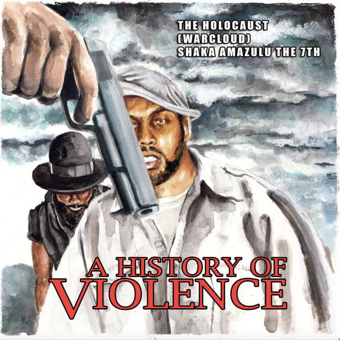
I accidentally found this cover to a rap album that I thought was amusing. "The Holocaust" being an profoundly unfortunate choice for an M.C. moniker, undoubtably why he chose "Warcloud" as an alternate choice for squeamish promoters.
-
Walter Kurtz
- Joined: Sat Jul 25, 2020 7:03 pm
Re: Criterion & Eclipse Cover Art & Packaging Babble-on Vol. 7
PS: The key little thing that makes the Criterion cover so en pointe is having Morternsen's head partially obscure the title. He has definitely popped up in front of the artificial fantasia. A shooting gallery figure that shoots back... covered in the color of vengeance and blood.
-
black&huge
- Joined: Tue Dec 26, 2017 9:35 am
Re: Criterion & Eclipse Cover Art & Packaging Babble-on Vol. 7
For me as well even before clicking to see it slightly larger. Definitely one of Criterion's all time best coversWalter Kurtz wrote: Wed Jul 16, 2025 4:44 pm On Violence: Great cover. It connected immediately. Reasons?
-
Murdoch
- Joined: Mon Apr 21, 2008 3:59 am
- Location: Upstate NY
Re: Criterion & Eclipse Cover Art & Packaging Babble-on Vol. 7
Everyone's focusing on the History of Violence cover, but at least that gives some variety. The Shrouds cover is atrocious, it's just a copy and paste of the poster.
-
sabbath
- Joined: Fri Apr 25, 2014 10:29 am
Re: Criterion & Eclipse Cover Art & Packaging Babble-on Vol. 7
The Shrouds is a Criterion Premieres (former Janus Contemporaries) release, so not surprising at all.
-
Murdoch
- Joined: Mon Apr 21, 2008 3:59 am
- Location: Upstate NY
Re: Criterion & Eclipse Cover Art & Packaging Babble-on Vol. 7
Ohh, that makes sense. Disappointing it didn't make it to the mainline. I will put in a positive word that I think the Deep Crimson cover is great.
-
Grand Wazoo

- Joined: Thu Jun 21, 2007 6:23 pm
Re: Criterion & Eclipse Cover Art & Packaging Babble-on Vol. 7
Thought Viggo looked a bit like a young Klaus Kinski on that cover and now I can't unsee it.
-
Captain Paranoia

- Joined: Thu Dec 28, 2023 12:33 am
Re: Criterion & Eclipse Cover Art & Packaging Babble-on Vol. 7
Haha, I was thinking that as well. (and maybe another more recent actor, can't necessarily put my finger on which one)Grand Wazoo wrote: Wed Jul 16, 2025 7:38 pm Thought Viggo looked a bit like a young Klaus Kinski on that cover and now I can't unsee it.
-
cdnchris

- Site Admin
- Joined: Tue Nov 02, 2004 6:45 pm
- Location: Washington
- Contact:
Re: Criterion & Eclipse Cover Art & Packaging Babble-on Vol. 7
Fires on the Plain [4K]
The Burmese Harp [4K]
Shoeshine [4K] (Booklet)
Cairo Station
Compensation (Booklet)
A Confucian Confusion/Mahjong (Booklet)
Saving Face
Restoration Details (at the bottom of the following pages):
Fires on the Plain
The Burmese Harp
Shoeshine
Cairo Station
Compensation
A Confucian Confusion/Mahjong
Saving Face has no details, but a quick look suggests an older high-def master.
-
Matt

- Joined: Tue Nov 02, 2004 4:58 pm
Re: Criterion & Eclipse Cover Art & Packaging Babble-on Vol. 7
Particularly unhelpful notes by Criterion on the Shoeshine master: “this new 4K restoration was created using the best surviving elements.”
Well, yes. One would expect that all 4K restorations are created using the best surviving elements. Perhaps you could tell us what those are.
Well, yes. One would expect that all 4K restorations are created using the best surviving elements. Perhaps you could tell us what those are.
-
ryannichols7

- Joined: Mon Jul 16, 2012 6:26 pm
Re: Criterion & Eclipse Cover Art & Packaging Babble-on Vol. 7
I find it amazing that Fires on the Plain came from the original negative, not common for that era of Japanese cinema I feel like? cool that Cairo Station is too, interesting that it's held by an Indian company
-
tenia

- Ask Me About My Bassoon
- Joined: Wed Apr 29, 2009 3:13 pm
Re: Criterion & Eclipse Cover Art & Packaging Babble-on Vol. 7
Prasad is a quite frequently-used restoration lab, but I don't think they held the film elements.