Criterion & Eclipse Cover Art & Packaging Babble-on Vol. 7
-
Mr.DarjeelingLimited

- Joined: Wed Dec 13, 2023 6:58 pm
Re: Criterion & Eclipse Cover Art & Packaging Babble-on Vol. 7
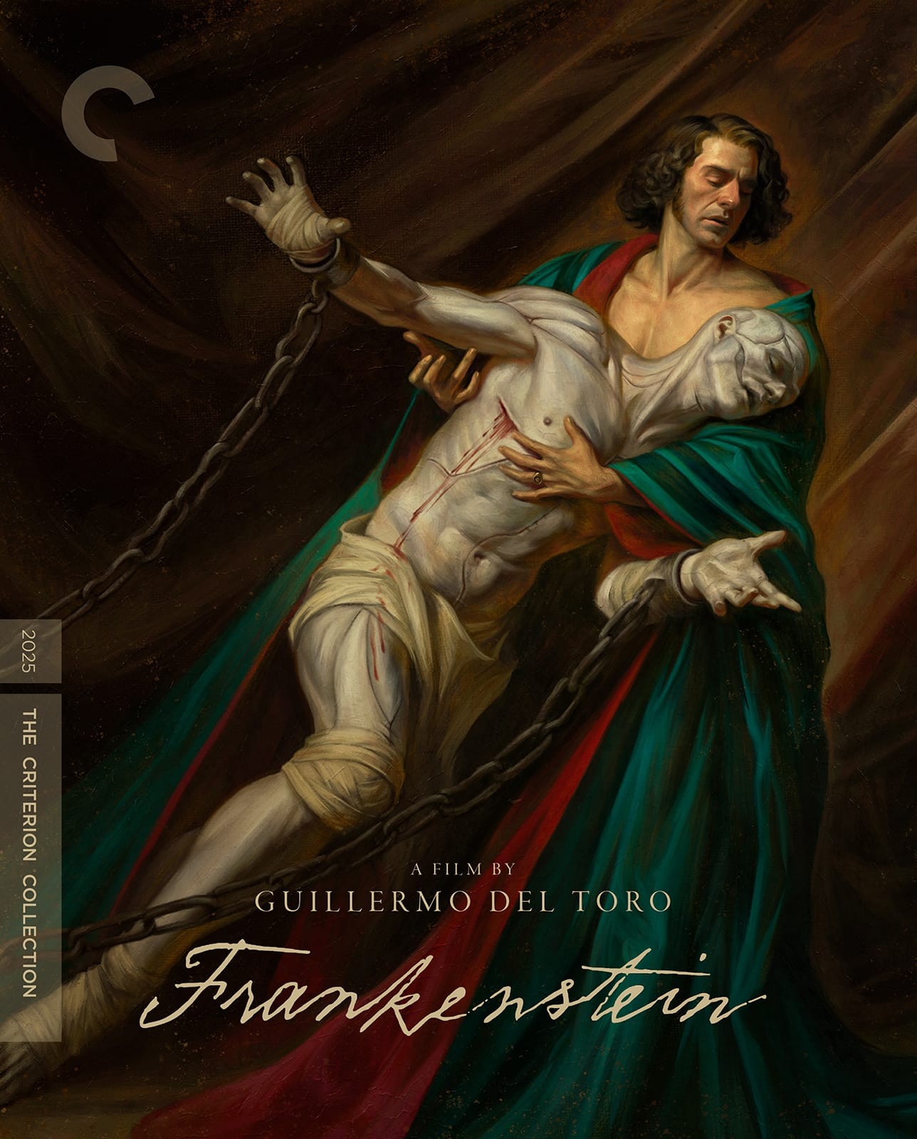
Frankensteins cover… wow! I love it.
-
Finch

- Joined: Mon Jul 07, 2008 9:09 pm
- Location: United States
-
Kracker

- Joined: Sat Sep 28, 2013 6:06 pm
Re: Criterion & Eclipse Cover Art & Packaging Babble-on Vol. 7
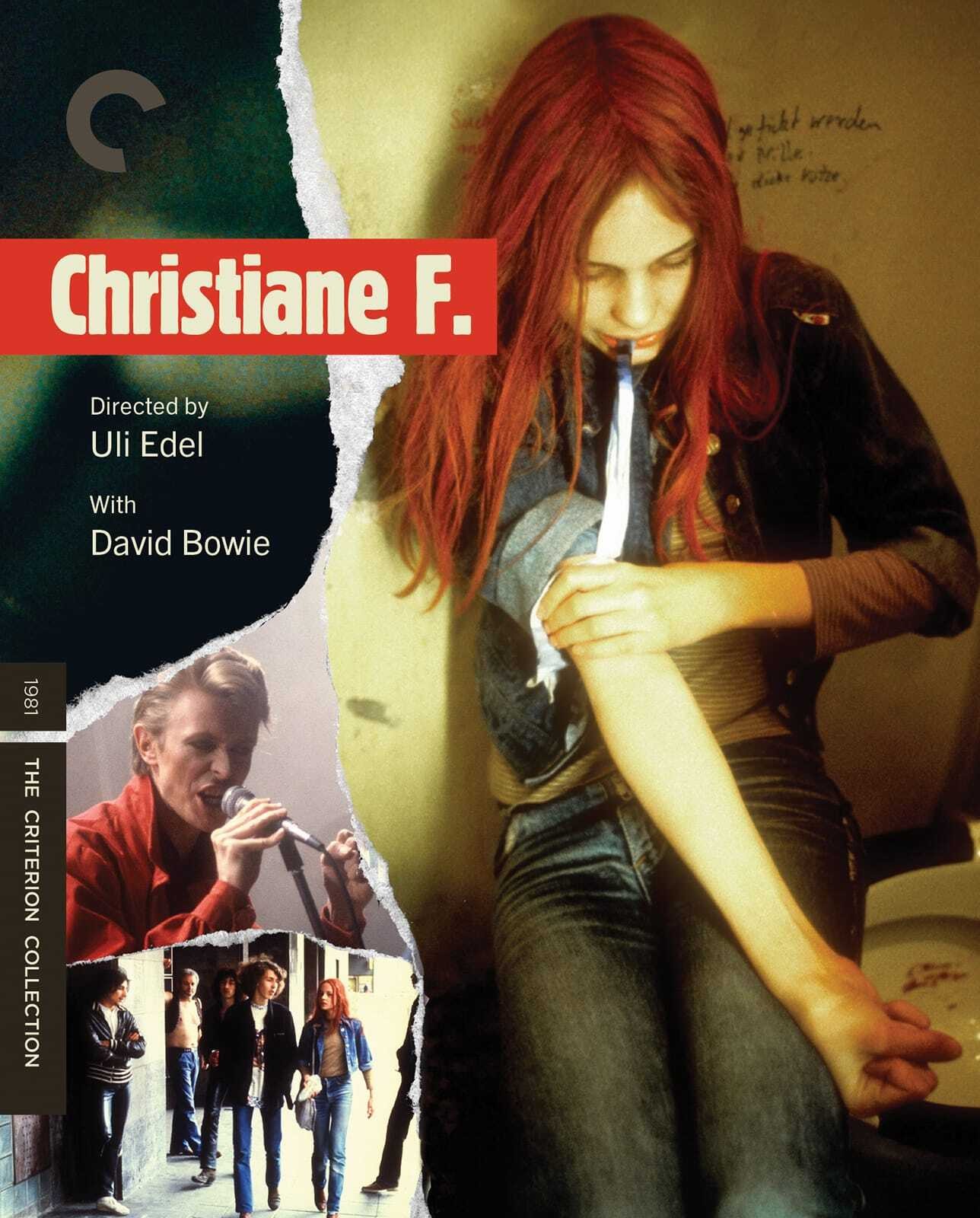
Welp, Christine F. gets the ugliest cover award this year.
-
DRW.mov

- Joined: Thu Sep 15, 2016 6:43 pm
- Location: Los Angeles, CA
Re: Criterion & Eclipse Cover Art & Packaging Babble-on Vol. 7
I mean, its the OG poster, the thing people are always asking for them to do more of, right?
-
Kracker
- Joined: Sat Sep 28, 2013 6:06 pm
Re: Criterion & Eclipse Cover Art & Packaging Babble-on Vol. 7
Sure when there was nothing wrong with the OG poster, but that's not even the original theatrical poster. It uses images from some of the posters, for sure.
-
aox

- Joined: Fri Jun 20, 2008 4:02 pm
- Location: nYc & Detroit
Re: Criterion & Eclipse Cover Art & Packaging Babble-on Vol. 7
I didn't like the film (other than the opening sequence), but that Frankenstein cover is a great pastiche.
-
domino harvey

- Dot Com Dom
- Joined: Wed Jan 11, 2006 6:42 pm
Re: Criterion & Eclipse Cover Art & Packaging Babble-on Vol. 7
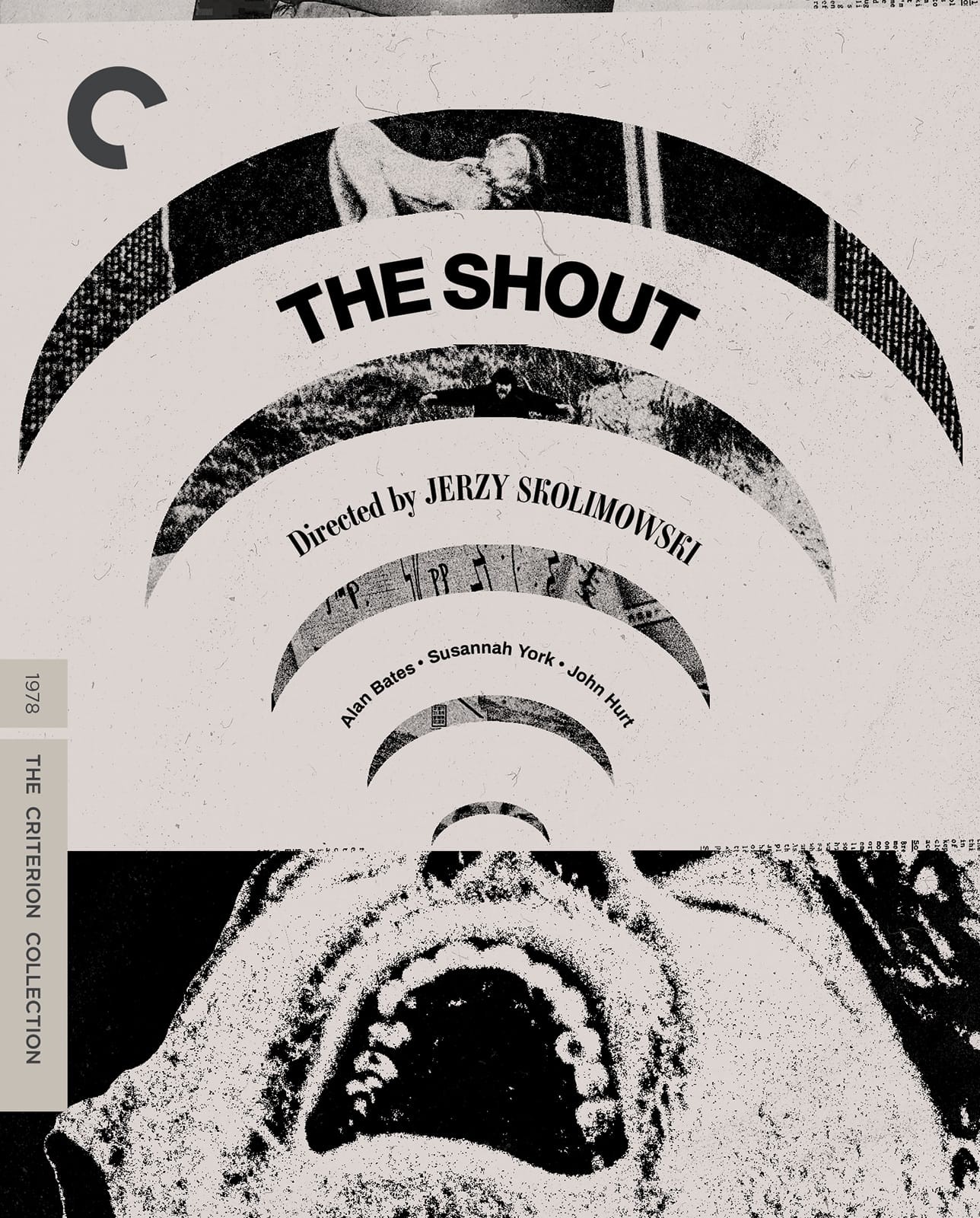
Don’t like the movie but the Shout cover is good. Rest are whatever, for a whatever month
-
criterionsnob

- Joined: Wed Nov 03, 2004 5:23 am
- Location: Canada
-
soundchaser

- Leave Her to Beaver
- Joined: Sun Aug 28, 2016 4:32 am
Re: Criterion & Eclipse Cover Art & Packaging Babble-on Vol. 7
I appreciate the thought that clearly went into it, but it all feels a little too "inside baseball" to accurately capture the spirit of the films themselves. How many people are familiar with Kubrick's archive, much less the boxes he used in it? (Which appear not dissimilar from regular archival storage boxes.) A strong, thorough execution of a flawed concept, imo.
-
Lowry_Sam

- Joined: Mon Jul 05, 2010 7:35 pm
- Location: San Francisco, CA
Re: Criterion & Eclipse Cover Art & Packaging Babble-on Vol. 7
I will go out on a limb and say that Christiane F looks better than all previous releases except for the German UHD digibook & not among Criterion's worst for 2026.
Frankenstein is impressive and a candidate for best of 2026.
Frankenstein is impressive and a candidate for best of 2026.
-
Lowry_Sam
- Joined: Mon Jul 05, 2010 7:35 pm
- Location: San Francisco, CA
Re: Criterion & Eclipse Cover Art & Packaging Babble-on Vol. 7
That disc slides out from the book very easily, maybe too easily? Hope we're not swapping one problem (stuck discs) for another (ones that fall out whenever you handle the book).
-
sabbath
- Joined: Fri Apr 25, 2014 10:29 am
Re: Criterion & Eclipse Cover Art & Packaging Babble-on Vol. 7
Probably has something to do with the "newly designed compartments that protect the discs and provide easier and safer access than previous sets" that the designer Sister Hyde said on Instagram.Lowry_Sam wrote: Wed Jul 15, 2026 8:52 pmThat disc slides out from the book very easily, maybe too easily? Hope we're not swapping one problem (stuck discs) for another (ones that fall out whenever you handle the book).
-
DimitriL
- Joined: Thu Jul 24, 2014 10:07 pm
Re: Criterion & Eclipse Cover Art & Packaging Babble-on Vol. 7
Here’s my thought. It’s the only possible way you can go that reflects Kubrick. Most things about Kubrick are bland from a design component because he reflects so many themes and visual signatures. (Or they emphasize one particular film, like the book title Kubrick: An Odyssey.) None of this particularly works. So, if you really want to do this right, you need to start by asking: what is this? Well, it’s an archive. And then suddenly you’ve got your way in, because that’s what Kubrick cared about. Who cares if it’s inside baseball? We’re all kind of obsessives to consider shelling out this kind of cash.soundchaser wrote: Wed Jul 15, 2026 8:24 pm I appreciate the thought that clearly went into it, but it all feels a little too "inside baseball" to accurately capture the spirit of the films themselves. How many people are familiar with Kubrick's archive, much less the boxes he used in it? (Which appear not dissimilar from regular archival storage boxes.) A strong, thorough execution of a flawed concept, imo.
 (And hey, they’re helpfully including the Boxes doc just in case there’s any questions.)
Anyway, my two cents.
-
Walter Kurtz

- Joined: Sat Jul 25, 2020 7:03 pm
Re: Criterion & Eclipse Cover Art & Packaging Babble-on Vol. 7
Talking about archives... i imagine every single person on this forum has visited at least of of the Kubrick Exhibitions that has toured the world for the past 20 or 25 odd years. I chose the Mexico City one because the exhibition completely filled every single room of a four to six story museum (don't remember which.) From Barry Lyndon costumes to the Clockwork Orange milk bar display with kneeling mannequins to HAL to the space baby to the redrum door to well.... everything. Spend Friday afternoon and evening there and the whole day of Saturday.
-
RPG

- Joined: Thu Feb 05, 2015 10:05 pm
Re: Criterion & Eclipse Cover Art & Packaging Babble-on Vol. 7
I wish the film was half as good as Frankenstein's cover. Absolutely a candidate for best of 2026.
-
cdnchris

- Site Admin
- Joined: Tue Nov 02, 2004 6:45 pm
- Location: Washington
- Contact:
Re: Criterion & Eclipse Cover Art & Packaging Babble-on Vol. 7
The Elephant Man [4K] (Booklet)
Alice Doesn't Live Here Anymore [4K]
Hud [4K]
The Crying Game [4K] (Booklet)
Cruel Story of Youth [4K]
I'll Remind You of Everything: The Films of Mike Mills [4K] (Booklet)
Alice Doesn't Live Here Anymore [4K]
Hud [4K]
The Crying Game [4K] (Booklet)
Cruel Story of Youth [4K]
I'll Remind You of Everything: The Films of Mike Mills [4K] (Booklet)
-
cdnchris
- Site Admin
- Joined: Tue Nov 02, 2004 6:45 pm
- Location: Washington
- Contact:
-
Mr.DarjeelingLimited
- Joined: Wed Dec 13, 2023 6:58 pm
Re: Criterion & Eclipse Cover Art & Packaging Babble-on Vol. 7
Mediocre packaging for a mediocre month. Pass from me on all the titles. Might go for the Eclipse eventually because those films are phenomenal.
-
swo17

- Bloodthirsty Butcher
- Joined: Tue Apr 15, 2008 2:25 pm
- Location: SLC, UT
Re: Criterion & Eclipse Cover Art & Packaging Babble-on Vol. 7
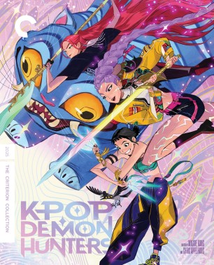
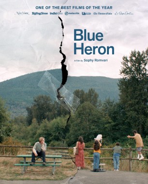
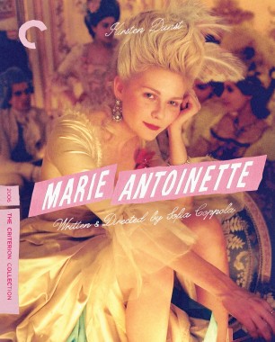
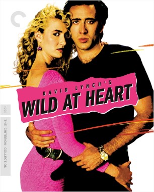
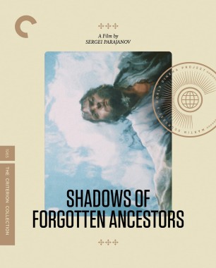
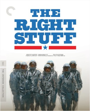
Since no one has posted these yet...
-
Mr.DarjeelingLimited
- Joined: Wed Dec 13, 2023 6:58 pm
Re: Criterion & Eclipse Cover Art & Packaging Babble-on Vol. 7
Great month for art as well as films. I despise the way they packaged Shadows of Forgotten Ancestors like it’s a part of a set (something they haven’t done for any other WCP standalone titles)
-
rwiggum
- Joined: Mon Oct 01, 2012 2:11 am
Re: Criterion & Eclipse Cover Art & Packaging Babble-on Vol. 7
Plus the packaging layouts for the digipaks of the month
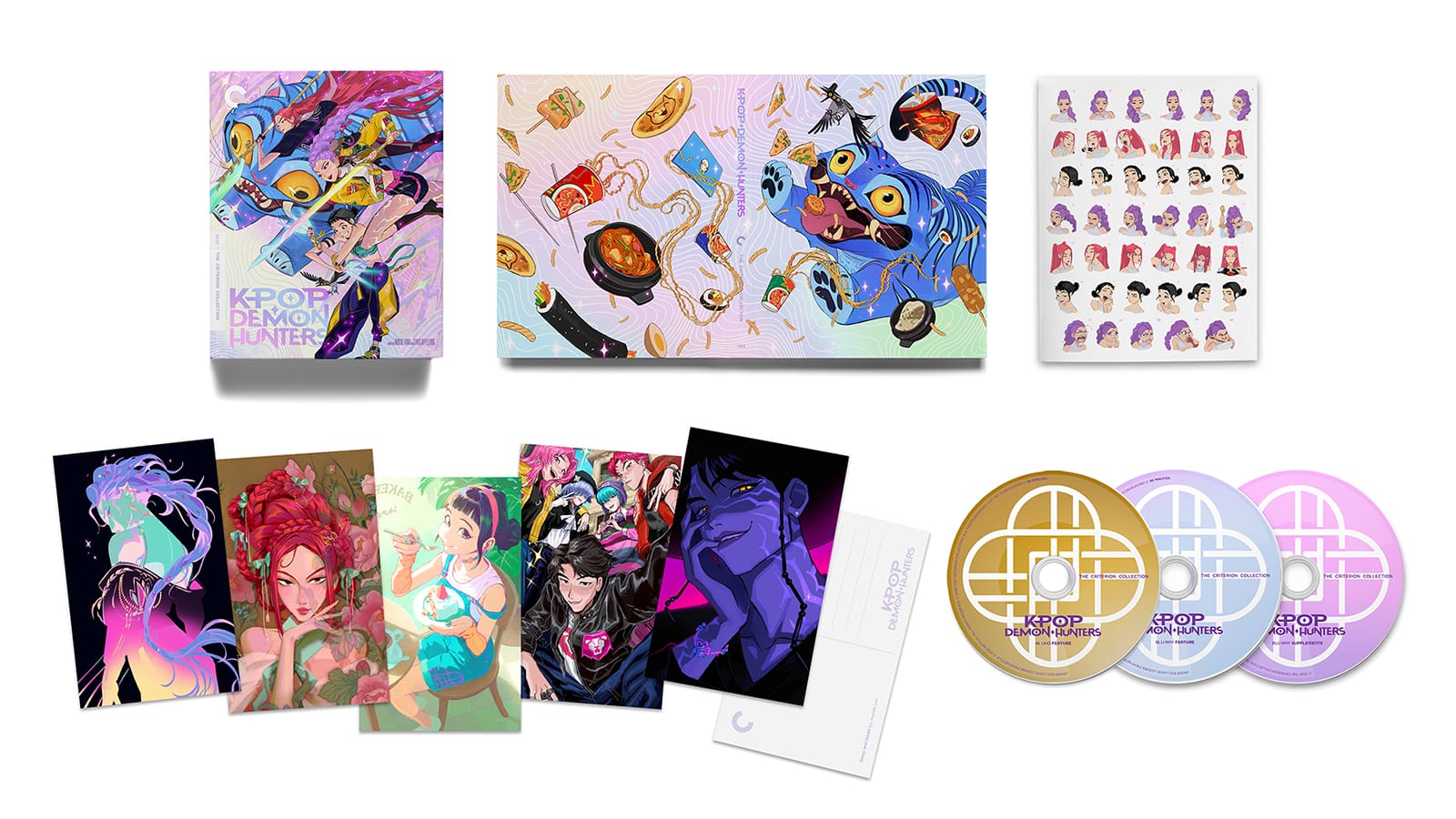
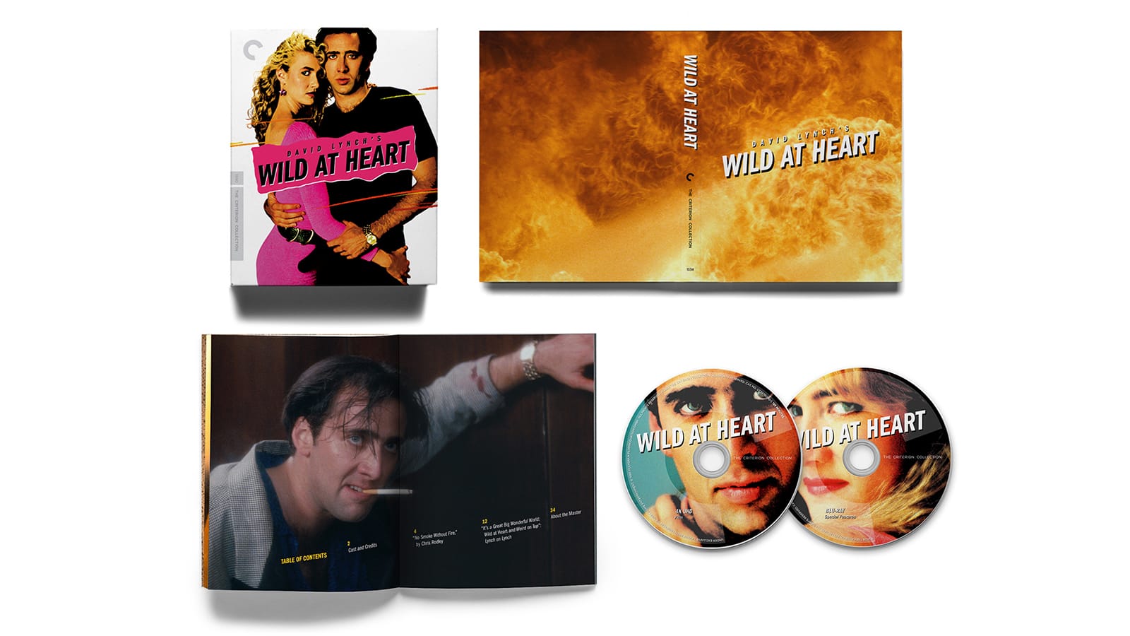
I know this is just a personal gripe, but for some reason I hate covers and posters that are just cut-out images over a pure white background. It always just feels like incomplete design elements to me, especially for a film so full of dynamic color and imagery as Wild at Heart. PARTICULARLY since it feels so much like a classic pulp novel, a medium absolutely overflowing with incredible imagery.
Other than that pettiness, a pretty great month for releases and art!
I know this is just a personal gripe, but for some reason I hate covers and posters that are just cut-out images over a pure white background. It always just feels like incomplete design elements to me, especially for a film so full of dynamic color and imagery as Wild at Heart. PARTICULARLY since it feels so much like a classic pulp novel, a medium absolutely overflowing with incredible imagery.
Other than that pettiness, a pretty great month for releases and art!
-
FrauBlucher

- Joined: Tue Jul 16, 2013 12:28 am
- Location: Greenwich Village
Re: Criterion & Eclipse Cover Art & Packaging Babble-on Vol. 7
I can’t say I love or even like the WILD AT HEART cover. Is it based off a poster?
-
Roger Ryan

- Joined: Wed Apr 28, 2010 4:04 pm
- Location: A Midland town spread and darkened into a city
Re: Criterion & Eclipse Cover Art & Packaging Babble-on Vol. 7
It is: "New cover by Fred Davis, based on the original theatrical poster"FrauBlucher wrote: Fri Aug 14, 2026 6:30 pm I can’t say I love or even like the WILD AT HEART cover. Is it based off a poster?
Nonetheless, it's not a particularly good poster and I think the fire imagery for the insert tray holder would have made a better outer cover... and a better match for Criterion's Blue Velvet cover.
-
Saturnome

- Joined: Sun Aug 12, 2007 9:22 pm
Re: Criterion & Eclipse Cover Art & Packaging Babble-on Vol. 7
Useless trivia : it's based on the original poster, but it's not the same photograph

-
James Stock
- Joined: Fri Jul 10, 2026 2:55 pm
Re: Criterion & Eclipse Cover Art & Packaging Babble-on Vol. 7
The cover would look a lot better if they'd kept the original background.