Noiretirc wrote: Sun Oct 25, 2026 3:48 am
Varda and Bergman boxes have similar slots, right? I've never had reason to complain about those.
Same. And the Zatoichi box too.
The one box set I've had an issue with is, ironically, one which doesn't have slots, the fucking Jackie Chan Emergence of a Superstar set. You have to grip and pull with all your might to get the case with the discs out of the overlying slipcase.
Didn't have the issue with the Bergman set. Had issues with the Zatoichi set last time I wanted to take a disc out of it, as it got stuck because of the glue. A problem I never had with a plastic case, like ever, and that no packaging, whose primary function is to protect its content, should ever pose.
fdm wrote: Mon Oct 26, 2026 10:46 pm
I trashed one of its discs when I tried to extricate it from its sleeve. It was really stuck in there. Criterion replaced it for me. (This was the original dual-format box, not too long after it was released.) Now stored with the rest of the blu-rays in a 9-disc blu-ray case.
My copy of Zatoichi is dual-format too and the discs still sit in their original packaging. Not sure if I got a revised printing (having bought it years after release), but they're holding up just fine. Same goes for Collected Works of Miyazaki (which I've had longer), Hammer Horror: The Blu-Ray Collection, as well as the first Hitchcock collection and all of Arrow's Shawscopes (though I store those face down instead of standing up). The only issue I've had with sleeve packaging is Godzilla, which was a nightmare and I essentially got every disc replaced. Those new discs now sit in a large blu-ray case.
kekid wrote: Mon Nov 09, 2026 12:46 am
Is the disc removal problem on Complete Kubrick better than, same as, or worse than the same for the Pasolini box set?
I really feel like the difficulty is overstated. I don't have the Pasolini set, but if you lift the flap up slightly, and try to slide the discs out by sticking your finger in the middle of the hole, I was able to get them out this way.
Has anyone tried the Bill Hunt's anti-static inner sleeve solution? If so, please explain how you cut the notch in the center only on one side of the sleeve. (Is the notch just a slit, a "V" or a semi-circle? Does it matter if the intention is just to insert your finger in the center hole? Also, what is the best quality source for these sleeves so that they don't crumple up? Hunt gives no details or picture.
My Kubrick box arrived last night and I'm happy to report that I had a mildly positive experience taking the discs out of it. They're tight, for sure, but I think it's a misnomer that they "slide out." It's more a "poke your finger in the center hole and push up" situation. Regardless, I bought the alternate packaging on Etsy just to save wear and tear on the awesome artwork.
That said, in a plot twist, I took a look at my Zatoichi box after some years to discover most of the Blu-Rays had slipped between the sleeves due to the glue melting (yet, the DVDs were fine). So, I take back everything I said previously and also purchased alternate packaging from the same Etsy seller. Worth noting that all my comparable Arrow Video packing (Shawscopes, Gamera, Bava set, etc.) are still in great shape with the discs remaining perfect. I think Criterion should make a call to Arrow and ask about their cardboard sorcery.
Raphael Geroni is a good designer but I feel his work isn't diverse enough imo... I get they want a degree of uniformity but many their recent silent/pre-code type releases look a bit samey to me as a result.
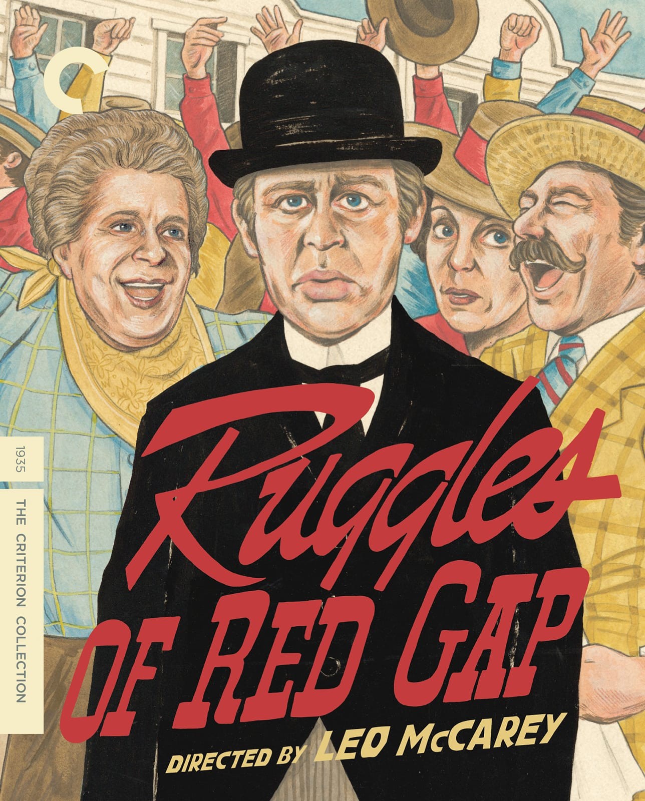
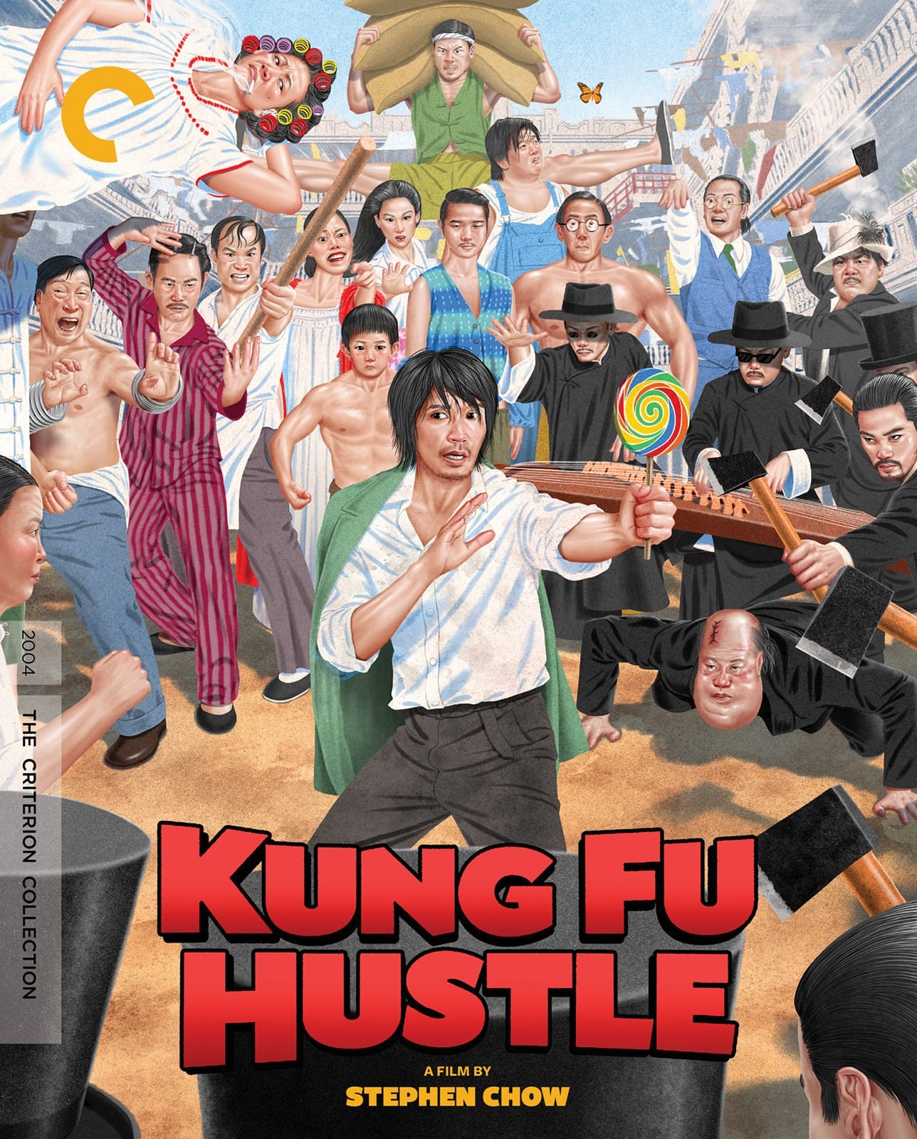
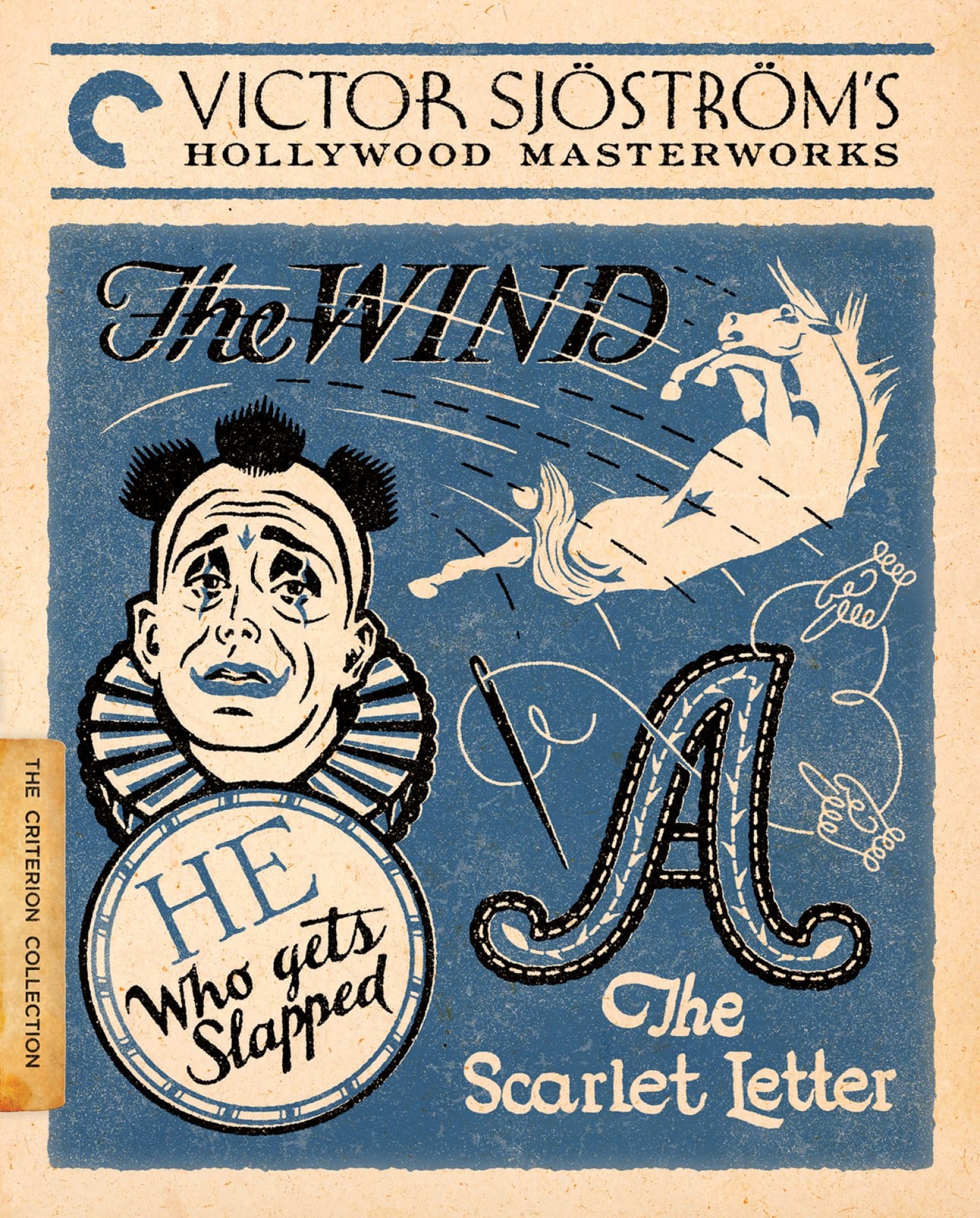
Love the artwork for Sweet Hereafter and really like the Sjöström set. I like the idea behind Kung Fu Hustle but not a fan of the style. Red Gap is okay, I guess. Worst cover goes to Jay Kelly.
The Sweet Hereafter is the big disappointment for me this month. Something much more simple and evocative would have been better. The bus. The snow. That’s it.
Plus, anyone unfamiliar with the movie will think it’s in black and white!
Jay Kelly looks like a sad imitation of Eternity. Otherwise they all seem uninspired this month. Kung Fu Hustle might have been okay had Stephen Chow actually look like Stephen Chow.
pistolwink wrote: Fri Nov 13, 2026 11:05 pm
The criterion logo sitting awkwardly on top of the first two letters of "Jay Kelly" screams "We slapped this together in a few minutes." And why not?
Sister Hyde would never do such a thing in her laziest moment.
For me, the horse flying through the air on the Sjostrom cover has the opposite effect of what I imagine was intended. This looks like the cover of a wacky comedy somehow involving clowns, a horsenado, and an embroidering ghost. Great execution, though!
Matt wrote:For me, the horse flying through the air on the Sjostrom cover has the opposite effect of what I imagine was intended. This looks like the cover of a wacky comedy somehow involving clowns, a horsenado, and an embroidering ghost. Great execution, though!
Are you thinking of his lost masterpiece The Bitch-Slapped Pony?